|
|
Post by jenr on Jun 20, 2017 17:26:26 GMT
|
|
|
|
Post by KikiPea on Jun 20, 2017 17:35:52 GMT
Your photo will enlarge, if you click on it. As for proofreading, I worked for a scrapbook manufacturer sever years back. You can have 5 people proofread something, and sometimes, things still fall through the cracks. It is unfortunate, though. |
|
|
|
Post by sleepingbooty on Jun 20, 2017 17:59:07 GMT
Are you perhaps mistaking the ball terminal of the lowercase letter g for an apostrophe? 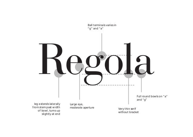 |
|
|
|
Post by workingclassdog on Jun 20, 2017 18:18:18 GMT
I'm an idiot.. I don't see any errors.. but take that with a grain of salt. lol
|
|
|
|
Post by jenr on Jun 20, 2017 18:18:49 GMT
Are you perhaps mistaking the ball terminal of the lowercase letter g for an apostrophe? Oooh. I guess I did. Shame on ME! Totally looks like an apostrophe though! Save |
|
|
|
Post by jenr on Jun 20, 2017 18:20:35 GMT
Apparently it's ME that can't read! Sorry, Fancy Pants!  |
|
|
|
Post by Delta Dawn on Jun 20, 2017 18:30:54 GMT
Did it really take my brain *that* long to recognize the mistake? I used to proofread for the ministry I worked for (government department) and I swear I leak brain cells all the time.
|
|
|
|
Post by anniefb on Jun 20, 2017 19:05:31 GMT
Apparently it's ME that can't read! Sorry, Fancy Pants! It looked like an apostrophe to me too  |
|
|
|
Post by scrappinmom1 on Jun 20, 2017 19:25:23 GMT
I thought it was an apostrophe too!
|
|
PaperAngel
Drama Llama

Posts: 7,313
Jun 27, 2014 23:04:06 GMT
|
Post by PaperAngel on Jun 20, 2017 20:08:30 GMT
I've noticed a decline in attention to spelling, grammar, etc. Although your example is correct, IMHO the designer should have chosen a different font for a small embellishment because it does look like an apostrophe/misspelling at first glance! Are you perhaps mistaking the ball terminal of the lowercase letter g for an apostrophe? is being a fancy pants & getting technical with typography! ♥️😉 |
|
|
|
Post by KikiPea on Jun 20, 2017 20:36:29 GMT
That G doesn't really look like it goes with the rest of the font. A little odd.
|
|
|
|
Post by sleepingbooty on Jun 20, 2017 20:38:03 GMT
Someone is being a fancy pants & getting technical with typography! ♥️😉  |
|
|
|
Post by LavenderLayoutLady on Jun 20, 2017 21:09:48 GMT
Apparently it's ME that can't read! Sorry, Fancy Pants! It looked like an apostrophe to me too Me too! I hope that looks less like an apostrophe in real life. |
|
|
|
Post by Scrapper100 on Jun 20, 2017 21:51:49 GMT
It looks like an apostrophe to me to. That would bug me. Poor choice of font.
|
|
Deleted
Posts: 0
May 8, 2024 2:10:53 GMT
|
Post by Deleted on Jun 20, 2017 22:17:25 GMT
Are you perhaps mistaking the ball terminal of the lowercase letter g for an apostrophe? I love that you know what that's called :*) Bad font though if it's so easily mistaken for an apostrophe, which I did when looking at the picture too - but I had already read the thread so I knew it wasn't. |
|
|
|
Post by crimsoncat05 on Jun 20, 2017 22:35:55 GMT
looked like an apostrophe to me too me, too!! |
|
|
|
Post by 950nancy on Jun 20, 2017 23:00:24 GMT
Learned a new term -ball terminals AND realized I need my new glasses sooner rather than later.
|
|
artisticscrapper
Pearl Clutcher
Posts: 3,603  Member is Online
|
Post by artisticscrapper on Jun 20, 2017 23:50:40 GMT
They don't seem to proofread novels anymore--I've seen errors in the grammar and sometimes even the spelling--so why should they bother to proofread craft items? My all time favorite was the Heidi Swapp 'Thrusday' error.
And that really does look like an apostrophe. Bad choice of font on their part.
|
|
|
|
Post by crimsoncat05 on Jun 21, 2017 1:35:26 GMT
My all time favorite was the Heidi Swapp 'Thrusday' error. that actually WAS an error on a product?  I thought it was just a 2Peas 'thing' not a REAL thing. |
|
|
|
Post by LisaDV on Jun 21, 2017 11:28:52 GMT
I'm an idiot.. I don't see any errors.. but take that with a grain of salt. lol I didn't either. Thanks to sleepingbooty, I now know what's going on. Oh, and I have that set of flairs! |
|
|
|
Post by workingclassdog on Jun 21, 2017 14:38:54 GMT
I'm an idiot.. I don't see any errors.. but take that with a grain of salt. lol I didn't either. Thanks to sleepingbooty , I now know what's going on. Oh, and I have that set of flairs! I did look at that 'g' for a bit and just figured it was apart of the g although it does look off.. but I was scanning for something more obvious. |
|
|
|
Post by myboysnme on Jun 21, 2017 23:30:06 GMT
Ugh! Fortunately I would be able to take a slick writer or sharpie and color in that misplaced apostrophe. My mother was a proofreader of technical manuals for many years. A professional proofreader would catch that or likely not be employed as a proofreader very long. |
|
|
|
Post by KikiPea on Jun 21, 2017 23:37:36 GMT
Ugh! Fortunately I would be able to take a slick writer or sharpie and color in that misplaced apostrophe. My mother was a proofreader of technical manuals for many years. A professional proofreader would catch that or likely not be employed as a proofreader very long. It's not an apostrophe, It's the font style. |
|
|
|
Post by lisacharlotte on Jun 21, 2017 23:39:03 GMT
I learned to proofread in the Air Force back in the days before computers and memory typewriters. Airman Performance Reports could not have corrected errors. I had to read everything backwards to check for misspellings. After reading something for the nth time, it becomes impossible to see your errors.
|
|
|
|
Post by LisaDV on Jun 22, 2017 13:14:00 GMT
I didn't either. Thanks to sleepingbooty , I now know what's going on. Oh, and I have that set of flairs! I did look at that 'g' for a bit and just figured it was apart of the g although it does look off.. but I was scanning for something more obvious. I got that it was the font choice right off. I think a designer looks at the fonts and chooses a great one, it just doesn't work so well when it's scaled down. There's been some wonky cursive scripts where I'm like, "what the heck are they trying to spell?". |
|
Deleted
Posts: 0
May 8, 2024 2:10:53 GMT
|
Post by Deleted on Jun 22, 2017 20:10:57 GMT
I'm an idiot.. I don't see any errors.. but take that with a grain of salt. lol I didn't either. Thanks to sleepingbooty , I now know what's going on. Oh, and I have that set of flairs! Add me to the list of P's who didn't see anything wrong. Or is it Ps??? Which looks like I spelled PS wrong.
Oh well.
|
|
|
|
Post by scrapaddict702 on Jun 22, 2017 20:29:27 GMT
My all time favorite was the Heidi Swapp 'Thrusday' error. that actually WAS an error on a product? I thought it was just a 2Peas 'thing' not a REAL thing. In her planners from M's (the green one and the black/white striped one), the monthly calendars all had WEDENESDAY.  |
|
|
|
Post by jennoconnell on Jun 23, 2017 4:06:54 GMT
Are you perhaps mistaking the ball terminal of the lowercase letter g for an apostrophe? I am so impressed that you know this. I learned something new today. Good on you! |
|
|
|
Post by riversong1963 on Jun 23, 2017 14:27:41 GMT
I didn't see anything wrong at first. Then I thought I did. Now I see that it's the font. It is a poor choice, IMO. I remember an Echo Park collection, Note to Self, that had 3 mistakes on various papers and stickers. I contacted Jen Gallacher, who was the product manager (or something like that) at the time. I'm a former English teacher, so these things really irk me. She apologized and said that 3 people, including herself, had proofed the collection and hadn't found any mistakes. She did see the ones I had pointed out after receiving my email, though. She told me to pick out any EP collection that I wanted, and she sent it to me at no charge. I still don't know how 3 people missed all 3 errors.
|
|
|
|
Post by anonrefugee on Jun 23, 2017 15:47:40 GMT
Good call sleepingbooty, thanks for lesson! Unfortunately, it's a poor graphic if it's so easily mistaken by viewers. |
|


 I thought it was just a 2Peas 'thing' not a REAL thing.


