kitbop
Pearl Clutcher

Posts: 4,622 
|
Post by kitbop on Sept 8, 2020 22:48:08 GMT
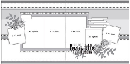
I hope Sketchtember is helping your creativity this month as much as it is mine! Here is a 2 page sketch from Allison Davis:  sketch 2 page alison davis sketch 2 page alison davis by kirstendrew, on Flickr And my example - pretty close to the sketch  Layout Tarzan of the Ausable Layout Tarzan of the Ausable by kirstendrew, on Flickr Your twist today: create a good sized cluster (7 items) by a title. Clusters need to be anchored, and where better to anchor than on your title! On the first page of my example, I even added a secondary "title" (I just loved the puffy word, had to use it) and anchored it to my cluster there. If you duplicate items (I did 2 sets of stamped leaves) and choose similar items from a set (3 pink flowers, different sizes) it helps keep things united and less overwhelming to the eye! |
|
|
|
Post by grammadee on Sept 8, 2020 23:16:17 GMT
Cool sketch and FUN page! Will print this with the others I have not yet done, shuffle, then see which one comes out on top for my next scrappy project...
I always want to scrap the LATEST photos, which are still on my phone and camera from this past weekend, but I am sure if I dig through the ones that I didn't get to, before, I can find at least six pic's that will work together...
|
|
nylene
Drama Llama
 
Posts: 6,779 
|
Post by nylene on Sept 10, 2020 0:46:09 GMT
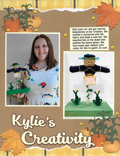
I looked through all my photos for appropriate photos and then remembered that the sketches are for inspiration. I love what kitbop has been doing with the torn borders and I love the clusters being anchored to photos and title. So though my photos don't fit the design, I tore paper borders and tried to better anchor my clusters. I hope that counts.  Kylie's Creativity Kylie's CreativityI need to get all these Cousin Camp photos scrapped while I still remember all the details. |
|
|
|
Post by AussieMeg on Sept 11, 2020 1:16:56 GMT
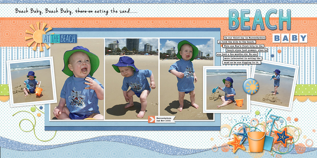
Thanks for the fun sketch, here is mine. I used the 'Heat of Summer' and 'Summer Is Here' kits, both by Lindsay Jane. I did a big cluster, but I didn't like the look of it when I anchored it to the title down the bottom, so I moved it back up the top.  |
|
kitbop
Pearl Clutcher

Posts: 4,622 
|
Post by kitbop on Sept 11, 2020 3:05:19 GMT
The pps here really steal the show - the waves generate so much movement and fun! Your title with the ombre is beautiful. Love it!
|
|
ComplicatedLady
Pearl Clutcher

Posts: 3,083  Location: Valley of the Sun
|
Post by ComplicatedLady on Sept 11, 2020 17:06:27 GMT
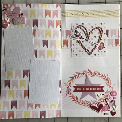
Here’s mine. I’m not a fan of my title/cluster combo—I think my title might be too small. I may edit the title or add something later, but then again, I might not so I figured it’s time to share it!  2020 Sketchtember #9 2020 Sketchtember #9 |
|
|
|
Post by Ryann on Sept 11, 2020 23:39:50 GMT
I really enjoyed this sketch. I don't typically do 2-page spreads, but after going through my photos I thought I would give it a try. After picking up my layout to put away, I set it back down, with the layouts on switched sides. I really liked the way the pages look that way, too! Here is a photo of the "traditional" orientation.   |
|
kitbop
Pearl Clutcher

Posts: 4,622 
|
Post by kitbop on Sept 12, 2020 14:08:20 GMT
ComplicatedLady - I love how I can see the sketch translated into your format! And I love all the flags in the background and the mini hearts detail at the top of page 2. Ryann - I'm impressed with how well the concert photos look with your choice of pps/background! The clusters are fabulous - I LOVE the leaf//feather? (they remind me of feathers here but maybe on the original pp they were leaves?) elements and your title choices! I'm jealous about seeing U2 as well.
|
|
wendy crowe
Junior Member
 
Posts: 73
Aug 7, 2020 14:00:10 GMT
|
Post by wendy crowe on Sept 14, 2020 0:07:08 GMT
|
|
|
|
Post by grammadee on Sept 14, 2020 17:58:58 GMT
Ryann and @disneydarling007, your pages are amazing! Both of them have so many interesting photos and details, yet have lots of "white" space. Love your clusters, Ryann, of seemingly random things that tie in with each other and the title so well. Wendy, your flower clusters are beautiful, and I love that ribbon at the bottom that looks like athletic edging: so perfect for an academic LO. And congrats on completing three LO's in one day!
|
|
|
|
Post by grammadee on Sept 14, 2020 18:03:37 GMT
I think I hate you, kitbop . I had this page planned--all except that CLUSTER  --and laid out on my counter last night, so the basic pages went together really quickly this morning. I knew I wanted a big title down the side, and found the letter stickers/diecuts without too much trouble. But then... that cluster gave me fits. It still looks like a pile of junk, I think, but I declared these pages DONE, so here they are:
POINTS: two pages created & shared (4). #1 Sketchtember #9 (2) plus twist (1) and bonus (5), #2 five photos for the Donna challenge (5), #3 triangles (1), #4 copper brads (2), #15 pic's from September (4), #31 & 32 (4), #33 doodling (1), #34 fall colours (2), #35 just starting my fall album (2), #36 new SS diecuts, but ribbon is at least 5 years old (2), #37 enamel dot (1), #38 5x7 photo (1), #42 smiling (2), #48 puffy sticker (1), #49 triangles on pop dots (1), #53 stitched ribbon (2), #55 love these little guys! (2). Total: 45
|
|
|
|
Post by Linda on Sept 16, 2020 0:54:59 GMT
kitbop - I love your sample - those banners, the colours, the clusters, and awesome photos! nylene - those pumpkins are awesome and I love the torn paper AussieMeg - that is a great cluster but the beach baby is stealing the show - what a cutie! ComplicatedLady - I think your title cluster looks great! Ryann - awesome photos and your layout looks great - love the clusters @disneydarling - love the kraft background - the flowers really pop! grammadee - fun photos and title - I like how it turned out Mine didn't end up much like the sketch in the end - I swear I started with it though. Shrinking the page size and still having biggish photos meant changing the photo spots up and then clusters defeated me and I ended up with a much simpler end result  
|
|
|
|
Post by justjac on Oct 28, 2020 12:55:50 GMT
|
|