ComplicatedLady
Pearl Clutcher

Posts: 3,083  Location: Valley of the Sun
|
Post by ComplicatedLady on Sept 20, 2020 0:48:26 GMT
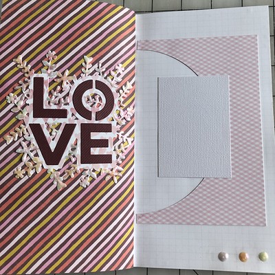
Here’s an example of where I veered a bit off of my own sketch, but when I found the pick paper with the half circle cut out, I liked the way it looked. I was initially thinking an open frame behind the photo mat, but this works! The twist is to use BIG letters somehow. I wanted to use the “love” die on my layout, which is what made me think of this one. Big is relative—use a letter or work that is bigger than you normally would use. The sketch  2020 Sketchtember #20 sketch 2020 Sketchtember #20 sketch My interpretation  2020 Sketchtember #20 2020 Sketchtember #20 |
|
|
|
Post by grammadee on Sept 20, 2020 3:23:49 GMT
I like the sketch and the LO. Hmmm... which to use as my jumping off point?
|
|
Chinagirl828
Drama Llama
  Melbourne, Australia
Posts: 6,682
Jun 28, 2014 6:28:53 GMT
|
Post by Chinagirl828 on Sept 20, 2020 4:02:24 GMT
ComplicatedLady these kinds of happy accidents are the best. Love the colour combo and that title piece is gorgeous!
|
|
|
|
Post by Linda on Sept 20, 2020 22:07:29 GMT
my version - kitbop - I actually have a cluster, okay so it's not for one of your sketches but...  |
|
kitbop
Pearl Clutcher

Posts: 4,622 
|
Post by kitbop on Sept 20, 2020 22:29:40 GMT
Linda - I have been watching your clusters - this isn't the first - and you are doing awesome with them!!! Do you like them??? Great page btw, I struggle with any bicycle ephemera, and you included it here perfectly.
|
|
|
|
Post by Linda on Sept 21, 2020 2:23:02 GMT
Thanks kitbop - I like THIS cluster - in general I think I only like them when they come together organically and I'm not trying to force them into existance for a sketch or with stuff that doesn't feel like it works together. I think it helped to use a collection for this layout that had everything coordinating and lots of bits to pick from |
|
|
|
Post by Ryann on Sept 21, 2020 20:38:44 GMT
ComplicatedLady Another great sketch!! I'm always a big fan of using scraps, so your open space created by the negative circle speaks to me! The contrasting pages (light/dark) is really stunning! Linda Another lovely layout! I don't typically have reasons to use fall themed bits, so I really appreciate when others do, so I can enjoy them, too!  This is one of the most simple layouts I think I've ever made and it came together so fast! The background is really busy and I didn't want to cover any of it up. This photo was taken at a local bingo hall. The painterly circles reminded me of the ink dobbers used to mark the numbers on a bingo card. 
|
|
|
|
Post by grammadee on Sept 21, 2020 21:15:13 GMT
Ryann, I LOVE the BINGO title! And that the background looks like they have been made with a Bingo dauber! Here is my take on the sketch. Doesn't look a LOT like the sketch, but believe me that is where I started...  Back to School Covid Style Back to School Covid Style by Gramma Dee, on Flickr
|
|
|
|
Post by Linda on Sept 21, 2020 21:22:21 GMT
Ryann - I don't get much opportunity to use fall themes either here in Florida. Love your Bingo page - that paper was perfect! grammadee - love all the PL cards and your awesome title
|
|
wendy crowe
Junior Member
 
Posts: 73
Aug 7, 2020 14:00:10 GMT
|
Post by wendy crowe on Sept 24, 2020 2:51:25 GMT
|
|
|
|
Post by Linda on Sept 24, 2020 11:57:26 GMT
wendy crowe - awesome hockey clusters and I love how you incorporated memorabilia
|
|