Chinagirl828
Drama Llama
 Melbourne, Australia
Posts: 6,479
Jun 28, 2014 6:28:53 GMT
|
Post by Chinagirl828 on Jun 16, 2017 7:59:55 GMT
I love this photo I took in St Peter's Basilica but am completely lost for how to scrap it and do it justice. I currently have it printed as a 5x7 and plan to do a single 12x12 page with just this photo. Whatever I do I want the focus to definitely stay on the photo and am leaning towards a white cardstock background but that's a far as I can get in my decision making process. Any suggestions for layout design, colours, papers, embellishments?  |
|
|
|
Post by dasmith2 on Jun 16, 2017 8:02:46 GMT
What an awesome pic. I'd go with white or cream cardstock base and maybe focus on journaling other than that I have no idea how to scrap photos like that,I've never had any awesome ones like that. sorry I'm no help  |
|
|
|
Post by sleepingbooty on Jun 16, 2017 9:16:47 GMT
I'd let the photo shine and keep it very simple. White or light cream background, minimal matting, gold and black (or warm grey if you manage to find some) embellishments that are on the fine line side of things (delicate), journaling. Nothing more. Do you sew? If so, I'd consider gold thread sewing across the white cardstock. Beautiful photo and, I'm sure, memory. Let those obvious elements have their moment and the background "just" be background.  PS: since you're scrapping pictures of the Vatican, did you see that Carta Bella's Transatlantic Travel line has a map of Italy pattern paper? |
|
|
|
Post by myboysnme on Jun 16, 2017 11:36:12 GMT
I would not go with white. I would go with a very dark brown. I would want that gorgeous illumination to be the light shining. White will box it in. The dark brown will allow it to basically expand its borders and really focus on the figure.
Could you lay it on white and on dark brown and show us?
I would mat it in burnished gold metallic. |
|
|
|
Post by LavenderLayoutLady on Jun 16, 2017 11:46:53 GMT
I would not go with white. I would go with a very dark brown. I agree. I would also look for embellishments that are metallic gold, or have gold foiling. Delicate embellishments, as another poster said. I'd stick to minimalistic embellishment, and type the journaling. |
|
scrapaddie
Drama Llama
Posts: 5,090 
|
Post by scrapaddie on Jun 16, 2017 12:08:50 GMT
I would probably mimic the dark red in the background with a gold mat.... Maybe gold flourish to embrace any journaling
|
|
|
|
Post by mikklynn on Jun 16, 2017 12:22:13 GMT
I agree with using a dark background and add a touch of gold. I'd limit my journaling to what and where.
|
|
pancakes
Pearl Clutcher
Posts: 4,993
|
Post by pancakes on Jun 16, 2017 12:25:11 GMT
I would probably mimic the dark red in the background with a gold mat.... Maybe gold flourish to embrace any journaling I like this idea of the dark red and gold mat. I would go for a very minimalist, one column layout, where the title is the same width as the photo. |
|
kelly8875
Pearl Clutcher
Posts: 4,391
Location: Lost in my supplies...
|
Post by kelly8875 on Jun 16, 2017 12:45:45 GMT
I would go with a very dark brown background or black (but I use tons of black so that's my favorite). I like someone's suggestion of seeing with some gold threads too. A simple title, and that's all I would do. Otherwise you'll take the focus away for sure.
|
|
|
|
Post by scrappinmom1 on Jun 16, 2017 16:29:28 GMT
I would try a cream background and mat on dark brown (maybe double mat with gold?). I would probably skip any embellishments (although I like the suggestion of gold thread) and limit the amount of journaling.
Christine
|
|
|
|
Post by grammadee on Jun 16, 2017 16:46:58 GMT
Gorgeous photo! I had trouble with the lighting--and the other snap happy tourists--when trying to take photos inside the Basilica. I like the idea of light bg with your journaling on it. Then I would use a large (maybe 9 1/2" high, 8" wide) dark matt--maybe black or deep red like the wall behind the statue. Then I would triple matt the photo, using black/dk red/metallic gold, whichever order looks the best with the photo. Your title could fit above or below the photo, or above the journaling in the column beside the photo. Another way would be to cut the largest size out of your large matt, then cut the next size out of the next matt, and so on, until you come DOWN to your photo behind them all (like a triple matted framed photo, KWIM? Whatever you decide to do, Chinagirl828, I hope you show us the final product! |
|
christinec68
Drama Llama
Posts: 5,129
Location: New York, NY
|
Post by christinec68 on Jun 16, 2017 17:06:39 GMT
|
|
|
|
Post by crimsoncat05 on Jun 16, 2017 21:17:41 GMT
I'd add a tiny pop of red in there somewhere, to draw your attention to the red in the background... I agree with NOT using white, and using some sort of brown instead.
Perhaps some textured gold paper or gold vellum, something like that.
if it was me, I wouldn't use anything too 'delicate' looking, in terms of flourishes or swirls, because that would look a little incongruous compared with the 'strength' of the statue.
|
|
|
|
Post by crimsoncat05 on Jun 16, 2017 21:40:32 GMT
maybe a layout something like THIS PIN for the layout?? maybe minus one or two of the lacy-looking borders, and perhaps with more tone-on-tone patterns for the layering pieces, to be more subtle and not draw too much attention away from your photo. or perhaps something like this pin, but mat your photo in very dark brown or black to set it off from the patterned paper pieces behind it... and again, use tone-on-tone papers or gold patterns so as to not detract too much from the photo. It's a gorgeous photo- I can understand wanting to do it justice with your layout. |
|
Chinagirl828
Drama Llama
Melbourne, Australia
Posts: 6,479
Jun 28, 2014 6:28:53 GMT
|
Post by Chinagirl828 on Jun 17, 2017 0:27:17 GMT
Thanks for all the suggestions so far, you've certainly given me plenty of options where I was struggling. myboysnme here it is on white (which has a slightly grey cast thanks to the poor lighting in my room in the morning), dark brown, and black.    |
|
|
|
Post by myboysnme on Jun 17, 2017 22:01:50 GMT
What do you like best? Come back to the thread and show us when you finish it!
|
|
nicolep
Drama Llama
Posts: 7,080
|
Post by nicolep on Jun 17, 2017 22:46:23 GMT
I like the white or the dark brown!
|
|
Chinagirl828
Drama Llama
Melbourne, Australia
Posts: 6,479
Jun 28, 2014 6:28:53 GMT
|
Post by Chinagirl828 on Jun 18, 2017 2:26:35 GMT
See, this is why I haven't scrapped this photo yet. I like the brown with the photo but I worry it will feel too heavy and out of place in the album as most of my other pages in this section are much lighter in colour. When I think about this moment it feels like the page needs to be lighter. We arrived early, there were few other tourists, and the early morning sunlight streamed through the open doors. I just don't know how to recapture that light, magical, moment with paper. I keep hoping I'll stumble across the perfect slightly textured not too light but not too dark background patterned paper in my stash but although the papers often feel like they are multiplying I can't find just the right thing. I suspect it will take me a while and several more supply changes before I finally find the right combination. I definitely appreciate all the suggestion and am always open to new ides. |
|
Chinagirl828
Drama Llama
Melbourne, Australia
Posts: 6,479
Jun 28, 2014 6:28:53 GMT
|
Post by Chinagirl828 on Jun 18, 2017 10:11:00 GMT
I have pushed these few supplies around and around the page to finally come up with this. It's not super clear on the scan but the polka dot print on the right hand side is clear acetate with gold glitter dots. I really like the barely there pattern because I can still see the texture of the background cardstock through it. Thanks to everyone who offered suggestions (and thanks crimsoncat05 for linking the sketches - I used the first one as my starting point here). 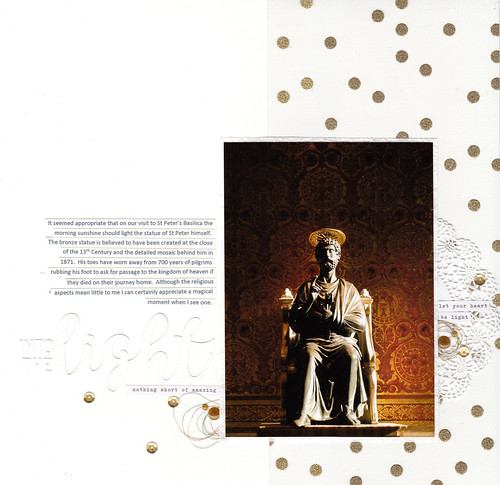 |
|
|
|
Post by LavenderLayoutLady on Jun 18, 2017 10:24:35 GMT
I have pushed these few supplies around and around the page to finally come up with this. It's not super clear on the scan but the polka dot print on the right hand side is clear acetate with gold glitter dots. I really like the barely there pattern because I can still see the texture of the background cardstock through it. Thanks to everyone who offered suggestions (and thanks crimsoncat05 for linking the sketches - I used the first one as my starting point here). That is just stunning, and you've absolutely done that photo justice! |
|
pilcas
Pearl Clutcher
Posts: 2,920
|
Post by pilcas on Jun 18, 2017 10:43:35 GMT
I love how it came out. The placement of the journaling makes all the difference. The dots on the transparency pick up the colors of the photo. Great job!
|
|
|
|
Post by freeatlast on Jun 18, 2017 10:47:47 GMT
Fabulous photo and layout!!!
|
|
nicolep
Drama Llama
Posts: 7,080
|
Post by nicolep on Jun 18, 2017 10:55:41 GMT
It is perfectly done! Looks fantastic!
|
|
|
|
Post by mikklynn on Jun 18, 2017 11:53:06 GMT
It's lovely. The gold dots were a great solution.
|
|
|
|
Post by miss_lizzie on Jun 18, 2017 11:59:34 GMT
So very beautiful. Wow!
|
|
|
|
Post by streetscrapper on Jun 18, 2017 12:04:37 GMT
AWESOME layout! It's stunning!
|
|
msliz
Drama Llama
The Procrastinator
Posts: 6,419
Jun 26, 2014 21:32:34 GMT
|
Post by msliz on Jun 18, 2017 12:56:27 GMT
Very elegant. Your choices support the photograph, not the other way around. I love it!
|
|
|
|
Post by Linda on Jun 18, 2017 13:01:30 GMT
beautiful!
|
|
|
|
Post by grammadee on Jun 18, 2017 14:43:17 GMT
Beautiful page, Chinagirl828 ! That white on white title really emphasizes the point of your journaling. I left some love in the Gallery. And thanks crimsoncat05 for the sketch. I pinned it for future use for scrapping a one photo page. |
|
|
|
Post by Skellinton on Jun 18, 2017 14:57:20 GMT
Stunnng, just stunning.
|
|