|
|
Post by grammadee on Feb 10, 2018 21:45:34 GMT
This is my take off on grammadee's layout. I used her title layout, sort of, and the family theme
Another super 2 pager! I may have to lift your lift LOL! I am in love with your page borders. Did you freehand those wavy strips? Or are they a cut file? |
|
gramma
Pearl Clutcher

Posts: 3,114  Location: Sacramento, Ca
|
Post by gramma on Feb 10, 2018 22:49:56 GMT
They are a Silhouette cut file that I stretched. I think they would be pretty simple to free hand though.
And thank you for the kind comments :-)
|
|
gramma
Pearl Clutcher

Posts: 3,114  Location: Sacramento, Ca
|
Post by gramma on Feb 10, 2018 22:51:52 GMT
Here’s my version of the inspiration LO by grammadee ! I took the “shelf” idea, along with the notched paper strip. I loved the inspiration. Thanks for letting me play! This one is going straight into my "I stole this one" file. Love it!
|
|
Chinagirl828
Drama Llama
  Melbourne, Australia
Posts: 6,682
Jun 28, 2014 6:28:53 GMT
|
Post by Chinagirl828 on Feb 11, 2018 1:19:23 GMT
gramma I love the mix of colours, especially with the shape of the swirls. Great photos too.
|
|
|
|
Post by mikklynn on Feb 11, 2018 2:04:06 GMT
gramma I love the mix of colours, especially with the shape of the swirls. Great photos too. Exactly what I was going to say, gramma. |
|
|
|
Post by stinkerbelle on Feb 11, 2018 2:10:36 GMT
gramma awesome lift! i really love the super bright colors!
|
|
|
|
Post by jeremysgirl on Feb 11, 2018 20:14:05 GMT
I'm not nuts about the way this one came out. I am wishing I had matted the photo on black before I secured everything down.  |
|
|
|
Post by grammadee on Feb 11, 2018 20:18:56 GMT
Your page is lovely, jeremysgirl. When that happens to me, I grab a sharpie and trace the edge of whatever it is that needs a little definition in my eyes. The width of the tip would depend on how much of a border I want to see. |
|
|
|
Post by jeremysgirl on Feb 11, 2018 20:20:49 GMT
Your page is lovely, jeremysgirl. When that happens to me, I grab a sharpie and trace the edge of whatever it is that needs a little definition in my eyes. The width of the tip would depend on how much of a border I want to see. Fantastic idea! Thank you. |
|
|
|
Post by mikklynn on Feb 11, 2018 20:25:41 GMT
jeremysgirl That is a fabulous layout. I just love it. I also like grammadee's idea to trace the photo with a black pen. Be warned, you may see that layout stolen/scraplifted in the future 
|
|
|
|
Post by LisaDV on Feb 11, 2018 21:57:05 GMT
gramma, wow. I love those border pieces and the colors. Great design. jeremysgirl, such a gorgeous layout, even without your black mat. I love that picture of you and your dh.
|
|
|
|
Post by LisaDV on Feb 11, 2018 22:02:18 GMT
DawnMcD, love the new photo! You look so chic.
|
|
oaksong
Drama Llama
 
Posts: 6,167  Location: LA Suburbia
Site Supporter
Jun 27, 2014 6:24:29 GMT
|
Post by oaksong on Feb 13, 2018 4:27:58 GMT
|
|
|
|
Post by stinkerbelle on Feb 13, 2018 4:45:30 GMT
jeremysgirl aww I’m a sucker for lovey dovey pages  I really like the heavy inking, especially in contrast to the very feminine floral and lacy border! oaksong love love the crepe paper behind your title and how you did your journaling! Very nice handwriting, btw
|
|
|
|
Post by LisaDV on Feb 13, 2018 21:28:39 GMT
oaksong, wow, another stellar pocket page. I'm loving that ruffle, colors, and how you did the middle center double photos.
|
|
|
|
Post by DawnMcD on Feb 13, 2018 21:39:15 GMT
gramma - I really like the way you used the way strips on your page, The colors are so fun and summery and the way you used the theme to lift. Lovely family. jeremysgirl - I think your page is very pretty. I like the pops of black with the lighter soft colors and florals. oaksong - I love ho you made it into a pocket page. Your photos are soo pretty. The sparkly title is so fun - I love some glitter!
|
|
Chinagirl828
Drama Llama
  Melbourne, Australia
Posts: 6,682
Jun 28, 2014 6:28:53 GMT
|
Post by Chinagirl828 on Feb 25, 2018 10:07:34 GMT
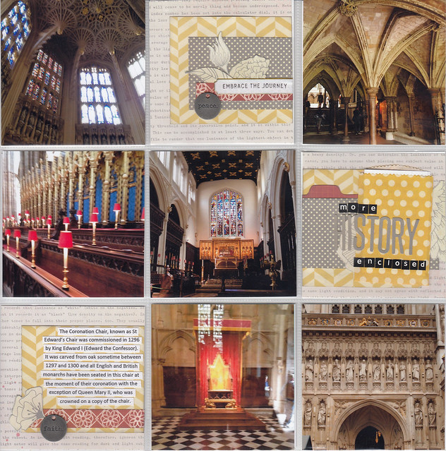
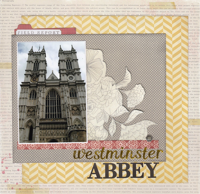
Here's my take. I really loved the big cluster of flowers and the text both above and below the photo. I added a pocket page with some additional (but not great quality - you're not meant to take photos inside Westminster abbey) photos.   |
|
|
|
Post by stinkerbelle on Feb 28, 2018 0:50:26 GMT
Chinagirl828 I love traveling vicariously through you! What gorgeous photos! I really like your color scheme and how you added the little pocket with more history 
|
|