msliz
Drama Llama
  The Procrastinator
Posts: 6,419
Jun 26, 2014 21:32:34 GMT
|
Post by msliz on Feb 16, 2018 15:58:45 GMT
Here's mine. My last of 4 Halloween pages from last year. I stamped and painted, and used a diecut, ribbon, and a metal thingamahoosie. Fun! Thanks for the template, JaneB. I had to switch it up a bit to accommodate my photos, but I tried to stick with your basic design.  JaneB JaneB, the photos and journaling in your layouts makes me smile. stinkerbelle , I just love looking at all the little details on your pages - the stitching, the staples, the spatters - all the eye candy. nylene , I love your colors, but it's the black die cuts that I'm appreciation the most (after the photos, of course! ) @elaynef , I can't tell if those are fabrics or papers, but I love the look - especially the lace. kiwigirl , you make those MH papers looks so awesome - the black and white stripe grounds the whole design for you. Another really nice layout! patin , Your page is so happy! BTW, I'm with you - I'm more comfortable scrapping multi photo too. There's less "extra space" to have to worry about doing something with. grammadee , your foil chevron looks amazing! gramma , your colors are perfect for your photos, the peach looks so sweet with the blue! Can't wait to see more layouts with this design. It's really versatile! |
|
|
|
Post by grammadee on Feb 16, 2018 16:22:06 GMT
Love the purple and green, msliz. And especially that "thingamahoosie"! |
|
|
|
Post by JaneB on Feb 16, 2018 17:47:03 GMT
I love templates...especially when digitally scrapping. My challenge here was using only 2 photos. I tried to use all the elements in the template, resulting in a very busy page, but I sorta like it. I am usually photo intense with an average of 5 per page. I have a feeling the facing page to this will be a project life pocket page! Thanks for this challenge Jane!  28-4-28 28-4-28 by Pati Nuce, on Flickr I'll give you a hint; there's more photos in the next templates  I like how the balloons follow through, like on the green where they remain shades of green, and the smaller ones underneath the photos. And the little tags for the ages, great details that work so well.  |
|
|
|
Post by JaneB on Feb 16, 2018 17:55:57 GMT
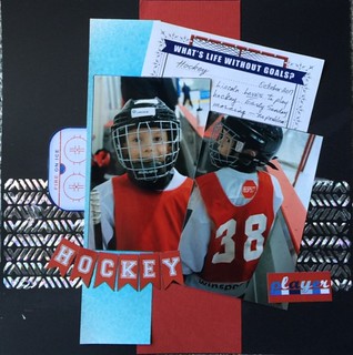
Finally had a little time to play today. Here is my page in response to the template. I decided to create the horizontal line with Minc foil in a chevron pattern. I had to add a journaling card to cover up a bit of a booboo with the cs. Apparently all washi tape is not created equal, and when I tried to remove the tape I had grabbed to hold down the stencil, it decided to take half the surface of the cs with it...  What's life without goals What's life without goals by Gramma Dee, on Flickr This is my six year old dgs, who is trying with all his might to be exactly like his big brother (aged almost 15 and a dedicated hockey player). I had hoped to get to the facing page today, but that does not look like it is happening, so I decided to share this one alone. As this image is slightly smaller I'm looking at it and thinking the chevron pattern looks almost like ice; reminds me of the tyre tracks I sometimes leave too! What a lovely smile, the photo is wonderful, and I like the hockey banner. |
|
|
|
Post by JaneB on Feb 16, 2018 18:00:51 GMT
Jane Oh Jane!! Only 2 photos? One page? And tilt the pictures??? You could not have challenged this old accountant more! I mean things are supposed to line up, right? I laid this out on my desk and walked around it for two days before I finally said )(*)&_)(*^ and stuck it down.
Oh, I'm sorry... You did it though and it's a lovely page. The soft colours, complementing the blue in the dress work so well. I like things ordered too; I'm afraid further templates will probably cause more )(*)&_)(*^ - hope you don't have a swear jar!  |
|
|
|
Post by JaneB on Feb 16, 2018 18:05:25 GMT
Here's mine. My last of 4 Halloween pages from last year. I stamped and painted, and used a diecut, ribbon, and a metal thingamahoosie. Fun! Thanks for the template, JaneB . I had to switch it up a bit to accommodate my photos, but I tried to stick with your basic design.  JaneB JaneB , the photos and journaling in your layouts makes me smile. stinkerbelle , I just love looking at all the little details on your pages - the stitching, the staples, the spatters - all the eye candy. nylene , I love your colors, but it's the black die cuts that I'm appreciation the most (after the photos, of course! ) @elaynef , I can't tell if those are fabrics or papers, but I love the look - especially the lace. kiwigirl , you make those MH papers looks so awesome - the black and white stripe grounds the whole design for you. Another really nice layout! patin , Your page is so happy! BTW, I'm with you - I'm more comfortable scrapping multi photo too. There's less "extra space" to have to worry about doing something with. grammadee , your foil chevron looks amazing! gramma , your colors are perfect for your photos, the peach looks so sweet with the blue! Can't wait to see more layouts with this design. It's really versatile! It's fascinating to see the different ways the same template can be used. 3 photos in row works well, and I love the purple, it's a beautiful shade  |
|
gramma
Pearl Clutcher

Posts: 3,114  Location: Sacramento, Ca
|
Post by gramma on Feb 16, 2018 18:13:24 GMT
Jane Oh Jane!! Only 2 photos? One page? And tilt the pictures??? You could not have challenged this old accountant more! I mean things are supposed to line up, right? I laid this out on my desk and walked around it for two days before I finally said )(*)&_)(*^ and stuck it down.
Oh, I'm sorry... You did it though and it's a lovely page. The soft colours, complementing the blue in the dress work so well. I like things ordered too; I'm afraid further templates will probably cause more )(*)&_)(*^ - hope you don't have a swear jar!  I'm still walking around your first template. But I will prevail!! And - my swear jar is full ;-)
|
|
|
|
Post by mikklynn on Feb 16, 2018 18:56:25 GMT
gramma It turned out great. But, I loved your comment about "challenging this old accountant". I am an engineer and very linear kind of girl. I struggle with angling photos, too! I do it occasionally. msliz I love your title - perfect! I really like the purple you used, too.
|
|
Chinagirl828
Drama Llama
  Melbourne, Australia
Posts: 6,682
Member is Online
Jun 28, 2014 6:28:53 GMT
|
Post by Chinagirl828 on Feb 16, 2018 21:27:15 GMT
msliz I love all the purples! Great job using the old ribbon slide too - I should pull those back out and get them used up.
|
|
|
|
Post by mikklynn on Feb 17, 2018 1:09:21 GMT
|
|
|
|
Post by JaneB on Feb 17, 2018 7:57:03 GMT
She's gorgeous; I wish I looked so good any time of day  I like the cluster of coffee elements at the side, and cool blue paper which makes you think of cold mornings. |
|
|
|
Post by stinkerbelle on Feb 18, 2018 6:01:25 GMT
gramma your post made me laugh  I think your LO turned out lovely, tilted photos and all! Gorgeous color scheme!! msliz I love your thingamahoosie! I really like the huge moon and how you changed it up to really suit your photos! mikklynn such a pretty page! I really like the colors and all the fun embellies 
|
|
Chinagirl828
Drama Llama
  Melbourne, Australia
Posts: 6,682
Member is Online
Jun 28, 2014 6:28:53 GMT
|
Post by Chinagirl828 on Feb 18, 2018 9:52:32 GMT
|
|
|
|
Post by JaneB on Feb 18, 2018 10:09:23 GMT
And excellently done too! I like the clusters either side of the photos, especially with the repeating globes, tying everything in together. The two styles of font for the title works well too, and all the colours pulling from the photos.  |
|
gramma
Pearl Clutcher

Posts: 3,114  Location: Sacramento, Ca
|
Post by gramma on Feb 18, 2018 15:15:36 GMT
I love this one - - and you were able to tilt the photos. Good Job ;-)
|
|
Deleted
Posts: 0
Nov 22, 2024 21:53:14 GMT
|
Post by Deleted on Feb 18, 2018 16:12:45 GMT
Great LO, I adore your embellishments and photos, so cute!
@elaynef your LO is amazing, is it fabric? It looks like fabric which goes so well with your title, it's perfect![/quote]
No fabric. That burlap and lace is the last leftovers from a pad of similar papers. I have no idea the manufacturer but when I goggled I found several available. The plaid is also from a pad of papers that look like boys shirt fabrics. Very useful for me with my 10 dgs. It's probably paper issues.
I'm enjoying watching all y'all's creations from dd's home in OKC. I updated what was going on with us in grammadee's total and talk thread.
|
|
|
|
Post by stinkerbelle on Feb 18, 2018 17:13:51 GMT
Chinagirl828 i love your take on the challenge! the brightly colored photos just pop on the white background and i love all your little travel goodies and cute lil mickey head 
|
|
|
|
Post by grammadee on Feb 18, 2018 18:27:55 GMT
I love seeing JaneB's design actually stretched over the two pages, Chinagirl828! Another lift coming up in my future, I think! |
|
|
|
Post by jeremysgirl on Feb 18, 2018 20:31:20 GMT
Here's mine. This is my big dog, Amelia.  |
|
|
|
Post by mikklynn on Feb 19, 2018 14:23:38 GMT
jeremysgirl Very cute! I love the ribbon bow with the tag. I never think to use ribbon. Bakers twine is my default.
|
|
|
|
Post by JaneB on Feb 19, 2018 20:59:58 GMT
Here's mine. This is my big dog, Amelia.  Ooh isn't she lovely? I like the addition of the Christmas hat  The red running through the photos, paper and embellishments ties it all together beautifully. |
|
|
|
Post by maribeth on Feb 20, 2018 3:08:23 GMT
|
|
|
|
Post by DawnMcD on Feb 20, 2018 4:43:16 GMT
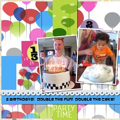
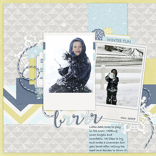
Thank you Jane for the template. I decided to go ahead and do another digital layout since you were so kind to provide the psd. These photos are of my youngest son in 2007. I changed the template a little by moving the vertical strip over to the right a little. I got a code format printer last year so I could try printing my layouts. I will try and give that a try this week.  |
|
|
|
Post by JaneB on Feb 20, 2018 6:31:14 GMT
Hats off to you! I think it's a skill to be able to put all the papers and embellishments together without the photos in person. I like how the colours are captured in the photo (the cake!) and the papers. I hope you're having a great time and getting lots done  |
|
|
|
Post by JaneB on Feb 20, 2018 6:35:40 GMT
Thank you Jane for the template. I decided to go ahead and do another digital layout since you were so kind to provide the psd. These photos are of my youngest son in 2007. I changed the template a little by moving the vertical strip over to the right a little. I got a code format printer last year so I could try printing my layouts. I will try and give that a try this week.  What gorgeous colours! I love the papers, erm.... where's it from? ( Ignore that, I've been to Flickr and it tells me!) As it's digital I might be tempted  I love the little clusters around the tags, the twine, the photos with the white space, it's all lovely - and it makes me want to go Brrr!  |
|
|
|
Post by DawnMcD on Feb 20, 2018 6:49:24 GMT
[quote author=" JaneB" source="/post/2005740/thread" timestamp="1519108540What gorgeous colours! I love the papers, erm.... where's it from? ( Ignore that, I've been to Flickr and it tells me!) As it's digital I might be tempted  I love the little clusters around the tags, the twine, the photos with the white space, it's all lovely - and it makes me want to go Brrr!  [/quote] jane if you go to the digiscrap parade site the brr kit is free in Feb.  |
|
|
|
Post by JaneB on Feb 20, 2018 8:50:55 GMT
jane if you go to the digiscrap parade site the brr kit is free in Feb. I have spent the last two hours downloading, following links, saving stuff to my bookmarks... thank you for the inspiration; I needed new digikits, mine are years old. I must go and get some work done now though!  |
|
|
|
Post by stinkerbelle on Feb 21, 2018 9:06:26 GMT
jeremysgirl love your take on the template! Your pup is adorable, especially with the hat  love the color scheme! maribeth I like the neutral colors and pops of orange you used  that’s some cake! DawnMcD love the frosty feel of your page! I would never have thought to bring in yellow (green?) but it really works  I love the loopy twine too!
|
|
Chinagirl828
Drama Llama
  Melbourne, Australia
Posts: 6,682
Member is Online
Jun 28, 2014 6:28:53 GMT
|
Post by Chinagirl828 on Feb 22, 2018 10:16:52 GMT
jeremysgirl I love the clothing embellishments - especially the cute little hat - and the ribbon is the perfect texture (also I really need to learn how to make my ribbon knots look like yours). maribeth Great colour scheme. With so little colour in your photos it would be easy to overwhelm them but I think they'll look beautiful on this layout.
|
|
|
|
Post by Linda on Feb 23, 2018 18:16:42 GMT
JaneB - you sure do want to challenge us, don't you? That said, I love how my page turned out...tilting and paper layering and all...completely out of this simple scrapper's box  I started with a purple cardstock background and used coordinating PPs from the DCWV Fresh Floral stack...FOUR different patterned papers when I usually struggle with ONE. 2 photos of my older two on Easter 2012 and I finished off with a couple of Doodlebug stickers and a Happy Easter sentiment from a MAMBI Spring collection that was the perfect colour. now to do the facing page with the rest of us 
|
|