joyfulnana
Pearl Clutcher

Posts: 3,043 
|
Post by joyfulnana on Sept 20, 2018 3:20:48 GMT
Hello! Here's your new Thursday sketch! This one is an 8.5x11 two pager that could easily be adapted to a one page or 12x12. It's from Amy's 4x6 Photo Sketch Blog. 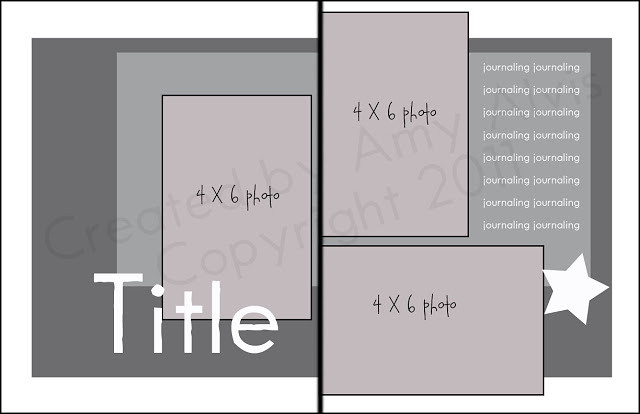 8.5 x 11- 17 8.5 x 11- 17 by Joyfulnana, on Flickr And here's my version: 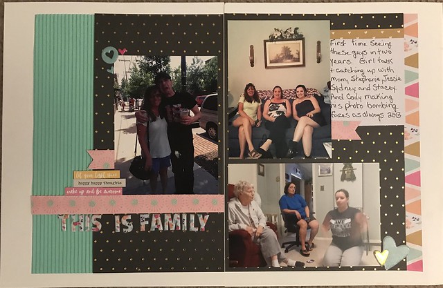 Family Family by Joyfulnana, on Flickr The twist for this sketch: Add texture. Whether corrugated paper, chipboard, torn paper etc. I hope you enjoy this sketch and I can't wait to see what you do with it! I'm claiming 1 pt for sharing and 1 for the UFO challenge since I had done it all except the journaling last month. |
|
|
|
Post by grammadee on Sept 20, 2018 3:41:54 GMT
Love the twist! So much fun to add texture, especially in the fall.
|
|
nylene
Drama Llama
 
Posts: 6,780 
|
Post by nylene on Sept 20, 2018 21:15:21 GMT
Thanks, joyfulnana, love having 8.5x11 designs. I will try this when I get a minute. |
|
|
|
Post by Linda on Sept 20, 2018 21:48:28 GMT
Thank you joyfulnana - I've adapted this to a one-page and will upload in a day or so |
|
|
|
Post by stinkerbelle on Sept 21, 2018 3:47:24 GMT
joyfulnana yes, thanks for another 8.5x11 sketch! Your example is gorgeous, I really love the black mixed in with the pastels and the corrugated paper really adds a punch to the spread. Love those floral alphas too!
|
|
|
|
Post by kiwigirl on Sept 21, 2018 14:44:21 GMT
Love your take joyfulnana , I love that corrugated cardstock and the triangle paper on the right hand side and your little stack of the banner and word stickers, very cool! Here's my take, I was just doing the left hand side - honestly! My texture is Nuvo dots and also the pink circles on the left hand side which I thought were a bit like a bottle/drink stain. I used Nuvo pink embossing paste.  Got 22 for this one. 1 for a LO, 1 for sharing, 5 for sketch + twist, #3, #7, #9, #12, #15, #21, #15, #21, #29, #31, #33, #38, #40 + BONUS, #42, #44 and Sept Stash Challenge - handwriting. |
|
|
|
Post by grammadee on Sept 21, 2018 14:50:08 GMT
Another awesome page, kiwigirl: proof you can create a gorgeous page about ANYTHING!!! That pink circle/splotch piece at the bottom is great! I love the neon pink with the black, how it fits the theme, and how it balances all the excitement at the right. |
|
|
|
Post by Linda on Sept 21, 2018 14:56:01 GMT
kiwigirl - you are a master of those black backgrounds -the bright colours are perfect with black
|
|
|
|
Post by stinkerbelle on Sept 21, 2018 15:01:54 GMT
kiwigirl goodness, you make even bad photos look fabulous! love the gorgeous colors and the embossing paste rings are just perfect; really digging the big multi-font title too!
|
|
Chinagirl828
Drama Llama
  Melbourne, Australia
Posts: 6,682
Jun 28, 2014 6:28:53 GMT
|
Post by Chinagirl828 on Sept 22, 2018 6:38:41 GMT
kiwigirl I love the neon pink texture paste here. You have such a way with colour, I feel like I could pick your pages anywhere.
|
|
|
|
Post by Linda on Sept 22, 2018 13:13:04 GMT
Finally got mine scanned - I combined the sketch into a single page  |
|
|
|
Post by KelleeM on Sept 22, 2018 13:57:55 GMT
 It was fun to use my brand new MME Halloween stuff this morning! |
|
|
|
Post by Linda on Sept 22, 2018 14:00:33 GMT
KelleeM - I love it - that witch paper and the cute little ghost! (and don't forget to take a Sep. Stash point for using your new stuff!)
|
|
Chinagirl828
Drama Llama
  Melbourne, Australia
Posts: 6,682
Jun 28, 2014 6:28:53 GMT
|
Post by Chinagirl828 on Sept 22, 2018 21:42:19 GMT
Linda I love the unexpected colour scheme, that giant houndstooth print is awesome! KelleeM this is so cute! I love the kitty face border strip and the little cluster of sequins that look like lollies. So lovely!
|
|
|
|
Post by grammadee on Sept 22, 2018 22:15:58 GMT
Love the pinks and greens, Linda. KelleeM, she is such a cutie. Love her little worried face at the beginning. Your scattering of sequins really does look like candy beside the little punkin basket. |
|
|
|
Post by kiwigirl on Sept 23, 2018 6:43:21 GMT
Linda great koala page! I couldn't see the title cause I hadn't scrolled down enough and I was like, is that a koala..... is it? scroll down, well yes it is!  Love the colours you picked to use with the photos, they're perfect! Lush LO KelleeM! I love the strips top and bottom and your big title along with the house on the other side, it's all fab!
|
|
Chinagirl828
Drama Llama
  Melbourne, Australia
Posts: 6,682
Jun 28, 2014 6:28:53 GMT
|
Post by Chinagirl828 on Sept 24, 2018 11:19:42 GMT
Here's my version: 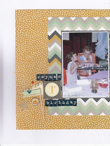 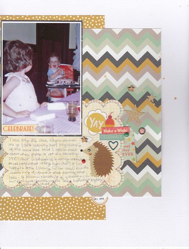 |
|
|
|
Post by Linda on Sept 24, 2018 11:48:37 GMT
@chinagirl - love the 70s colour scheme and that little hedgehog is adorable!
|
|
joyfulnana
Pearl Clutcher

Posts: 3,043 
|
Post by joyfulnana on Sept 24, 2018 12:38:22 GMT
kiwigirl this is fabulous! I love the hot, bright colors and you are rockin' the black backgrounds! I used to use black quite often. Love the bottle stain. I don't need to be getting into nuvo paste too! :  linda linda - Love those colors! And that you took the sketch and made it work for you! KelleeM cute pages! I love how you used up the extra space on the left with a bigger title! Chinagirl828 I love seeing your layouts with the older photos and your clusters on either side are awesome. I love that little hedgehog! You ladies that are doing every sketch are my heros!
|
|
|
|
Post by grammadee on Sept 24, 2018 15:44:37 GMT
Here is my two pager. I flipped the sketch horizontally, and changed the shape of the pp a bit, but I think you can still see the sketch here. I will add up the other points later, but I am claiming 5 for the sketch plus the texture twist (I added a couple of stick on sewing patches at the bottom right). 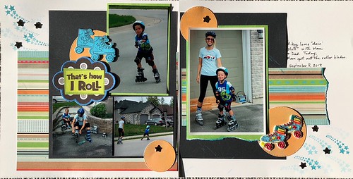 how i roll how i roll by Gramma Dee, on Flickr I don't know why this photo looks dingy. It was taken in full sunlight: that background should look WHITE. Anyway, no time to rephotograph, so it is what it is. |
|
|
|
Post by stinkerbelle on Sept 28, 2018 4:42:24 GMT
i went with the left page of the sketch and have to thank you joyfulnana because i am not crazy about the background paper i used, but it reminded me of the layers of your sketch and i'm actually quite happy with how it turned out  my texture element for the twist was going to involve some tearing of the edge, but then i realized that my puffy stickers had a ton of texture and the edge would probably be overkill.  level up level up by sadkid, on Flickr |
|
|
|
Post by stinkerbelle on Sept 28, 2018 4:50:17 GMT
grammadee love the striped paper and stars, they help create a lot of movement on your pages, love the fun title too! Chinagirl828 I don’t think you could’ve chosen more perfect papers if you’d tried! Love the little flags and hedgie joural card (sassafras had the cutest animals!). you added just enough birthday themed stuff! KelleeM how cute!! hooray for using new stuff, too! That witch paper is just darling and so perfect for your little trick-or-treater; love the cluster with the pumpkin bucket that looks like candy spilling out. All the Halloween icons really add to the fun of this spread! Linda I love how you used bright colors with the mostly neutral photos and combined both pages of the sketch into one LO! The flowers add the perfect texture to go with mr. fuzzy buns koala 
|
|
|
|
Post by kiwigirl on Sept 28, 2018 7:28:10 GMT
Wow Chinagirl828 loving your papers, so 70s! Also the clusters and that adorable little hedgehog, so awesome! grammadee I love that stripey paper, it's awesome! Totally love those roller skates too, and the funky title, very cool & groovy LO!  stinkerbelle stinkerbelle love that you can farm your alpacas now! And the perfect puffy embellishment - it's not even random!!!! Love that background paper, I used it and put Nuvos all around the edges of the different layers once (labour of love I tell ya!). I adore your stars too, so perfect  |
|
|
|
Post by JaneB on Sept 28, 2018 8:07:52 GMT
I wasn't concentrating and didn't see this as two pages until I was making my template, so I made it one!
 In the spirit of the title, everything on this page is homemade  Home is Novecento Sans turned into a sticker alpha, the banner with made is my own handwriting. Journal font is Open Sans. |
|
|
|
Post by kiwigirl on Sept 28, 2018 8:13:05 GMT
Wow JaneB I love your page! Totally digging the plaid, it's so autumn and perfect! The Nuvo dots look awesome as does that quiche (yum!) it looks fabulous! |
|
Chinagirl828
Drama Llama
  Melbourne, Australia
Posts: 6,682
Jun 28, 2014 6:28:53 GMT
|
Post by Chinagirl828 on Sept 28, 2018 9:40:26 GMT
JaneB the edible/enamel dots made me laugh! Love the homemade plaid (and that quiche).
|
|
|
|
Post by Linda on Sept 28, 2018 12:19:48 GMT
JaneB - Loving the plaid and yum for quiche
|
|
kitbop
Pearl Clutcher

Posts: 4,622 
|
Post by kitbop on Sept 29, 2018 1:36:43 GMT
So I squashed the 2 pages together here, but kept the "thick" black line in the page-break area and turned it into 2 paper strips. For texture, I used texture paste, plus I cut out edge pieces with a punch and backed them, plus I had the fringed yellow cardstock (I was thinking towel when I did the fringing. Not sure it works, but it's different!) 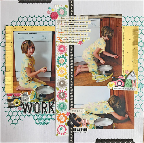 layout work layout work by kirstendrew, on Flickr |
|
|
|
Post by kiwigirl on Sept 29, 2018 8:07:15 GMT
Wow kitbop this is STUNNING! Love the colours, so pretty and the texture in the background is amazing! Love your clustering as always, you are a master clusterer lol!  |
|
joyfulnana
Pearl Clutcher

Posts: 3,043 
|
Post by joyfulnana on Sept 30, 2018 18:33:09 GMT
I love all of these and how it's the same sketch and yet the pages are all soooo different!
|
|