|
|
Post by KikiPea on Jul 3, 2016 15:22:17 GMT
Welcome to monthly Sketch/Scraplift challenge! Each month, I will post either a sketch, or a LO for you to lift, or draw inspiration. Here is the LO SCRAPLIFT challenge for July:  Finally had a chance to put this together.   As you know, in scraplifting/using sketches, your LO's can end up looking exactly like the inspiration piece, or you can let your creativity run wild!  These are just jumping off points to get you rolling. This one is simple, so it can go many different directions. Have fun, and link your LO's back to this thread so that we can all see your piece of art and give you some lovin'!  admin admin , please add to the master list. Thank you! I can't wait to see what you create! |
|
|
|
Post by mikklynn on Jul 4, 2016 0:50:43 GMT
Oh, I like this one! I would never use that color combination on my own. I really like it.
|
|
Chinagirl828
Drama Llama
  Melbourne, Australia
Posts: 6,682
Jun 28, 2014 6:28:53 GMT
|
Post by Chinagirl828 on Jul 4, 2016 7:59:21 GMT
Life is kind of crazy at the moment but hopefully I'll find some time to play along with this one.
|
|
|
|
Post by grammadee on Jul 7, 2016 15:16:23 GMT
I can see more than one project coming out of this inspiration. Love the colours! Love the page design.
Hoping to get some scrappy time in the next couple of weeks, and this is just the challenge to get me started!
|
|
|
|
Post by grammadee on Jul 19, 2016 13:25:59 GMT
Add this to the list of pages I want to do this week while justjac is here. |
|
|
|
Post by mikklynn on Jul 19, 2016 20:06:40 GMT
I'm hoping to get some scrappy time this Friday. I have the inspiration piece printed and sitting on my table!
|
|
|
|
Post by KikiPea on Jul 19, 2016 20:52:43 GMT
Finally had a chance to play with this great Scraplift LO. It worked perfectly for these pics.  The two black hearts were made from ink and my thumbprint.  |
|
|
|
Post by mikklynn on Jul 20, 2016 12:44:01 GMT
KikiPea I like your take on the layout. Clever idea to use thumbprints!
|
|
|
|
Post by grammadee on Jul 20, 2016 13:24:35 GMT
Finally had a chance to play with this great Scraplift LO. It worked perfectly for these pics.  The two black hearts were made from ink and my thumbprint. Love this! |
|
|
|
Post by justjac on Jul 21, 2016 16:20:25 GMT
KikiPea love those hearts. Great layout. I had three 4x6's I wanted to put on my layout so that changed the look quite a bit. I did do the vertical title which I hardly ever do. Thanks for the inspiration. 
|
|
Deleted
Posts: 0
Nov 22, 2024 11:01:47 GMT
|
Post by Deleted on Jul 21, 2016 21:27:45 GMT
Doing the same pics for several grandchildren so I was glad for the challenge to break up the boredom!  |
|
|
|
Post by KikiPea on Jul 21, 2016 22:21:56 GMT
KikiPea love those hearts. Great layout. I had three 4x6's I wanted to put on my layout so that changed the look quite a bit. I did do the vertical title which I hardly ever do. Thanks for the inspiration.  Those windows are gorgeous! Love that you used bigger pics, and those Thickers go with it really well! |
|
|
|
Post by KikiPea on Jul 21, 2016 22:24:33 GMT
Doing the same pics for several grandchildren so I was glad for the challenge to break up the boredom! Beautiful! Love the map paper, and that you were able to make it work with an 8 1/2x11 background. |
|
|
|
Post by mikklynn on Jul 22, 2016 0:18:25 GMT
@elaynef What a pretty layout. I love how you scattered the raised dots. What are those?
|
|
Deleted
Posts: 0
Nov 22, 2024 11:01:47 GMT
|
Post by Deleted on Jul 22, 2016 2:05:02 GMT
@elaynef What a pretty layout. I love how you scattered the raised dots. What are those? Sequins. Thank you! |
|
|
|
Post by grammadee on Jul 22, 2016 3:08:45 GMT
Love your page, @elaynef . Great colours, and the maps are the perfect background! justjac 's page is gorgeous IRL. Love the title and the lace and flowers. Here is my page. It looks a bit weird here because the spritzing made the background cs curl. Thanks so much for the challenge, KikiPea . Attachments:
|
|
|
|
Post by mikklynn on Jul 22, 2016 13:22:13 GMT
justjac I like that you used larger photos. I like your paper layering on the side, too. Great job!
|
|
|
|
Post by mikklynn on Jul 22, 2016 13:24:14 GMT
grammadee I love the way you used different border punches for your layers. I would not have thought of that. This is why I love seeing what everyone does with the inspiration!
|
|
|
|
Post by KikiPea on Jul 22, 2016 19:54:30 GMT
Love your page, @elaynef . Great colours, and the maps are the perfect background! justjac 's page is gorgeous IRL. Love the title and the lace and flowers. Here is my page. It looks a bit weird here because the spritzing made the background cs curl. Thanks so much for the challenge, KikiPea . That looks great! Love the different border papers.  |
|
|
|
Post by mikklynn on Jul 26, 2016 0:54:44 GMT
Here is my take on the scraplift challenge. I usually am much closer to the original sketch. I did use the color inspiration. I would not have used the gray with the yellow and green on my own. 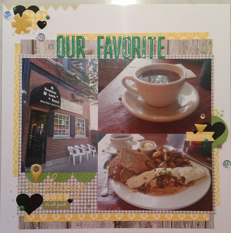 July 2016 scraplift challenge July 2016 scraplift challenge by Mikk lynn, on Flickr |
|
|
|
Post by grammadee on Jul 26, 2016 3:25:35 GMT
This is gorgeous, mikklynn ! Love your use of the colours! Your embellishment clusters and the flow of sequins and dots across the page are really eye catching. |
|
|
|
Post by KikiPea on Jul 26, 2016 16:01:04 GMT
Here is my take on the scraplift challenge. I usually am much closer to the original sketch. I did use the color inspiration. I would not have used the gray with the yellow and green on my own.  July 2016 scraplift challenge July 2016 scraplift challenge by Mikk lynn, on Flickr That's awesome! Love that you took inspiration from the color scheme. That's what scrap lifting is all about!  |
|
chendra
Pearl Clutcher

Posts: 2,882
Location: The 33rd State
Jun 27, 2014 16:58:50 GMT
|
Post by chendra on Jul 30, 2016 3:20:19 GMT
Here is my attempt. I was very literal, right down to the black and white dog. He is very interested in a box of doughnuts, as you can see.  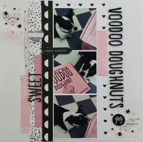 |
|
chendra
Pearl Clutcher

Posts: 2,882
Location: The 33rd State
Jun 27, 2014 16:58:50 GMT
|
Post by chendra on Jul 30, 2016 3:30:31 GMT
Finally had a chance to play with this great Scraplift LO. It worked perfectly for these pics.  The two black hearts were made from ink and my thumbprint. I really like the overall color scheme and the papers you chose, as well your thumbprint heart. What exactly was going on in your photos? Where were you? |
|
chendra
Pearl Clutcher

Posts: 2,882
Location: The 33rd State
Jun 27, 2014 16:58:50 GMT
|
Post by chendra on Jul 30, 2016 3:32:58 GMT
KikiPea love those hearts. Great layout. I had three 4x6's I wanted to put on my layout so that changed the look quite a bit. I did do the vertical title which I hardly ever do. Thanks for the inspiration.  Those really are the perfect Thickers for your photos! That marbled bit you chose along the edge is beautiful too. |
|
chendra
Pearl Clutcher

Posts: 2,882
Location: The 33rd State
Jun 27, 2014 16:58:50 GMT
|
Post by chendra on Jul 30, 2016 3:34:21 GMT
Love your page, @elaynef . Great colours, and the maps are the perfect background! justjac 's page is gorgeous IRL. Love the title and the lace and flowers. Here is my page. It looks a bit weird here because the spritzing made the background cs curl. Thanks so much for the challenge, KikiPea . I like the way you used different border punches along the edges too. I need to remember to try that sometime! |
|
chendra
Pearl Clutcher

Posts: 2,882
Location: The 33rd State
Jun 27, 2014 16:58:50 GMT
|
Post by chendra on Jul 30, 2016 3:36:08 GMT
Doing the same pics for several grandchildren so I was glad for the challenge to break up the boredom! I like your use of maps for the background, plus that vibrant orange border strip was the perfect choice  |
|
chendra
Pearl Clutcher

Posts: 2,882
Location: The 33rd State
Jun 27, 2014 16:58:50 GMT
|
Post by chendra on Jul 30, 2016 3:39:50 GMT
Here is my take on the scraplift challenge. I usually am much closer to the original sketch. I did use the color inspiration. I would not have used the gray with the yellow and green on my own.  July 2016 scraplift challenge July 2016 scraplift challenge by Mikk lynn, on Flickr I like that you used the color scheme for inspiration and I really like your woodgrain background too. It sets a nice homey tone for that delicious looking food. I'm trying to read the name of the cafe in case I ever find myself back in Chicago one of these days. Something Maple? |
|
|
|
Post by KikiPea on Jul 30, 2016 4:10:11 GMT
Finally had a chance to play with this great Scraplift LO. It worked perfectly for these pics.  The two black hearts were made from ink and my thumbprint. I really like the overall color scheme and the papers you chose, as well your thumbprint heart. What exactly was going on in your photos? Where were you? I forgot to add that little fact. LOL We were at the Mob Museum in Vegas with my brother and SIL.  |
|
|
|
Post by KikiPea on Jul 30, 2016 4:12:53 GMT
Here is my attempt. I was very literal, right down to the black and white dog. He is very interested in a box of doughnuts, as you can see.   Beautiful! Love the classic black/white/pink color scheme, and the use of larger photos. |
|