|
|
Post by KikiPea on Aug 1, 2016 2:14:54 GMT
Welcome to monthly Sketch/Scraplift challenge! Each month, I will post either a sketch, or a LO for you to lift, or draw inspiration. Here is the LO SKETCH challenge for July: From Elle's Studio Blog  Ok, here's my take!  As you know, in scraplifting/using sketches, your LO's can end up looking exactly like the inspiration piece, or you can let your creativity run wild!  These are just jumping off points to get you rolling. Have fun, and link your LO's back to this thread so that we can all see your piece of art and give you some lovin'!  admin admin , please add to the master list. Thank you! I can't wait to see what you create! |
|
|
|
Post by grammadee on Aug 2, 2016 10:42:26 GMT
Thanks, KikiPea ! This one is urging me to try some of those embellishment clusters I have been wanting to try. Maybe on the weekend... |
|
|
|
Post by maribeth on Aug 2, 2016 11:21:03 GMT
I would like to try this challenge this month.
|
|
|
|
Post by mikklynn on Aug 7, 2016 12:30:20 GMT
|
|
nicolep
Drama Llama
 
Posts: 7,199 
|
Post by nicolep on Aug 7, 2016 13:11:15 GMT
Thanks for the challenge KikiPea! I hope to participate. mikklynn I think it looks great! I love the polka dot paper and the placement of your speech bubble! |
|
|
|
Post by KikiPea on Aug 7, 2016 14:25:12 GMT
I love it! So cute. Love your use of the PL card, speech bubble, hearts...very cool.  |
|
|
|
Post by grammadee on Aug 7, 2016 17:29:47 GMT
Here is mine. It doesn't look much like the sketch, but the page is divided and separated with twine rather than washi tape.  bd 14 party bd 14 party by Gramma Dee, on Flickr |
|
|
|
Post by KikiPea on Aug 7, 2016 17:40:28 GMT
Here is mine. It doesn't look much like the sketch, but the page is divided and separated with twine rather than washi tape.  bd 14 party bd 14 party by Gramma Dee, on Flickr But, that's why I love it! The sketch is just for inspiration, and a starting point. You used it exactly how it should be used.  Adorable pics. Love the twine, and use of PL card for the title.  |
|
|
|
Post by mikklynn on Aug 8, 2016 12:17:48 GMT
grammadee I love your take on the sketch. It's hard to mix 3 photos with different orientations.
|
|
|
|
Post by KikiPea on Aug 12, 2016 19:16:42 GMT
Okay, ladies, here's mine!  Can't wait to see more! |
|
chendra
Pearl Clutcher

Posts: 2,882
Location: The 33rd State
Jun 27, 2014 16:58:50 GMT
|
Post by chendra on Aug 13, 2016 20:11:10 GMT
I do! I especially like the way you used the project life card; I must remember that. I didn't even realize that's what it was--I thought you just stacked your title that way. I don't do project life, but I still have somehow acquired some cards that I need to incorporate in my regular layouts. I like the color scheme you used too. It complements the lovely pizza. (I'm still taking notes on your Chicago food layouts  ) |
|
chendra
Pearl Clutcher

Posts: 2,882
Location: The 33rd State
Jun 27, 2014 16:58:50 GMT
|
Post by chendra on Aug 13, 2016 20:14:00 GMT
Okay, ladies, here's mine! Can't wait to see more! I love everything about this--the color scheme, the font, the photos, the message, the embellishments. . . I especially like the woodgrain paper. I wish I was bold enough to use my writing on my layouts. I used to have nice legible handwriting, but not any more. Even when I try to write neatly, it's just all scraggly. Thanks for the inspiration! |
|
chendra
Pearl Clutcher

Posts: 2,882
Location: The 33rd State
Jun 27, 2014 16:58:50 GMT
|
Post by chendra on Aug 13, 2016 20:17:25 GMT
Here is mine. It doesn't look much like the sketch, but the page is divided and separated with twine rather than washi tape.  bd 14 party bd 14 party by Gramma Dee, on Flickr You just never know where a sketch will take you  I tend to be a very literal interpreter, so I like to see how people make sketches their own. I like your use of twine as the dividing line. I never remember to use twine. It looks like you made little notches on the side to keep it in place--good idea! I'll have to remember to do that too if I ever remember to use my twine. |
|
chendra
Pearl Clutcher

Posts: 2,882
Location: The 33rd State
Jun 27, 2014 16:58:50 GMT
|
Post by chendra on Aug 13, 2016 20:27:20 GMT
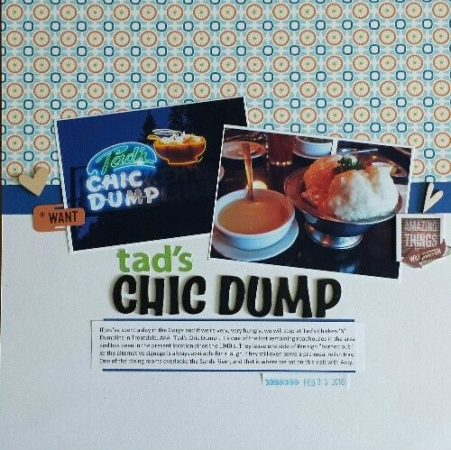
Here is mine. Thanks mikklynn for inspiring me to scrap about FOOD  I've been wanting to make a layout about this place since my friend came for a visit. I've been wanting to make a layout about this place since my friend came for a visit.
And thank you KikiPea for the inspiration. This came together so quickly and I finally used an old piece of SEI paper I've been hoarding . I should use sketches more often. Hmm, I forgot to finish fixing my stamping mistake before I took the photo. (Why oh why do I keep attempting to stamp directly on layouts? It never works. I need to accept it.) Off to do that.

|
|
|
|
Post by KikiPea on Aug 13, 2016 21:02:44 GMT
Here is mine. Thanks mikklynn for inspiring me to scrap about FOOD  I've been wanting to make a layout about this place since my friend came for a visit. I've been wanting to make a layout about this place since my friend came for a visit.
And thank you KikiPea for the inspiration. This came together so quickly and I finally used an old piece of SEI paper I've been hoarding . I should use sketches more often. Hmm, I forgot to finish fixing my stamping mistake before I took the photo. (Why oh why do I keep attempting to stamp directly on layouts? It never works. I need to accept it.) Off to do that.

This is awesome! Love the clean lines, large pics, that beautiful paper/color scheme and title don't. It all flows together perfectly! Thanks for playing. Please join us again next month!  |
|
|
|
Post by mikklynn on Aug 13, 2016 23:19:30 GMT
Here is mine. Thanks mikklynn for inspiring me to scrap about FOOD  I've been wanting to make a layout about this place since my friend came for a visit. I've been wanting to make a layout about this place since my friend came for a visit.
And thank you KikiPea for the inspiration. This came together so quickly and I finally used an old piece of SEI paper I've been hoarding . I should use sketches more often. Hmm, I forgot to finish fixing my stamping mistake before I took the photo. (Why oh why do I keep attempting to stamp directly on layouts? It never works. I need to accept it.) Off to do that.

I love your take on the challenge. What a great way to use a busy pattern cardstock! I like how you tucked the "tad's" into a space between the photos. |
|
|
|
Post by sbartist on Aug 14, 2016 0:12:59 GMT
As close to the sketch as I could get since I could not crop the photos:

|
|
|
|
Post by KikiPea on Aug 14, 2016 1:31:09 GMT
As close to the sketch as I could get since I could not crop the photos:

Nice job! Love the colors. That title almost doesn't fit! Nice work getting it all on there. That rose, and border are pretty cool!  Thanks for playing! |
|
|
|
Post by grammadee on Aug 14, 2016 4:48:19 GMT
Glad you got to play, KikiPea ! Great title, and I like how you used the wood grain. Also like that you had both a close up and a setting shot Love your page chendra ! Great photos, and I like your tilted photos. & thanks for your kind comments about my page. Yes I did notch the cs. It just makes the twine process go much more smoothly. And sbartist , I like how you worked that grey black and red colour scheme. Your photo placement really adds interest to your page |
|
|
|
Post by LisaDV on Aug 15, 2016 19:23:17 GMT
chendra, Fantastic page! The colors and continuity are PERFECT! I love it. sbartist, great page! I love the middle border and that rose.
|
|
|
|
Post by LisaDV on Aug 23, 2016 14:44:58 GMT
|
|