Chinagirl828
Drama Llama
  Melbourne, Australia
Posts: 6,682
Jun 28, 2014 6:28:53 GMT
|
Post by Chinagirl828 on Sept 2, 2016 11:29:29 GMT
Welcome to September. I'd like to say a big thank you to grammadee for hosting the August challenge.
Use the below list to inspire your project. You can use one, some or all the prompts on the list. Substitutions are welcome and encouraged.
• something from your last purchase
• tags
• thickers
• ink/mist
• border strips
• something you've been saving for the perfect project
All types of projects count (paper, digi, hybrid, PL, art journaling, anything else you create) and if you share your projects online please link them here so we can admire and leave some love. You can find instructions to post in the Refupeas gallery in this thread but shout out if you need help.
I hope you find time to play along and I can't wait to see what everyone creates.
|
|
|
|
Post by grammadee on Sept 2, 2016 13:05:52 GMT
Thanks for the challenge, Chinagirl828 ! I like the combination of old and new in one project. |
|
nicolep
Drama Llama
 
Posts: 7,199 
|
Post by nicolep on Sept 2, 2016 13:21:53 GMT
I love this! Hope to play with you all! Thanks Chinagirl828! |
|
|
|
Post by Scrapper100 on Sept 2, 2016 23:41:20 GMT
I did scrap last month but don't think anything matched the challenge here. I think this month that will change  . This list. Looks like a good one. |
|
|
|
Post by dasmith2 on Sept 3, 2016 0:01:53 GMT
I love this challenge! I've been doing a lot of them but I could never figure out how to add a photo
|
|
Chinagirl828
Drama Llama
  Melbourne, Australia
Posts: 6,682
Jun 28, 2014 6:28:53 GMT
|
Post by Chinagirl828 on Sept 5, 2016 6:50:37 GMT
Here's my first layout for this challenge. I've used some MME flag stickers from my last purchase and the pink journaling box I have had for forever and always thought I'd use on a page about my childhood. There's a pretty good mix of new and (really) old here. 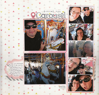 |
|
|
|
Post by mikklynn on Sept 5, 2016 13:11:47 GMT
Chinagirl828 I love how you fit so many photos on the page without it being too busy. Great layout!
|
|
|
|
Post by dasmith2 on Sept 5, 2016 16:23:42 GMT
I really loved this challenge! I used up some old Twelve Fridays scraps(anyone remember them? ...anyone..lol) and some new stickers. Lol in our Flickr group
|
|
chendra
Pearl Clutcher

Posts: 2,882
Location: The 33rd State
Jun 27, 2014 16:58:50 GMT
|
Post by chendra on Sept 6, 2016 5:48:00 GMT
Chinagirl828 I love how you fit so many photos on the page without it being too busy. Great layout! I thought the same thing! I haven't quite gotten the hang of it. Chinagirl828--did you go to Disneyland? It looks like King Arthur's Carousel, but I'm on my phone and it won't let me enlarge the photo. How was your trip? Where all did you go? Did you take a lot of pictures to scrap?  |
|
Chinagirl828
Drama Llama
  Melbourne, Australia
Posts: 6,682
Jun 28, 2014 6:28:53 GMT
|
Post by Chinagirl828 on Sept 6, 2016 7:20:30 GMT
Chinagirl828 I love how you fit so many photos on the page without it being too busy. Great layout! I thought the same thing! I haven't quite gotten the hang of it. Chinagirl828 --did you go to Disneyland? It looks like King Arthur's Carousel, but I'm on my phone and it won't let me enlarge the photo. How was your trip? Where all did you go? Did you take a lot of pictures to scrap?  I have to confess it's a scraplift of a double page layout by Shimelle in her class the 20 Project. The two main photos are 5x3 and the other 5 are 2x3.
It is Disneyland - it was a bit of an impulse visit during the few days we had in LA on our way home. We started in Vegas, went to Cuba for 8 days, then had a quick stop over in Turks & Caicos before heading back to LA and home to Melbourne.
The trip was fabulous. I took a surprisingly small no of photos - under 900 for me and only a couple of hundred from my SO (he's really good at keeping only the best shots from each day). I didn't take many photos in the USA as we've both been to Vegas and LA before. Cuba has the lion's share of photos since we've never been - it was amazing and eye opening and everything I could have expected from the photos I've seen online but somehow so much more. I will definitely be scrapping heaps of photos from this part of my trip, I just need to get my head past the "these photos are too special and I'll never do them justice" thing first.
|
|
Chinagirl828
Drama Llama
  Melbourne, Australia
Posts: 6,682
Jun 28, 2014 6:28:53 GMT
|
Post by Chinagirl828 on Sept 6, 2016 7:24:50 GMT
I really loved this challenge! I used up some old Twelve Fridays scraps(anyone remember them? ...anyone..lol) and some new stickers. Lol in our Flickr group I've never even heard of Twelve Fridays. I left you some love in the gallery. |
|
chendra
Pearl Clutcher

Posts: 2,882
Location: The 33rd State
Jun 27, 2014 16:58:50 GMT
|
Post by chendra on Sept 8, 2016 19:51:12 GMT
Chinagirl828, that sounds like a wonderful trip! I am really looking forward to seeing some of your Cuba photos, as until recently, Cuba was not a place Americans could easily visit. I understand about scrapping "special" photos paralysis, but I hope you get over it soon so we can all see 
|
|
chendra
Pearl Clutcher

Posts: 2,882
Location: The 33rd State
Jun 27, 2014 16:58:50 GMT
|
Post by chendra on Sept 8, 2016 20:01:50 GMT
This is my mom and her friends sailing to Hawaii the year it became a US state--1959. The blue cardstock is my most recent purchase, and you can't really tell because so little of it shows, but I misted it in gold. I've been clinging to that leftover piece of striped KI Memories paper since 2008 (according to the branding strip) and I was saving it for photos that were also fun and colorful. The blue rickrack is a little inside family joke, as my mom used to sew a lot of our clothes when we were kids and she often used rickrack for trim, especially to hide the lines that showed when she would let out the hems. 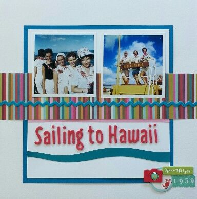 |
|
Chinagirl828
Drama Llama
  Melbourne, Australia
Posts: 6,682
Jun 28, 2014 6:28:53 GMT
|
Post by Chinagirl828 on Sept 9, 2016 5:43:32 GMT
chendra I love the light and fresh feeling to this page and all the details are just perfect - the wave under the title, the colour of the cardstock and rickrack, that cute little crab tag - and I love the striped pp. Beautiful!
|
|
|
|
Post by mikklynn on Sept 9, 2016 19:34:38 GMT
chendra I love the colors and clean lines in your layout! I might have to scraplift it.
|
|
|
|
Post by mikklynn on Sept 9, 2016 20:33:18 GMT
Here is my layout. I used my very first Felicity Jane kit for most of it. My saved for the perfect layout are my last two acetate flowers. I think they are Heidi Swapp. Whatever they are, they are OLD! I used two stamps. The challenges are forcing my to use them and I am really enjoying it. I apologize for the uncropped image. I must have uploaded the wrong file and I am way too tired to redo it. 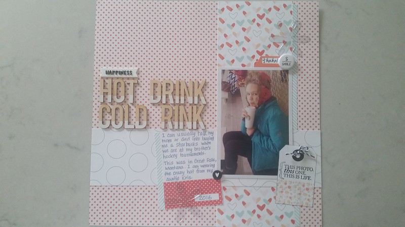 September 2016 Stash Challenge September 2016 Stash Challenge by Mikk lynn, on Flickr |
|
Chinagirl828
Drama Llama
  Melbourne, Australia
Posts: 6,682
Jun 28, 2014 6:28:53 GMT
|
Post by Chinagirl828 on Sept 9, 2016 21:06:34 GMT
mikklynn oh those ghost shapes! I loved those and finally used my last snowflakes on a page earlier this year. Like you I'd been hoarding them a long time. I left you some love in the gallery.
|
|
Chinagirl828
Drama Llama
  Melbourne, Australia
Posts: 6,682
Jun 28, 2014 6:28:53 GMT
|
Post by Chinagirl828 on Sept 9, 2016 21:27:47 GMT
Here's my next one. I really struggled with this layout - I've changed the background pp over to cardstock, I've changed the order of all the other papers, and I've shuffled embellishments around - but I really like the way it turned out. The pink(ish) pp is one I've been hoarding, the stickers and the woodgrain pp are from my last purchase, and I used some mist. 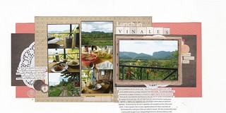 |
|
|
|
Post by mikklynn on Sept 10, 2016 1:54:20 GMT
Chinagirl828 Your layout turned out just lovely. I have done that, peeled everything up and replaced the background paper. It was worth the effort for you!
|
|
|
|
Post by LisaDV on Sept 10, 2016 12:29:50 GMT
 Here's mine. The die cuts and pinked circle are all newer purchases as is the cherish wood veneer. The border banner has been hanging out in my stash for several years waiting for the right layout. I used sei ltr stickers instead of thickers as they matched better, bonus as they were untouched from at least 2003 or 04! |
|
|
|
Post by mikklynn on Sept 10, 2016 13:14:30 GMT
LisaDV Nice! I really like the way you layered your photos. Don't you love finally using old products?
|
|
|
|
Post by grammadee on Sept 10, 2016 14:30:37 GMT
This is my mom and her friends sailing to Hawaii the year it became a US state--1959. The blue cardstock is my most recent purchase, and you can't really tell because so little of it shows, but I misted it in gold. I've been clinging to that leftover piece of striped KI Memories paper since 2008 (according to the branding strip) and I was saving it for photos that were also fun and colorful. The blue rickrack is a little inside family joke, as my mom used to sew a lot of our clothes when we were kids and she often used rickrack for trim, especially to hide the lines that showed when she would let out the hems.  Chendra, that is a beautiful page! That ricrac is the perfect finishing touch: even without the "inside joke", it suggests waves on this LO. And I love that wave below the title. Already thinking how I could copy that with a curvy cutter  |
|
|
|
Post by grammadee on Sept 10, 2016 14:32:25 GMT
Here is my layout. I used my very first Felicity Jane kit for most of it. My saved for the perfect layout are my last two acetate flowers. I think they are Heidi Swapp. Whatever they are, they are OLD! I used two stamps. The challenges are forcing my to use them and I am really enjoying it. I apologize for the uncropped image. I must have uploaded the wrong file and I am way too tired to redo it.  September 2016 Stash Challenge September 2016 Stash Challenge by Mikk lynn, on Flickr Those acetate flowers are perfect on this page: you see? there was a REASON for hoarding them! Left you some love in the Gallery. |
|
|
|
Post by grammadee on Sept 10, 2016 14:34:12 GMT
Here's my next one. I really struggled with this layout - I've changed the background pp over to cardstock, I've changed the order of all the other papers, and I've shuffled embellishments around - but I really like the way it turned out. The pink(ish) pp is one I've been hoarding, the stickers and the woodgrain pp are from my last purchase, and I used some mist.  I LOVE this 2 page spread. The finished product really shows all the love and attention you put into creating it. Gorgeous! |
|
|
|
Post by grammadee on Sept 10, 2016 14:37:04 GMT
 Here's mine. The die cuts and pinked circle are all newer purchases as is the cherish wood veneer. The border banner has been hanging out in my stash for several years waiting for the right layout. I used sei ltr stickers instead of thickers as they matched better, bonus as they were untouched from at least 2003 or 04! I love the fall colours and all the photos of you relaxing with the family. Great way to use up those stickers! Isn't it great when you get new stuff and realize it goes perfectly with something you have had in your stash for awhile? |
|
|
|
Post by LisaDV on Sept 10, 2016 23:43:51 GMT
Don't you love finally using old products? YES. It's strange the satisfaction seems to be inversely proportionate to the time I've I'd had it. Isn't it great when you get new stuff and realize it goes perfectly with something you have had in your stash for awhile? I love it when any thing matches what I have perfectly, whether it's new or old, because I will use something less than perfect on a page to get it done. ha. |
|
Chinagirl828
Drama Llama
  Melbourne, Australia
Posts: 6,682
Jun 28, 2014 6:28:53 GMT
|
Post by Chinagirl828 on Sept 11, 2016 2:34:06 GMT
LisaDV I love how you've clustered your photos. Great job using such old supplies too!
|
|
scrapheart
Junior Member
 
Posts: 94 
|
Post by scrapheart on Sept 11, 2016 4:13:00 GMT
Love seeing all the great pages! Challenges are a fun way to get scrapping, thanks Chinagirl828 for hosting! |
|
Chinagirl828
Drama Llama
  Melbourne, Australia
Posts: 6,682
Jun 28, 2014 6:28:53 GMT
|
Post by Chinagirl828 on Sept 18, 2016 6:44:17 GMT
Here's another one from me. I've been working my way back through Shimelle's Scrapbook Remix class and trying to create pages from each of the prompts, one of which was to use the same page design which explains why I've had so many similar looking pages lately (and I love how many extra photos I can fit on a page this way). From the list I used mist, tags, something from my last purchase (the BG purple alpha stickers), border strips (the scalloped washi is sort of a border strip), and something I've been saving for the perfect project (the purple background paper). 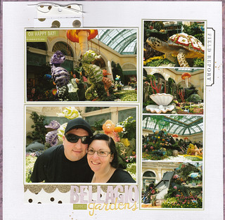 |
|
|
|
Post by LisaDV on Sept 20, 2016 0:10:07 GMT
@chinagirl, beautiful layout. I love that page design too. Works great with so many photos to showcase.
|
|