|
|
Post by chaosisapony on Jun 22, 2017 23:21:54 GMT
Apologies if this has already been posted, I looked for a thread and didn't see one. I pre-ordered some of this collection from ACOT today. www.acherryontop.com/shop/company/onecanoetwo/line/creekside I absolutely love the color scheme! A lot of it is fairly stereotypical for an outdoor/camping line but I really like the shades of blue and green they chose, plus the little pop of blush. Although I'm sure I'm probably the only refupea that will like the blush pink lol. Overall I can just picture this coordinating so well with the summer photos I usually get from lake and campgrounds. |
|
Deleted
Posts: 0
May 7, 2024 10:03:55 GMT
|
Post by Deleted on Jun 22, 2017 23:36:16 GMT
It's nice, but it bugs me that the designs are very similar to their last collection down to the colors.
|
|
|
|
Post by 950nancy on Jun 22, 2017 23:39:13 GMT
It is very cute, but 2/3 of the papers have pink in them. Too girlie for me.
|
|
|
|
Post by chaosisapony on Jun 22, 2017 23:56:28 GMT
It's nice, but it bugs me that the designs are very similar to their last collection down to the colors. Oh really? This is the first collection I have seen from them. |
|
FurryP
Drama Llama
 To pea or not to pea...
Posts: 6,968
Site Supporter
Jun 26, 2014 19:58:26 GMT
|
Post by FurryP on Jun 23, 2017 0:13:44 GMT
I like. I have never seen their other collection either.
|
|
craftymom101
Pearl Clutcher
Posts: 3,624 
|
Post by craftymom101 on Jun 23, 2017 0:36:16 GMT
I have a few pieces of their first collection, and at least one stamp set they designed for Studio Calico a few years ago. I like this one a lot, despite the pink. The pink is subtle, and the blues and browns and greens more than make up for it. I'll probably pick up the paper pad and a few of the embellishments.
|
|
|
|
Post by anniefb on Jun 23, 2017 0:57:07 GMT
It's nice, but it bugs me that the designs are very similar to their last collection down to the colors. That's what struck me too. I was just cutting up some flower paper from the first collection yesterday. |
|
|
|
Post by KikiPea on Jun 23, 2017 1:14:15 GMT
I actually love that it coordinates. I bought just a couple of sheets from the other line to go with some other papers I picked up for a vacation album. I was disappointed that they didn't have more I could use. Now, they do! 😁
|
|
|
|
Post by wendifful on Jun 23, 2017 1:14:59 GMT
Those constellation rub ons...*swoon*
|
|
|
|
Post by jamiebohbamie on Jun 23, 2017 2:03:36 GMT
I happen to love that paper line. I just made a purchase today for my Aspen, CO trip album and I'm kind of bummed because this would be perfect. The colors are great, the mountain paper, the florals, the tree rings... It was a family trip, we stayed in a hotel, but we did hike a bit, we did see the Maroon Bells, and we were there for a graduation so the flowers would be such a sweet touch. I have to say that I don't love the embellishments. I never know what to do with ephemera, I have no use for enamel pins, and what would anyone do with those binder clips?
|
|
|
|
Post by Linda on Jun 23, 2017 2:07:37 GMT
mixed here - I like the paddle on paper, cozy plaid, night sky and most of the B-sides. I'm one who is anti-pink but I don't mind the blush
|
|
|
|
Post by mom on Jun 23, 2017 3:45:11 GMT
I like it and will use it with some of their older stuff. Now next release? That needs to be something different.
|
|
|
|
Post by carolynhasacat on Jun 23, 2017 3:56:06 GMT
It reminds me of Pink Paislee's Outfitters collection. The gold foil/navy thickers are interesting. Might grab those. And the rub ons are very cool. 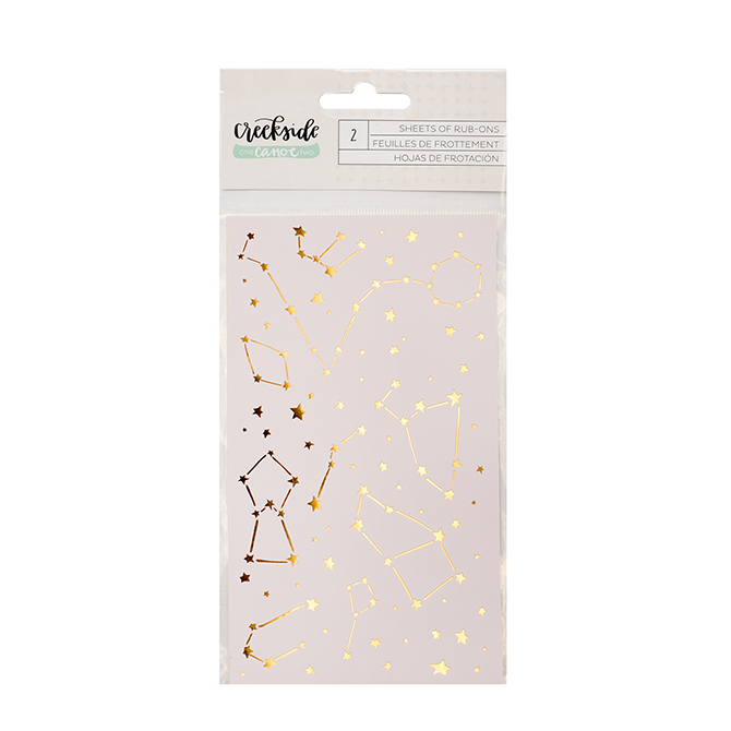 |
|
Chinagirl828
Drama Llama
Melbourne, Australia
Posts: 6,472
Jun 28, 2014 6:28:53 GMT
|
Post by Chinagirl828 on Jun 23, 2017 5:54:15 GMT
There are a couple of b sides I don't mind but overall I think I would say I'm underwhelmed.
|
|
|
|
Post by LavenderLayoutLady on Jun 23, 2017 11:12:30 GMT
Those constellation rub ons...*swoon* Yes! I also love the starry sky paper, and the Thickers. |
|
|
|
Post by mikklynn on Jun 23, 2017 11:56:32 GMT
I love the Thickers and the embellishment pack.
|
|
|
|
Post by scrappinheather on Jun 23, 2017 13:03:25 GMT
I like this one!
|
|
Deleted
Posts: 0
May 7, 2024 10:03:55 GMT
|
Post by Deleted on Jun 23, 2017 13:12:58 GMT
It's nice, but it bugs me that the designs are very similar to their last collection down to the colors. Oh really? This is the first collection I have seen from them. Look up hazelwood. That was their first release and it was gorgeous too! |
|
|
|
Post by justjac on Jun 23, 2017 13:28:35 GMT
I'm going to the mountains at the end of July and there are a few papers that would be so perfect for that. I like about half the papers. I'll see if my LSS gets it in.
|
|
msliz
Drama Llama
The Procrastinator
Posts: 6,419
Jun 26, 2014 21:32:34 GMT
|
Post by msliz on Jun 23, 2017 14:22:12 GMT
I'm with Chinagirl828 , there are a couple of B sides that I like, but I don't think I would have a use for most of those papers. Of the B sides, I like the white with green leaves and the navy with white dots (night sky, no constellations,) but the green with white dots just makes me think of pollen.  |
|
|
|
Post by LisaDV on Jun 23, 2017 15:16:10 GMT
I like it. I will definitely have to get a piece of night sky & rings and crosses, which were probably the only A sides I could see using.
|
|
|
|
Post by janamke on Jun 23, 2017 15:19:47 GMT
Must have the constellation rubons. Some of the papers would be tough for me to work with but I like it overall.
|
|
nicolep
Drama Llama
Posts: 7,080
|
Post by nicolep on Jun 23, 2017 18:19:21 GMT
It is interesting and refreshing to see some navy!
|
|
|
|
Post by refugeepea on Jun 23, 2017 18:26:34 GMT
I like parts of the collection. I do like that the pink is minimal in this collection and more subtle.
|
|
|
|
Post by meridon on Jun 23, 2017 20:25:21 GMT
I'm not typically a "theme-y" scrapper, but I have some camping pics from a mother/daughter retreat that I was going to make a mini album of and this line would be great! I'm not sure I had even heard of this company before, so TFS!
|
|
|
|
Post by sleepingbooty on Jun 23, 2017 20:59:16 GMT
This is extremely reminiscent of Hazelwood as others have pointed out. I'll just be honest and say it: I don't like OneCanoeTwo's floral patterns much. Just not my style.
I'll try to get my hands on the constellation paper (I think it would be fun to sew over a few with some gold thread) and perhaps that black and white painted mountains pattern. Big prints are always tricky to work with on 6x12 layouts but I might give that one a go. The rest is likely a pass from me.
I will say that some blush is fine with me. I don't mind it as much as the "girly" pinks. However, all the cliché sayings, oh my. This collection is, well... a collection of them. "Wild & free", "let's get lost", "the mountains are calling and I must go", "adventure awaits." So over those phrases. Something new, please! #GrumpyCat
|
|


