nicolep
Drama Llama

Posts: 7,080 
|
Post by nicolep on Aug 24, 2017 15:37:54 GMT
|
|
|
|
Post by LavenderLayoutLady on Aug 24, 2017 15:42:47 GMT
The pink is inescapable.
More gold foil, which I don't totally hate. Better than rose gold.
I don't need this line, though.
I miss finding papers that I can't live without.
|
|
|
|
Post by grammadee on Aug 24, 2017 16:03:56 GMT
Those pequin stickers are really cute. Wish they had a sheet with JUST the penguins: they would be super cute on winter cards sent to a couple--Chrismas, anniversary...
|
|
|
|
Post by Skellinton on Aug 24, 2017 16:12:45 GMT
This is cute, and I adore the blue, but I don't see myself using it. It does look very Pinkfresh which I have struggled to use when it came in kits.
I am super glad to see the bright blue, hope it becomes a trend!
|
|
|
|
Post by scrapaddict702 on Aug 24, 2017 16:14:52 GMT
The pink is inescapable. More gold foil, which I don't totally hate. Better than rose gold. I don't need this line, though. I miss finding papers that I can't live without. If it's American Crafts, there HAS to be pink...apparently it's a rule. I actually LOVE the copper and rose golds. I'd take rose gold over nothing, but definitely prefer copper...that's one of my favorite things about metallics becoming so big...copper works well for Autumnal lines. |
|
|
|
Post by scrapaddict702 on Aug 24, 2017 16:16:23 GMT
It's not awful, but the pink is too much for me. I like the designs okay if not for the pink. Which is okay because we don't really have much of a winter here (start of January is when we usually start to see leaves falling off of trees...my climate is confused) and I don't need anything else Christmas themed for years to come, so it's not a huge deal.
|
|
breetheflea
Drama Llama
Posts: 5,905
Location: PNW
|
Post by breetheflea on Aug 24, 2017 16:24:43 GMT
I think what I don't like about most AC lines, is the white background with objects stuck all over it. If there was a background pattern/color even a subtle one, I might like this line. It kind of seems like a sticker sneeze with the white background...
|
|
|
|
Post by sleepingbooty on Aug 24, 2017 16:31:55 GMT
Snow & Cocoa redesigned by Pinkfresh Studio with a thick brush line finish, that's what springs to mind straight away. It is cute and will work great for the fashionable white-background aesthetics. It'll mix in well with some of Falala and all of Snow & Cocoa by Crate Paper which so many seem to love these days. Fresh and youthful but very much repetitive of what we've been given these past few years. This is clearly aimed at the younger demographic. I might pick up a few things because it's not an obnoxious collection or one geared towards parents/grandparents which suits my lifestyle. Probably the ephmera pack and a couple of papers. The cutout paper is great for PL folks who like to document their cup of hot cocoa and chunky sweaters + mittens. 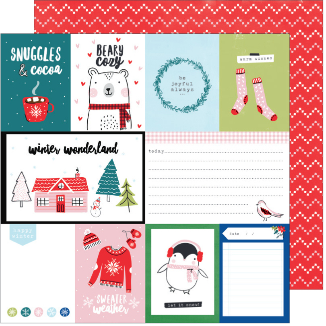 ETA: also, now on loop in my head...
|
|
Deleted
Posts: 0
May 12, 2024 23:05:59 GMT
|
Post by Deleted on Aug 24, 2017 16:45:05 GMT
I like it but it looks identical to last years pinkfresh studio release.
|
|
Deleted
Posts: 0
May 12, 2024 23:05:59 GMT
|
Post by Deleted on Aug 24, 2017 17:20:45 GMT
While it's not amazing, it's nice to see a winter line that is not so Christmassy and full of red and green. All the companies seem to be going super traditional this year. I can see myself picking up some of it to add to snow and cocoa.
|
|
|
|
Post by anniefb on Aug 24, 2017 17:27:20 GMT
Some cute elements but not something I need for a summer Christmas. And it looks incredibly like someone borrowed ideas from Pinkfresh or similar lines from last year. Oh well, good for my wallet - I do really need to be buying less stuff!
|
|
cbscrapper
Pearl Clutcher
Posts: 3,408
|
Post by cbscrapper on Aug 24, 2017 17:30:01 GMT
It definitely feels like Pinkfresh. I would pick some up except...pink.
|
|
|
|
Post by DawnMcD on Aug 24, 2017 20:40:38 GMT
I actually love this! I think it will work well for both my teen boy and girls. As well as for my older son and his wife. I probably will get this line!
|
|
|
|
Post by stinkerbelle on Aug 25, 2017 2:25:11 GMT
living in arizona, i don't have much use for wintery lines, which absolutely didn't stop me from ordering the sweater paper  |
|
|
|
Post by mom on Aug 25, 2017 2:30:02 GMT
Its ok - I will for sure buy the blue plaid paper as well as the blue and green snowflake paper.
|
|
FurryP
Drama Llama
To pea or not to pea...
Posts: 6,972
Site Supporter
Jun 26, 2014 19:58:26 GMT
|
Post by FurryP on Aug 25, 2017 2:48:33 GMT
I like the stickers you posted...
|
|
hutchfan
Drama Llama
Posts: 6,123
|
Post by hutchfan on Aug 25, 2017 2:54:27 GMT
Too much pink for my taste. I am very happy with my purchase of A Very Merry Christmas line from Carta Bella to use this year.
|
|
|
|
Post by twillerbee on Aug 25, 2017 5:08:51 GMT
Snow & Cocoa redesigned by Pinkfresh Studio with a thick brush line finish, that's what springs to mind straight away. It is cute and will work great for the fashionable white-background aesthetics. It'll mix in well with some of Falala and all of Snow & Cocoa by Crate Paper which so many seem to love these days. Fresh and youthful but very much repetitive of what we've been given these past few years. This is clearly aimed at the younger demographic. I might pick up a few things because it's not an obnoxious collection or one geared towards parents/grandparents which suits my lifestyle. Probably the ephmera pack and a couple of papers. The cutout paper is great for PL folks who like to document their cup of hot cocoa and chunky sweaters + mittens. _______________________________________________________________________________________________________________________
This^^^ I am just amazed at a fact that why are they ok with this. Being a parent company for so many scrapbook companies I would expect better from them. Why do they think that it is ok to copy a style. They need better graphic designers.That black and white paper with phrases is so similar to pinkfresh too. This also looks like a color palette that pinkfresh has. Even that pink paper with white dots is similar to pinkfresh december days paper. The font of weather in SWEATER WEATHER is also similar to pinkfresh black and white paper. I want to like this collection but I would rather save my money and spend it on december days from pinkfresh and use my snow and cocoa stash from last year. SaveSaveSaveSaveSaveSave |
|
|
|
Post by auroraborealis on Aug 25, 2017 5:58:57 GMT
Snow & Cocoa redesigned by Pinkfresh Studio with a thick brush line finish, that's what springs to mind straight away. It is cute and will work great for the fashionable white-background aesthetics. It'll mix in well with some of Falala and all of Snow & Cocoa by Crate Paper which so many seem to love these days. Fresh and youthful but very much repetitive of what we've been given these past few years. This is clearly aimed at the younger demographic. I might pick up a few things because it's not an obnoxious collection or one geared towards parents/grandparents which suits my lifestyle. Probably the ephmera pack and a couple of papers. The cutout paper is great for PL folks who like to document their cup of hot cocoa and chunky sweaters + mittens. Yeah, this is a bit of a remake of what we have seen before. But, I will get some for sure to mix in with my Falala and Snow and Cocoa. I do like it when I can mix new things in with what I have remaining from before (Snow and Cocoa), or another recent line (like Falala). I have also been looking for something that works for "crazy holiday sweaters" and this totally works! It isn't obnoxious either, plenty of winter/holiday versatility for me. |
|
Chinagirl828
Drama Llama
Melbourne, Australia
Posts: 6,475
Jun 28, 2014 6:28:53 GMT
|
Post by Chinagirl828 on Aug 25, 2017 9:10:30 GMT
There are a couple of papers I don't mind but I also don't think I'd be overly disappointed if this sold out before I bought any either.
|
|
|
|
Post by myboysnme on Aug 25, 2017 11:33:56 GMT
I do not like sweaters that look like someone is wearing them and the body is missing. Sweater weather for me is Fall and this is obviously for winter so maybe call it Parka Weather. I like black better for words and I do not like white borders around stickers. Ugh! It's like 1999 all over again with HOTP punch out titles.
It's a cute line though! I like it! |
|
Deleted
Posts: 0
May 12, 2024 23:05:59 GMT
|
Post by Deleted on Aug 25, 2017 14:25:43 GMT
The flowers scream SPRING to me!
|
|
|
|
Post by refugeepea on Aug 25, 2017 18:49:50 GMT
|
|
camcas
Pearl Clutcher
Posts: 3,973
|
Post by camcas on Aug 26, 2017 11:33:05 GMT
The blue plaid is fab...the rest...meh
|
|
|
|
Post by jen on Aug 26, 2017 13:16:59 GMT
I like the pink, it's a cute collection!
|
|
|
|
Post by Ryann on Aug 27, 2017 17:15:24 GMT
I really like this collection. It looks more light blue than aqua to me, but it could just be my computer. In any case, I will be picking up this line for sure! Thank you for sharing, nicolep |
|
|
|
Post by mrssch on Aug 28, 2017 1:45:15 GMT
Ummm NO! For me, sweater weather means black, brown, rust or deep green turtlenecks paired with leggings (black or dark brown), short skirts (see colors above), denim (jeans, skirts or jackets), long shawls (mostly black; but here's where I get wild and throw in plaid (see colors previously mentioned). I have a great collection of coats (yet no pink or turquoise) and my UGGS (brown leather bomber and a new pair that are some shade of brown or black) and Cowboy boots (black).
These colors are SWEATER FREAKIN WEATHER.
I live in TEXAS. No PENGUINS. No BEARS (is he on something?) No SNOW or SNOWMEN.
I just don't live that "cute".
I'm going to look through my closet, photos and favorite things to create my own holiday palette.
It's just as personal as a playlist.
|
|
|
|
Post by melanell on Aug 28, 2017 21:46:33 GMT
Meh. Gold & pink. They just aren't for me and right now they are so, so popular among designers.
|
|


 Although I DO applaud the navy and red but would just really love it if they would get the pink out! The last paper I posted reminds me a lot of Pink Fresh Studio's line last year. I may have to get a sheet or two of the sweaters because I'm diggin' that blue plaid lol.