|
|
Post by DawnMcD on Feb 23, 2018 9:27:36 GMT
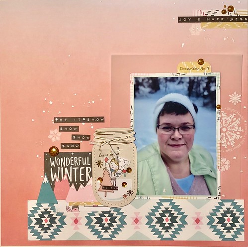
Happy Friday! We are in the home stretch now! This is our last lift the pea challenge. You can be inspired by the general layout, the theme, the colors, whatever makes you happy! Just create something NEW for each challenge and share that you did it and either a picture or a description of what you did so we can all be inspired! This can be a layout, a card, digital, whatever you are inspired to make. This weeks pea is mikklynn I chose this amazing layout. The Ombre paper, the soft colors, the wintery theme it all spoke to me.  I love everything about Winter, Snow, Cold so this layout was perfect for me to Lift and use photo of myself from this winter. I did a pretty strait forward lift with a few layers added in. I even used some old Basic Grey rubons and was surprised when most of them were still good.  Have fun and be sure to share what you make! |
|
|
|
Post by grammadee on Feb 23, 2018 10:56:39 GMT
Congrats on being chosen, mikklynn! I love the soft colours in your page. Great lift, DawnMcD! Thanks so much for hosting this month. I love that each lift you chose was so unique from the others. Wonderful way to keep us all challenged! |
|
|
|
Post by kiwigirl on Feb 23, 2018 11:44:55 GMT
mikklynn way to go being picked and I love your LO, it's just gorgeous, such pretty colours and that background paper is lush! DawnMcD your LO is absolutely gorgeous too! Love your paper choices and beautiful embellishments!
|
|
|
|
Post by mikklynn on Feb 23, 2018 12:03:42 GMT
Oh my gosh! I was very surprised when I opened this challenge this morning. I got lucky that I had the perfect ombre paper for the photo. If Chinagirl828 hadn't put ombre paper in her This or That challenge, I'm sure I wouldn't have dug through my stash and found it. DawnMcD I love your layout. The white ink is so perfect! ETA - I'm so disappointed I won't get to play this next week. After I get done snowblowing my driveway this am, I'm leaving town for a week. I'll be seeing the grands, so I'll have lots of new photos to scrap. I'll be checking in, though! |
|
|
|
Post by kiwigirl on Feb 23, 2018 16:03:30 GMT
Here's my version!  mikklynn mikklynn have a great week with your grandkids! |
|
|
|
Post by DawnMcD on Feb 23, 2018 18:40:44 GMT
kiwigirl The is so stunning. I love the rainbow paint paper on the edges and the beautiful cluster. so pretty
|
|
|
|
Post by woodysbetty on Feb 23, 2018 19:40:10 GMT
DawnMcD Thanks so much for the idea. I loved your idea of a pic of you so I followed along. Funny thing about me is I am not really good about following instructions or even recipes. I start but then I seem to migrate to other places...yikes!! 
|
|
nylene
Drama Llama
 
Posts: 6,779 
|
Post by nylene on Feb 25, 2018 1:07:00 GMT
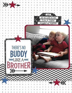
DawnMcD , your layout is beautiful and I love that photo of you. Very classy work! Thanks for this challenge. It took me a while to decide what to scraplift, but I ended up lifting the design. mikklynn , congrats on being chosen for scraplifting. Your layout is so soft and pretty. I loved your design and tried to copy it. kiwigirl , I love the colors in your layout, against the white barn wood. Just a gorgeous layout. I think you need to teach a class on getting your Nuvo dots so perfect and perfectly spaced. Amazing! woodysbetty , I had to laugh at your explanation of not following instructions or recipes. Your layout is amazing. I love what you did with the angles in your background paper. Such a great idea and I love that you included a photo of you. Someday I need to do the same. LOL Here is my version.  There's No Buddy Like A Brother There's No Buddy Like A Brother by Nylene Budge, on Flickr
|
|
|
|
Post by mikklynn on Feb 25, 2018 2:12:49 GMT
nylene I love your layout. The photo is so sweet  . I like the arrow and star, love the title. kiwigirl I love your use of color in this layout. I always enjoy your work. woodysbetty I love the use of black with all the pretty colors. Great layout.
|
|
|
|
Post by stinkerbelle on Feb 27, 2018 11:02:17 GMT
mine! mikklynn loved your page and had fun putting my spin on it  DawnMcD DawnMcD thanks for a great challenge and all of your hard work this month!  |
|
|
|
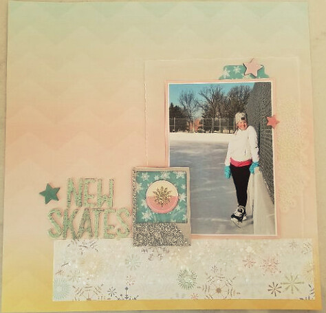
Post by stinkerbelle on Feb 27, 2018 15:16:18 GMT
DawnMcD your lift is just amazing…the colors, embellishments, the rubons…gorgeous! kiwigirl soooo pretty! I think that is my favorite cocoa vanilla line and I just love what you’ve done with it…your signature nuvo drops look fabulous and I love all the vellum pieces! woodysbetty love how you took the inspiration LO and went your own way with it…the black accents are very striking against all the soft colors  nylene nylene I really like how the red and blue just pop with all the black and white! Great lift!
|
|
Chinagirl828
Drama Llama
  Melbourne, Australia
Posts: 6,682
Jun 28, 2014 6:28:53 GMT
|
Post by Chinagirl828 on Mar 2, 2018 10:33:08 GMT
stinkerbelle I love your ombre background - did you create that yourself? The colours are beautiful with your photo and I love the clear text print layer.
|
|
|
|
Post by stinkerbelle on Mar 2, 2018 13:28:34 GMT
stinkerbelle I love your ombre background - did you create that yourself? The colours are beautiful with your photo and I love the clear text print layer. ha, i wish i were so talented! it's an 8x8 paper from Pretty Little Studio  |
|
|
|
Post by mikklynn on Mar 3, 2018 14:38:48 GMT
stinkerbelle I love your take on it. How fun that you also had a photo with pink in it - so perfect! Your text layer and title are fabulous.
|
|
|
|
Post by grammadee on Mar 3, 2018 16:52:12 GMT
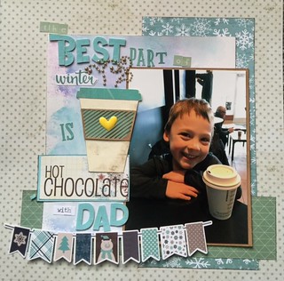
Here is my winter page. It will be the last page in my Winter 17-18 album.  Best part of winter Best part of winter by Gramma Dee, on Flickr I was intrigued by the watercolour look to the background, and tried to get a similar effect with Oxides on Bristol cs. I am also using this for Chinagirl828's March Bonus Challenge. I *think* I got most of the colours. |
|
|
|
Post by justjac on Mar 4, 2018 4:19:55 GMT
|
|
|
|
Post by patin on Mar 5, 2018 4:36:42 GMT
mikklynn- I couldn't possibly touch the soft, ethereal look of your page. Instead, I chose to be inspired by the winter scene & used a soft paper to reflect the scene & the story. This is a digital layout.  28-4-28 28-4-28 by Pati Nuce, on Flickr |
|
|
|
Post by mikklynn on Mar 5, 2018 16:18:32 GMT
grammadee The cup is darling and a perfect match for the darling little boy and his beverage. justjac Cute layouts. I'm glad you showed both! patin I'm glad you joined in! I love your before and after photos/layout.
|
|
|
|
Post by stinkerbelle on Mar 7, 2018 6:27:29 GMT
grammadee I think this is my favorite of all your pages this month…everything is fabulous! The photo, colors, layering, banner, coffee cup, the steam and that perfect yellow heart  justjac justjac both pages are equally lovely! I really like how you embellished the scraplift! patin your page is awesome! Love the background and fun title, and of course the before/after photos 
|
|