kitbop
Pearl Clutcher

Posts: 4,622 
|
Post by kitbop on Sept 16, 2020 1:20:20 GMT
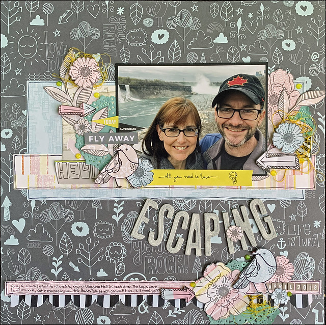
Wow, over half-way through September already! I have had this layout in my Pinterest board for a long time. The sketch associated with it - from Stuck Sketches - is no longer available. I couldn't find it no matter how I searched. So instead, I used the layout itself as my sketch today. Here is Mandy Melville's sketch interpretation that inspired me:  Loved(a) (with banner) Loved(a) (with banner) by kirstendrew, on Flickr And my interpretation - I used the bottom strip for my journaling; kept my title in a banner/arch shape under the photo; and designed clusters in the same spots as the original. This is 2012 paper from Studio calico - "Atlantic" collection!!!  LAYOUT ESCAPING LAYOUT ESCAPING by kirstendrew, on Flickr Now the cluster twist. Today, let's look at 2 different parts of a cluster: First, the finishing touches. In this layout, I chose nuvo drops and thread to "fill in the gaps" and add some texture. So for 1 point and to meet the twist component, add Nuvo drops to your clusters. Nuvo drops are often the tiny tidbit that adds balance to your cluster. Drop them in the natural nooks and crannies, and consider making a "triangle" around your cluster. Second, the background layer - it's unifying to start with the same colour and shape in the back of your cluster. Today, I started with a blue doily, although different amounts of the doily are visible in each cluster. For 5 twist points, start each of your clusters with the SAME background shape (large label; a tag; a circle; a heart): make it the same colour but the SIZE can be different. |
|
|
|
Post by Linda on Sept 16, 2020 1:25:10 GMT
great sample kitbop - that background PP is lovely - I especially like your border with the journalling and the clusters. I do appreciate your cluster tips and I keep trying... |
|
|
|
Post by grammadee on Sept 16, 2020 14:22:55 GMT
kitbop, I can see why you kept that sketch/LO for so long: it is one that can be dressed up or down, and it certainly has lots of room for clusters! And your take on it is beautiful. I might not have considered using pp with it instead of cs, but you did it brilliantly!
|
|
nylene
Drama Llama
 
Posts: 6,779  Member is Online
|
Post by nylene on Sept 16, 2020 16:30:04 GMT
kitbop, this is a great sketch. I love what you did with it. Your clusters are awesome. I hope I can scraplift them on my page. Thanks for the "cluster" tutorials each week. This will be a fun one.
|
|
|
|
Post by AussieMeg on Sept 17, 2020 9:29:03 GMT
I have had this layout in my Pinterest board for a long time. The sketch associated with it - from Stuck Sketches - is no longer available. I couldn't find it no matter how I searched. So instead, I used the layout itself as my sketch today. I love a challenge! I found this blog post that has a download link to all the Stuck Sketches, and the one for 15th September 2017 is one there. And here is the link to to download the PDF of all the sketches: Sketches |
|
kitbop
Pearl Clutcher

Posts: 4,622 
|
Post by kitbop on Sept 17, 2020 11:24:12 GMT
Wow AussieMeg, that is a fabulous resource! I really like those sketches!!! Thanks for the sleuthing  |
|
nylene
Drama Llama
 
Posts: 6,779  Member is Online
|
Post by nylene on Sept 17, 2020 16:53:31 GMT
Here is my #16. I can tell I need a lot more practice with clusters. Thanks for the challenge kitbop.  Originality Originality |
|
|
|
Post by AussieMeg on Sept 19, 2020 5:18:54 GMT
Thanks for the fabulous sketch! I will be using this one again for sure. Here is mine:  |
|
|
|
Post by Ryann on Sept 19, 2020 19:29:53 GMT
kitbop Really fun sketch and twist! I enjoyed the one photo focus and cluster action! I love your whimsical layout and the idea of journaling in a skinny border strip. I will have to file that away for later.  nylene nylene I really like this! You've got your layout neatly divided into thirds with the cute geckos playing about. Your clusters lead your eyes around the page, telling you where to "go". Great job with the sketch! AussieMeg Lovely colors and fun bits all around! Your clusters looks great and I love your title nestled in amongst the mist. Here goes my take. I moved the photo area to the bottom half of the page, and moved the banner and bottom bits to the top corner. I'm not much of a doily user, but had some shimmery black doilies that I used to anchor the clusters on either side of the photo area. I don't typically use Nuvo drops, so it was good to actually get some down on a page. I definitely need more practice as they were a bit fiddly! 
|
|
ComplicatedLady
Pearl Clutcher

Posts: 3,083  Location: Valley of the Sun
|
Post by ComplicatedLady on Sept 20, 2020 1:06:55 GMT
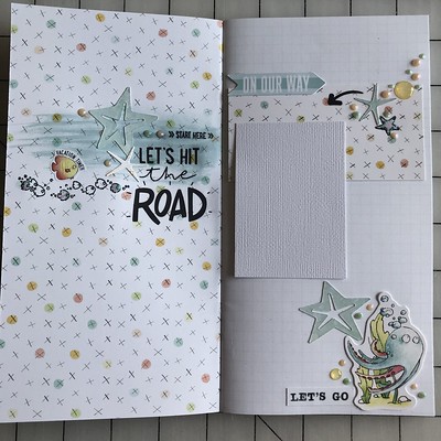
Here’s mine. I started with blue starfish in each cluster then stamped and added stuff around it. I used the pearlescent Nuvo drops—which are becoming my favorite. I also used some stickles glitter and a couple enamel dots from my kit. Lots of drops!!  2020 Sketchtember #16 2020 Sketchtember #16 |
|
|
|
Post by grammadee on Sept 20, 2020 3:52:37 GMT
Love your take on this, Ryann. Such pretty colours. The black doily and ribbon are the perfect hit of black. Awesome clustering around the photo! |
|
Chinagirl828
Drama Llama
  Melbourne, Australia
Posts: 6,682
Jun 28, 2014 6:28:53 GMT
|
Post by Chinagirl828 on Sept 20, 2020 10:39:33 GMT
Here's mine:  |
|
Chinagirl828
Drama Llama
  Melbourne, Australia
Posts: 6,682
Jun 28, 2014 6:28:53 GMT
|
Post by Chinagirl828 on Sept 20, 2020 10:50:30 GMT
Ryann I love how you've moved the design around to work for you. Fab clusters, and those little costumed characters are adorable. I've left praise for everyone else in the gallery.
|
|
|
|
Post by grammadee on Sept 20, 2020 19:02:56 GMT
Another chunky cluster for me, but I got the Nuvo drops in there!  first day left first day left by Gramma Dee, on Flickr This is the first page of a LO I will be sharing in the Sharing & Commenting thread. Had fun playing with all the school and fall stickers and diecuts and... |
|
|
|
Post by Linda on Sept 20, 2020 19:12:20 GMT
I'm a cluster failure - sorry. And I swear my layout is straight (or at least straighter) IRL - the scanner doesn't like popdots  |
|
|
|
Post by Linda on Sept 20, 2020 19:16:14 GMT
nylene - I think your clusters look great - and I love the little geckos! AussieMeg - love the title! beautiful layout Ryann - I like how you moved the elements around - fun Halloween layout! ComplicatedLady - love the starfish!@ great spread! Chinagirl828 -awesome concert pics and I love the stars and music notes! grammadee - fun school/fall cluster and banner!
|
|
wendy crowe
Junior Member
 
Posts: 73
Aug 7, 2020 14:00:10 GMT
|
Post by wendy crowe on Sept 21, 2020 1:06:28 GMT
|
|
kellyr21
Pearl Clutcher

Posts: 3,002  Location: California
|
Post by kellyr21 on Sept 21, 2020 3:53:43 GMT
|
|
|
|
Post by Linda on Sept 21, 2020 11:51:28 GMT
wendy crowe - another great baseball layout - the star backed cluster are awesome kellyr21 - beautiful indeed
|
|
|
|
Post by lynnek on Oct 28, 2020 15:53:16 GMT
Here is my take.  |
|