kitbop
Pearl Clutcher

Posts: 4,622 
|
Post by kitbop on May 14, 2021 22:05:11 GMT
I'm eager to start my weekend, so I'm getting the sketchy saturday up early! I followed the sketch pretty literally for me! I liked that it had a few embellishments placed to suggest where my clusters could start. I added extra swirls and sprinkles - I though the swirls kinda looked like her jump position! I also used a blender brush to add yellow ink to the edge of my gingham paper background - I felt like it gave the page a border without extra pattern.  sketch 4 insd 2021 sketch 4 insd 2021 by kirstendrew, on Flickr  layout blueberry layout blueberry by kirstendrew, on Flickr |
|
|
|
Post by AussieMeg on May 15, 2021 0:49:53 GMT
Love it!! I can’t wait to get started on this one.
|
|
|
|
Post by AussieMeg on May 16, 2021 0:37:05 GMT
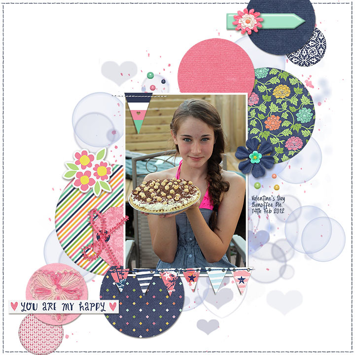
Here is mine:  |
|
kitbop
Pearl Clutcher

Posts: 4,622 
|
Post by kitbop on May 16, 2021 2:07:46 GMT
AussieMeg - wow did you make that photo POP! I love how you used a more muted pink compared to her dress - a real standout. That tag/ribbon is just sweet at the side. And I adore how you used the banner under the photo. Banoffee pie is not really a thing in Canada. I have a British friend who introduced it to us... um... hello, where have you been all my life?
|
|
|
|
Post by grammadee on May 16, 2021 3:55:48 GMT
Amazing pages, ladies! Interesting to see how one sketch can inspire so many different looks. Just saw justjac's page in the Gallery and it is completely masculine. |
|
MDscrapaholic
Drama Llama
 
Posts: 6,632
Location: Down by the bay....
Jun 25, 2014 20:49:07 GMT
|
Post by MDscrapaholic on May 31, 2021 0:29:31 GMT
I loved this one! Thanks for sharing the sketch!  |
|
|
|
Post by grammadee on May 31, 2021 2:26:13 GMT
Oh, MDscrapaholic! What a sweet page for a sweet princess! Love how they did her name in chalk for the photo, and your papers are perfect. I like how the circles are so subtle, yet add to the depth of the page. |
|
nylene
Drama Llama
 
Posts: 6,779 
|
Post by nylene on Jun 4, 2021 16:48:52 GMT
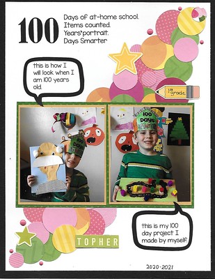
I don't always look at the Sketch Challenge because I have a hard time translating them to 8.5x11 and I usually have 4x6 photos. But I saw justjac's example of this sketch and knew I had a whole stack of circles left from card making, so I roughly followed it for this layout. I wondered if I could get 100 circles on the page to fit the title, but gave up.  100 Days 100 Days by Nylene Budge, on Flickr |
|
|
|
Post by grammadee on Jun 13, 2021 21:07:05 GMT
|
|
|
|
Post by Linda on Jun 21, 2021 13:47:16 GMT
kitbop - great sketch - I love the doily circles! AussieMeg - awesome take - I like the mix of digital paper circles with the digi-stamp/drawn? circles MDscrapaholic - that sweet photo is the focus - love how the subtle colours don't compete nylene - I LOVE that! might have to scraplift your version grammadee - great stretch - I love how there's continuity but still two distinct pages I started with the sketch but...the circles weren't working so I did a diagonal strip of PP instead and well, it doesn't look much like the sketch now but... 
|
|
|
|
Post by grammadee on Jun 21, 2021 14:02:19 GMT
Interesting way to interpret the sketch, Linda, with the two landscape photos standing in for one portrait and the diagonal strip instead of the circles. That is the great thing about sketches: they are a starting OFF point. Where they take you is up to YOU! |
|
|
|
Post by Linda on Aug 26, 2021 19:06:50 GMT
This one didn't quite turn out the way I had hoped but...EP Celebrate Spring collection kit.  |
|
|
|
Post by kmage on Feb 18, 2022 15:05:00 GMT
Used this in a new challenge, great sketch!!  IMG_3402 IMG_3402 by K Mage, on Flickr |
|