|
|
Post by happyscrappydo on Jun 16, 2021 22:40:17 GMT
So another reveal today was Obed Marshall’s new Collection. I loved his first collection and bought quite a few papers and apparently it was very popular because this new collection is like a sequel collection to the first. At first I thought it was the same one but then I realized it was slightly different. The colors and the feel are the same in both collections. As I have not used the first one, I will be passing on this one but maybe they sold out of the first collection and this is another chance for people to get it (even if not exactly the same). I have never seen two so similar collections for two different seasons from any AC designers. What do you think? It’s on preorder at ACOT as I I am not sure how to insert pictures here.
|
|
|
|
Post by sleepingbooty on Jun 16, 2021 22:45:32 GMT
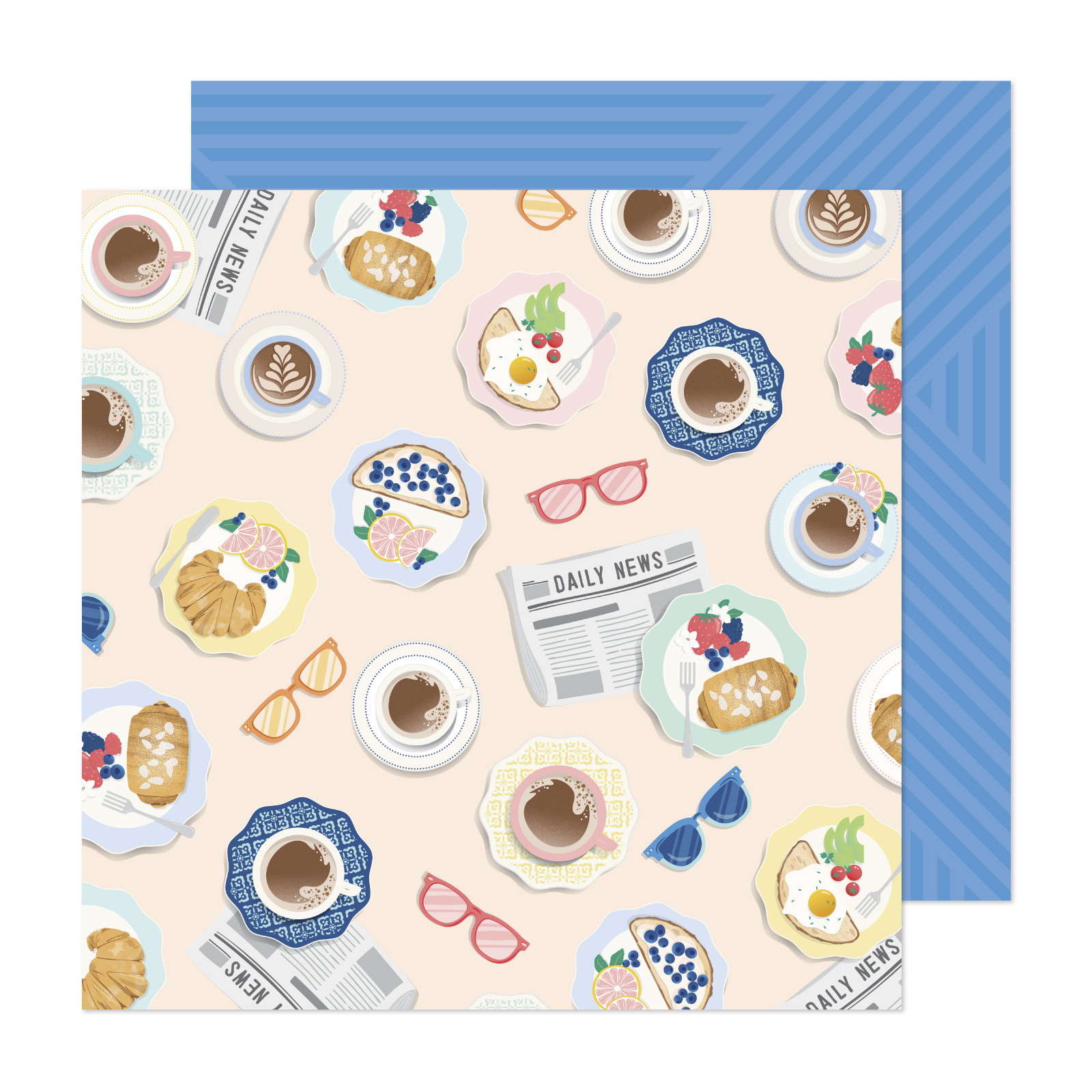
Early collections from AC designer brands tend to resemble each other more. It helps to establish the visual identity of the brand better. I'm not surprised they stayed within that same pastel-y peach and blue colour scheme. It looks like this one is more travel-geared, however. I've not found anything I simply *must* have yet but this brunch/breakfast paper definitely stood out to me:  |
|
Deleted
Posts: 0
Nov 16, 2024 13:01:01 GMT
|
Post by Deleted on Jun 17, 2021 0:03:59 GMT
Yeah, no. Loved the last release and bought a lot of paper. It was unique! This is so same same. And toooooooo much pink. I have a boy who loves green and blue. Ugh.
|
|
Elsabelle
Pearl Clutcher

Posts: 3,687 
|
Post by Elsabelle on Jun 17, 2021 0:06:05 GMT
Early collections from AC designer brands tend to resemble each other more. It helps to establish the visual identity of the brand better. I'm not surprised they stayed within that same pastel-y peach and blue colour scheme. It looks like this one is more travel-geared, however. I've not found anything I simply *must* have yet but this brunch/breakfast paper definitely stood out to me:  I need 10 of those. And a few other things from this collection as well. |
|
|
|
Post by mom on Jun 17, 2021 0:07:05 GMT
Hard no for me. Way to pastel.
|
|
|
|
Post by Skellinton on Jun 17, 2021 1:16:32 GMT
I would love it if he used deeper colors like our friend Steve Duncan.
|
|
|
|
Post by tinksmommy on Jun 17, 2021 1:30:03 GMT
I bought quite a bit of Buenos Dias but I’ll pass on this one.
|
|
msliz
Drama Llama
  The Procrastinator
Posts: 6,419
Jun 26, 2014 21:32:34 GMT
|
Post by msliz on Jun 17, 2021 1:47:13 GMT
I just saw there are new lines for Paige Evans and Jen Hadfield too. If JoAnn sells them for 20 cents a sheet, I'll buy them all. But I don't plan on buying any AC (except maybe Vicki Boutin) for full price again. I'd rather chance missing out on it altogether.
|
|
|
|
Post by AussieMeg on Jun 17, 2021 2:17:19 GMT
I bought the digital kit of Buenos Dias, and I will probably buy this one as well when the digital version is released. The colours make me so happy. Such a difference to the drab dull and depressing colours of the Christmas and Fall kits I'm seeing!   |
|
PaperAngel
Prolific Pea
  
Posts: 7,980
Jun 27, 2014 23:04:06 GMT
|
Post by PaperAngel on Jun 17, 2021 4:17:03 GMT
Link to ACOT: Obed Marshall Fantastico collectionThe only product added to my wish list is the versatile Alpha Puffy Stickers. ETA: I HATE that AC's paper product photos only show a peek of the patterns on reverse sides & not individual images of both the fronts & backs of each sheet! |
|
camcas
Pearl Clutcher

Posts: 4,150 
|
Post by camcas on Jun 17, 2021 4:52:42 GMT
Nope- way too pink and pastel-ICK!
|
|
artbabe
Pearl Clutcher

Posts: 3,393 
|
Post by artbabe on Jun 17, 2021 16:02:03 GMT
I looked at the papers- there are actually quite a few of them that aren't pink. Definitely a lot of pink in the embellishments, though. I noticed there is a lot more Spanish in this line, and not as much English. That is really good in general (yay for diversity!) but makes it hard for me to use. When Joann had his last line it was in English so maybe there will be an English version, too.
I love the ombre paper, the swirl, the stripe, and the phones. I think those will be very useable. That breakfast paper is to die for- I love breakfast. I love the beautiful blue b-side, too.
As for the embellishments, I'll probably get the Thickers (I have a Thicker problem), the puffy stickers, and the enamel dots. I usually love chipboard and die cuts but everything looks so square! I'm always looking for more organic, irregular shapes to use on my layouts or it just becomes nothing but rectangles on top of rectangles and that looks weird to me.
|
|
|
|
Post by hockeyfan06 on Jun 17, 2021 18:25:28 GMT
I like this line. It's fun and youthful. My favs are the colored binder rings, alphas and brunch paper. I can see making a very cute flip tag mini album of all the places we can now go to for brunch!
|
|
|
|
Post by cupcakepeddler on Jun 18, 2021 3:48:37 GMT
I like this line a whole lot more than his first one. I am a pink girl but the tone of the pink in Buenos Dias I did not like and the B side patterns were not really my thing. Fantastico seems to have a lot more in the way of blue and green and for me anyway, more versatile patterns. I have only just seen in the last few weeks a paper pad of Buenos Dias in Australia in store so it might be a while longer before we get any of Fantastico. I would probably buy a few single sheets from that line so hopefully we do get it here.
|
|
Chinagirl828
Drama Llama
  Melbourne, Australia
Posts: 6,679
Jun 28, 2014 6:28:53 GMT
|
Post by Chinagirl828 on Jun 18, 2021 5:58:19 GMT
This one doesn't appeal to me at all.
|
|
|
|
Post by sleepingbooty on Jun 19, 2021 12:16:32 GMT
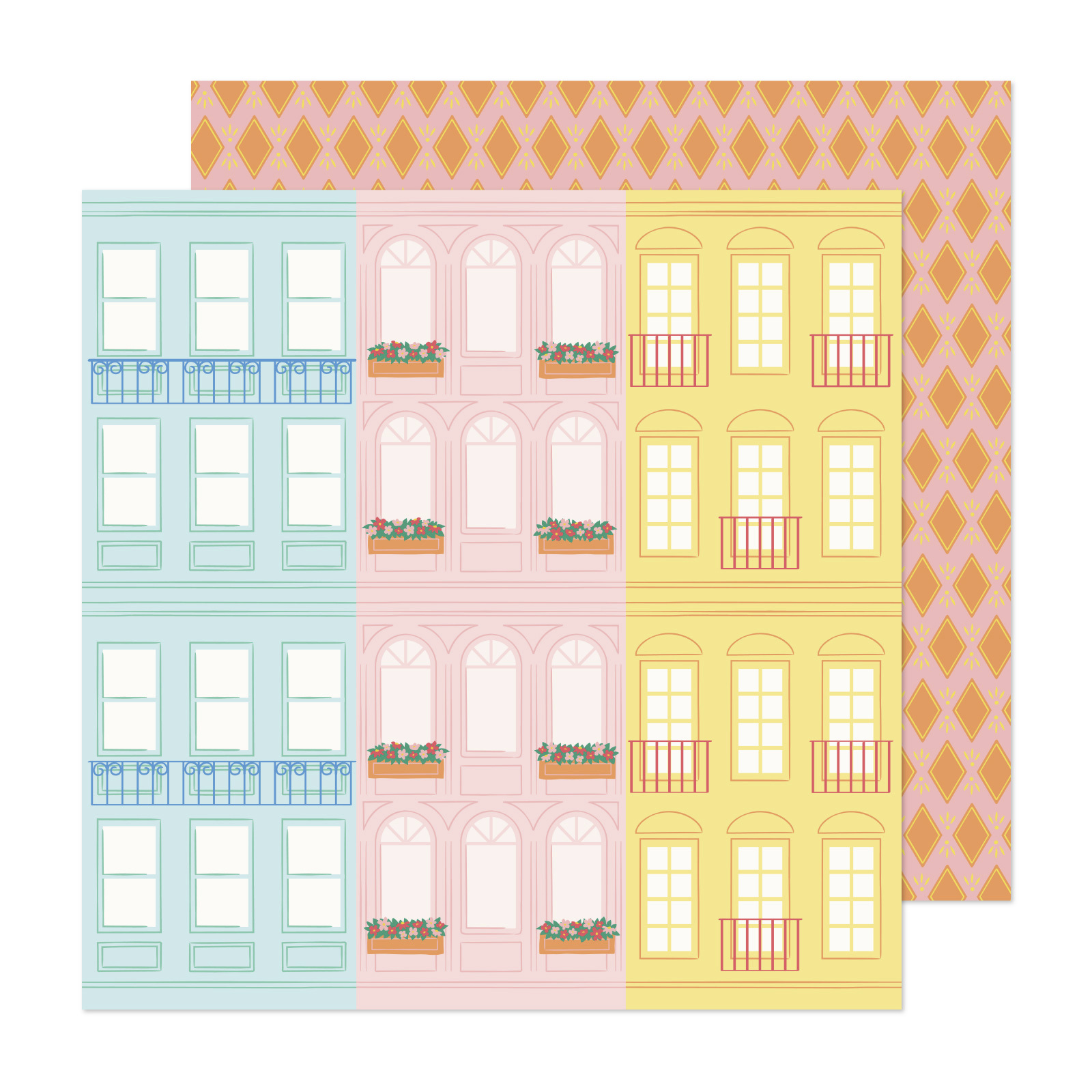
Just realised the city street paper can be cut down to 6 4x6 vertical façades, pretty neat for cardmakers looking for a quick background!  |
|
|
|
Post by grammadee on Jun 19, 2021 14:21:53 GMT
That page has croiscents on it, sleepingbooty ! Hoping this will link here. I really like the blue and the starburst pattern rolls: are they sb papers or wrapping paper? (they peek out of the "specialty paper" cluster. Oh and I love that she hung on to her bright yellows.  |
|
artbabe
Pearl Clutcher

Posts: 3,393 
|
Post by artbabe on Jun 19, 2021 15:04:30 GMT
I've made a few pages with his last line and while they were okay, they aren't my favorite pages. I'll try to make another page with it this weekend and see if I can do better- for some reason I found the embellishments hard to work with. The paper is so pretty, though.
I'll end up buying some of this line, too. Maybe if I mix it in with the last line it might help my mojo.
|
|
PaperAngel
Prolific Pea
  
Posts: 7,980
Jun 27, 2014 23:04:06 GMT
|
Post by PaperAngel on Jun 20, 2021 1:08:39 GMT
...Oh and I love that she hung on to her bright yellows. [bold is mine] Note the designer, Obed Marshall, is a 20-something male crafter from Spain injecting diversity & bright colors into the industry! |
|
paperhearts
Junior Member
 
Posts: 66
Dec 19, 2020 19:00:12 GMT
|
Post by paperhearts on Aug 1, 2021 11:05:04 GMT
Does anyone know if we can expect to see this line in Joanns?
|
|
|
|
Post by ecvnj58 on Aug 1, 2021 13:48:52 GMT
Does anyone know if we can expect to see this line in Joanns? I think it’s in scrapbook stores only. I believe this is what he said on the paper talk podcast. |
|
jediannie
Pearl Clutcher

Posts: 3,081
Jun 30, 2014 3:19:06 GMT
|
Post by jediannie on Aug 2, 2021 16:03:48 GMT
Does anyone know if we can expect to see this line in Joanns? I think it’s in scrapbook stores only. I believe this is what he said on the paper talk podcast. Yes, he said it was exclusive to scrapbook stores and won't be sold at Joann's. |
|