kitbop
Pearl Clutcher

Posts: 4,622 
|
Post by kitbop on Feb 16, 2023 1:09:14 GMT
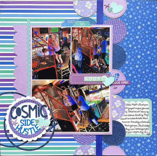
Welcome to 28-4-28 and the 3rd installment of "Shape Up!" Thursday challenges! Thursday challenges will focus on how to use basic shapes on a page, and the twist will be a specific shape to use. WEEK 3 your challenge is to create ROW of basic shapes as an EDGE, DIVISION OR BANNER. Here are my examples this week, starting with the one I specifically made for the challenge, using 2 rows of circles along the dividing line in my design:  layout cosmic side hustle layout cosmic side hustle by kirstendrew, on Flickr And for other examples: Here are "flag" shapes arranged on layouts:  layout drama dog elite layout drama dog elite by kirstendrew, on Flickr  Layout solid gold Layout solid gold by kirstendrew, on Flickr Tags lined up to make top and bottom borders (I don't like this page...but I like the idea and want to try again, maybe just using a top OR bottom border, or using LESS of the tag showing?)  LAYOUT welcome to wing A LAYOUT welcome to wing A by kirstendrew, on Flickr And you don't have to cut your own shapes - there may be patterned papers that have rows of repeated shapes that make this process easy. Here are arrows used this way:  layout changes layout changes by kirstendrew, on Flickr Tickets!  layout ghouls night out layout ghouls night out by kirstendrew, on Flickr Semi-circles  layout nutella and chill layout nutella and chill by kirstendrew, on Flickr Chevons/"v"shapes?  layout hello from the other side layout hello from the other side by kirstendrew, on Flickr WEEK 1-4 your twist is to use CIRCLES, TRIANGLES, SQUARES, HEXAGONS or TAGS as your repeated elements...but...choose wisely! These 5 shapes will be the same every week but you may only use each shape ONCE this month to meet the twist! So if you use circles this week for the twist, next week you have to choose from the remaining 4 options! |
|
|
|
Post by grammadee on Feb 16, 2023 17:53:21 GMT
Hope this works for this challenge, kitbop. I am not sure how straight my row of hexagons is, but I was going for a border below the photos. Hexagons works as a twist, right?  Oh Layla 1 Oh Layla 1 by Gramma Dee, on Flickr |
|
nylene
Drama Llama
 
Posts: 6,779 
|
Post by nylene on Feb 17, 2023 22:05:08 GMT
kitbop , I love every one of your layouts. I left you love in the gallery for the new one and noticed I left love on the others too. I love your style! grammadee , I love the playful arrangement of your hexagons. So fitting for the page. You have love in the gallery. This one is for #12 Sweet challenge and also for #16 shaped borders.  Sweet Valentine Sweet Valentine
|
|
kitbop
Pearl Clutcher

Posts: 4,622 
|
Post by kitbop on Feb 17, 2023 22:10:21 GMT
grammadee - you are always good with your hexagons! I'm working with them for next week  I love the "confetti" strewn amongst your elements. nylene - what a sweet line of squares you made! And I love that heart die-cut background too. It *almost* makes me want to dust off my old cameo. But that sounds very work-ish.
|
|
|
|
Post by Linda on Feb 19, 2023 4:28:17 GMT
Hoping to claim this one also - does my border of little circles count?  |
|
breetheflea
Drama Llama
 
Posts: 6,582  Location: PNW
|
Post by breetheflea on Mar 8, 2023 2:02:19 GMT
 scratchoff scratchoff by BreetheFlea, on Flickr Better late than never? A row of shapes: I had triangles, tags and hexagons left so I chose hexagons. The background paper is black cardstock with distress ink stenciled on it (got the idea from a recent steakgoddess Youtube video, or maybe it was someone else, I watched a lot of videos last week when I was sick) I used pink ink... but I like how that part turned out. I used my embossing folders (or one of them) for the first time in years as I said I was going to do on a recent post. The brown outline is my dinner table not part of the layout. Oh and the photo was taken on Christmas day, and I didn't use a single red or green item, it's going to look weird in my album in between all the Christmas pages  |
|
Chinagirl828
Drama Llama
  Melbourne, Australia
Posts: 6,682
Jun 28, 2014 6:28:53 GMT
|
Post by Chinagirl828 on Mar 12, 2023 8:45:40 GMT
I've had this page half done for the last couple of weeks, and then ran out of mojo. I'm pleased with how it turned out in the end, and have wanted to try this border of tags for a long time.  |
|
kitbop
Pearl Clutcher

Posts: 4,622 
|
Post by kitbop on Mar 12, 2023 13:11:01 GMT
@chinagirl: I love borders of tags! I also love how "nautical" that simple pp looks the way you used it. Your title work is spot on! @breetheflea - What amazing movement you got from hexagons (which I find often "sit still" because of the way they interlock iykwim) - the diagonal stripe and the continuation of the hexies with the stencil works so well on the 2 sides of the "line"! Linda - oh my gosh, your colour matching is really magazine worthy - that picture is just so well accented by your design and choices! |
|
|
|
Post by Linda on Mar 12, 2023 14:55:08 GMT
breetheflea -I love the monochrome colours and the hexagons - those worked super well! Chinagirl828 - the tag border is lovely and the tone on tone of the tags and the PP are just right. Gorgeous photos kitbop - thank you!
|
|