pantsonfire
Drama Llama
  Take a step back, evaluate what is important, and enjoy your life with those who you love.
Posts: 6,273 
|
Post by pantsonfire on Apr 23, 2023 2:42:18 GMT
Since there have been some discussions regarding alcohol markers, tutorials, examples, etc., I was thinking we could have an on going thread where we can all share our colorings. I love to browse Instagram looking for colors that others used on stamps and drawn images.
So share your coloring projects here! And please share what colors you use as well as what brand of markers you used. I know there are several on the market.
|
|
pantsonfire
Drama Llama
  Take a step back, evaluate what is important, and enjoy your life with those who you love.
Posts: 6,273 
|
Post by pantsonfire on Apr 23, 2023 2:47:24 GMT
I saw a pooh bear coloring by Alberto Gava on IG using a My Favorite Things stamp and got inspired to give it a try on one of the MFT Polar Bear Pals stamps. I am quite pleased with how it turned out. This was my first try, so I wasn't super careful about staying in the lines. I just wanted to see what colors I needed to create a Pooh like bear. I used Ohuhu markers and the colors are on the cardstock. I looked up Pooh wearing a scarf to get color inspiration for the scarf. Found several where Pooh has a light and dark blue scarf so went with the PB blues. For the shirt, I colored it first with R2 and then added highlights with R4 which is just a hair darker. For Pooh himself, I colored arms, and face with Y2 and then did the belly in Y3, added Y2 around that and then went back and color blended with Y3. On my next go I may drawn black lines for the shirt sleeves and bottom park after I color. http://instagram.com/p/CrXLa5bLTvI |
|
leeny
Pearl Clutcher

Posts: 4,800
Location: Northern California
Site Supporter
Jun 27, 2014 1:55:53 GMT
|
Post by leeny on Apr 23, 2023 3:26:14 GMT
I belong to the Krazy Kreations card kit club. It's mostly alcohol ink coloring on fine glitter paper. Attachments:
|
|
pantsonfire
Drama Llama
  Take a step back, evaluate what is important, and enjoy your life with those who you love.
Posts: 6,273 
|
Post by pantsonfire on Apr 23, 2023 13:35:09 GMT
leeny I really like your owls!
|
|
|
|
Post by babylou on Apr 23, 2023 15:02:44 GMT
This is my latest. Done with Copics. Not sure of the colors right off hand, but if anyone wants to know, I can figure it out and list them. 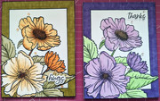 |
|
pantsonfire
Drama Llama
  Take a step back, evaluate what is important, and enjoy your life with those who you love.
Posts: 6,273 
|
Post by pantsonfire on Apr 23, 2023 17:21:17 GMT
This is my latest. Done with Copics. Not sure of the colors right off hand, but if anyone wants to know, I can figure it out and list them.  I am working on using a darker color to highlight where the stamp is and then coloring in with lighter. Great job! |
|
pantsonfire
Drama Llama
  Take a step back, evaluate what is important, and enjoy your life with those who you love.
Posts: 6,273 
|
Post by pantsonfire on Apr 23, 2023 17:21:35 GMT
|
|
|
|
Post by kmage on Apr 23, 2023 20:05:16 GMT
|
|
Shakti
Pearl Clutcher
 Troubled, complicated, and constant
Posts: 3,244
Oct 30, 2022 23:42:30 GMT
|
Post by Shakti on Apr 27, 2023 11:20:31 GMT
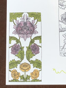 New-to-me stamp, courtesy of MichyM. Altenew Moss G935, Olive G825, Grape Agate C008, Amethyst R611, Pale Mauve C011, Yellow Ochre C012, Butternut C014 & Pumpkin Pie C013. Will become the focal image on a mini slimline sympathy card. EtA: Not happy with the white background. I'm thinking grey or maybe some sort of blue. I don't think I want to use more marker -- maybe colored pencil or watercolor pencil? 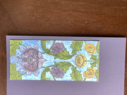 |
|
Shakti
Pearl Clutcher
 Troubled, complicated, and constant
Posts: 3,244
Oct 30, 2022 23:42:30 GMT
|
Post by Shakti on Apr 30, 2023 16:56:47 GMT
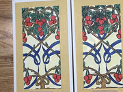 The other large stamp from the same set. Altenew R105, R107, R218, B003, B027, C015, G213, G315, Y423, & Y425. |
|
Shakti
Pearl Clutcher
 Troubled, complicated, and constant
Posts: 3,244
Oct 30, 2022 23:42:30 GMT
|
Post by Shakti on Jul 4, 2023 21:49:47 GMT
Haven't done much with my markers lately, but today: 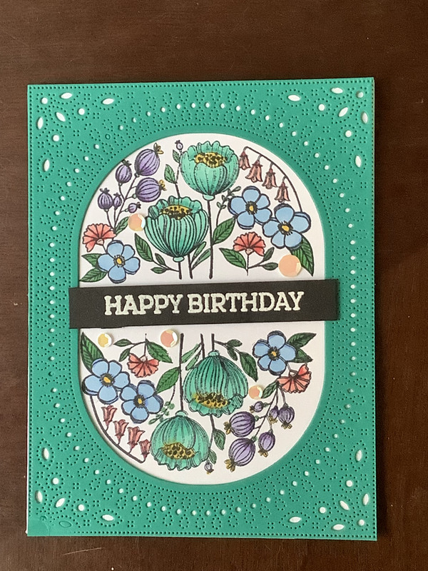 I used Altenew markers from sets C, D, G, & H. I don't think anyone else uses that brand, but if someone wants the exact colors, let me know. Also whether you want names or numbers. |
|
FurryP
Drama Llama
  To pea or not to pea...
Posts: 7,284
Site Supporter
Jun 26, 2014 19:58:26 GMT
|
Post by FurryP on Jul 8, 2023 22:41:21 GMT
|
|
Shakti
Pearl Clutcher
 Troubled, complicated, and constant
Posts: 3,244
Oct 30, 2022 23:42:30 GMT
|
Post by Shakti on Aug 1, 2023 15:17:00 GMT
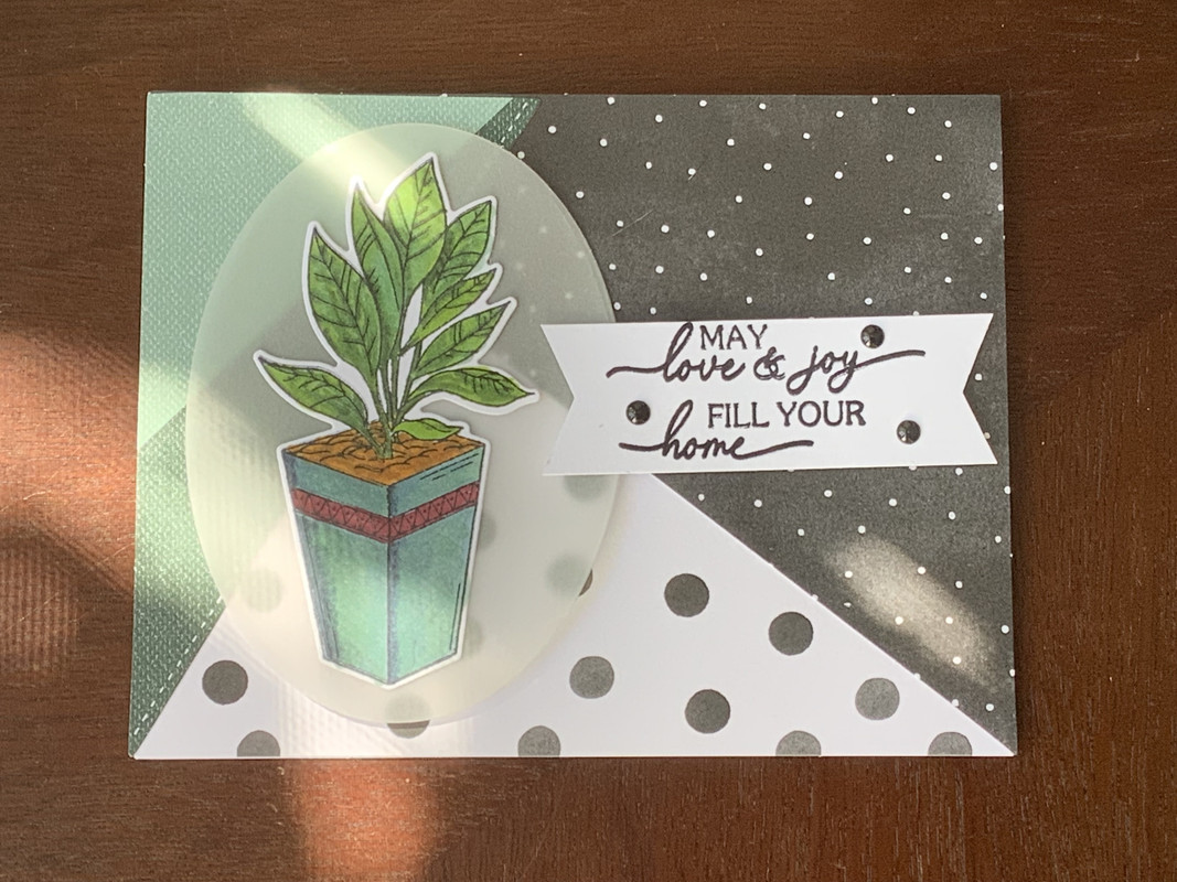 Quick housewarming card. Altenew markers and stamp/die bundle. SU kit card base. |
|
Shakti
Pearl Clutcher
 Troubled, complicated, and constant
Posts: 3,244
Oct 30, 2022 23:42:30 GMT
|
Post by Shakti on Mar 29, 2024 11:35:09 GMT
The one card I completed last weekend during Altenew's Colorful Expressions alcohol marker coloring class with Kelly Taylor: 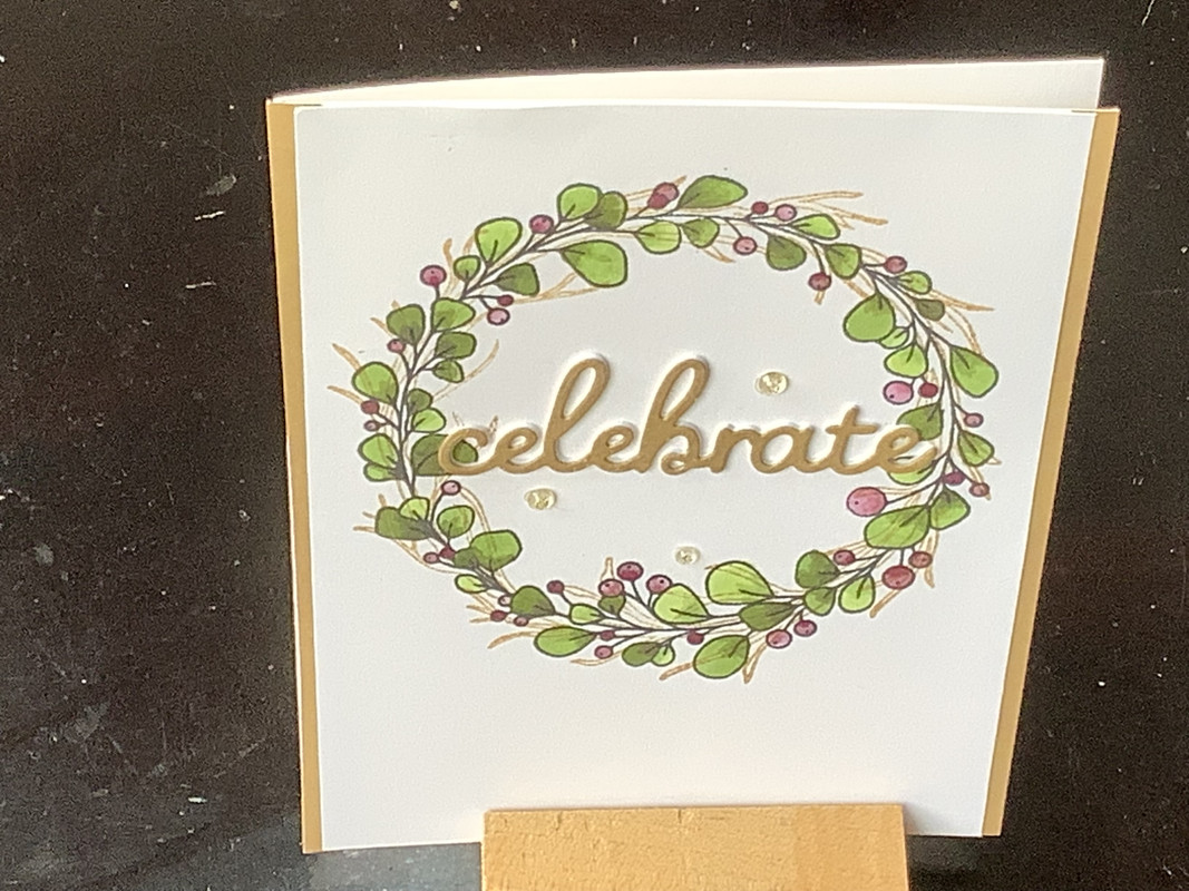 My thoughts about this class are complicated and my feelings mixed. I can elaborate if anyone's interested in reading; otherwise I'll just leave it at that. |
|
|
|
Post by Margie on Mar 30, 2024 15:19:45 GMT
I've tried alcohol markers and colored pencils, but I've never been happy with my coloring so I've stayed away from it. However, I recently discovered a YT channel, "Crafty Concepts with Erin." I love her coloring and she makes it look so easy. She mostly uses Spectrum Noir Tri-Blend markers. After much consideration (thinking about all those markers and pencils sitting unused in my stash), I bit the bullet and purchased a set. They come with three different shades on each marker, which make shading and highlighting very easy. After my first try, I was already very pleased with the results. I realize that if I knew what I was doing, I could probably get the same outcome if I went through my old alcohol markers and selected the proper shades of each color, but the Tri-Blend markers make it so easy. Here's a link to one of Erin's videos. |
|
leeny
Pearl Clutcher

Posts: 4,800
Location: Northern California
Site Supporter
Jun 27, 2014 1:55:53 GMT
|
Post by leeny on Mar 30, 2024 17:54:30 GMT
I've tried alcohol markers and colored pencils, but I've never been happy with my coloring so I've stayed away from it. However, I recently discovered a YT channel, "Crafty Concepts with Erin." I love her coloring and she makes it look so easy. She mostly uses Spectrum Noir Tri-Blend markers. After much consideration (thinking about all those markers and pencils sitting unused in my stash), I bit the bullet and purchased a set. They come with three different shades on each marker, which make shading and highlighting very easy. After my first try, I was already very pleased with the results. I realize that if I knew what I was doing, I could probably get the same outcome if I went through my old alcohol markers and selected the proper shades of each color, but the Tri-Blend markers make it so easy. Here's a link to one of Erin's videos. Spectrum Noir are my favorite, but I'm no pro. I have the regulars and the tri-blends. I found this chart that I printed off if I am looking for a specific blend for my regulars. clicky This is from the Kit and Clowder website and she has lots of resources for using markers. |
|
|
|
Post by Margie on Mar 30, 2024 19:56:13 GMT
I've tried alcohol markers and colored pencils, but I've never been happy with my coloring so I've stayed away from it. However, I recently discovered a YT channel, "Crafty Concepts with Erin." I love her coloring and she makes it look so easy. She mostly uses Spectrum Noir Tri-Blend markers. After much consideration (thinking about all those markers and pencils sitting unused in my stash), I bit the bullet and purchased a set. They come with three different shades on each marker, which make shading and highlighting very easy. After my first try, I was already very pleased with the results. I realize that if I knew what I was doing, I could probably get the same outcome if I went through my old alcohol markers and selected the proper shades of each color, but the Tri-Blend markers make it so easy. Here's a link to one of Erin's videos. Spectrum Noir are my favorite, but I'm no pro. I have the regulars and the tri-blends. I found this chart that I printed off if I am looking for a specific blend for my regulars. clicky This is from the Kit and Clowder website and she has lots of resources for using markers. Thanks leeny! Your post reminded me that I had seen a printed blank sheet that enables you to color in all three shades with your markers. This would be handy in case your printer's colors are off. I just googled it and found this link that has both filled in and blank spots with the colors identified. |
|
|
|
Post by Embri on Apr 1, 2024 2:28:07 GMT
I Copic color all my die cut stuff. Here's a very random assortment of things from yesterday and today that hasn't been put away in the storage binder yet. Birch trees, icicle border, octopus, raccoon, two bears, a tiny rabbit, daisy, beehive and baby llama. 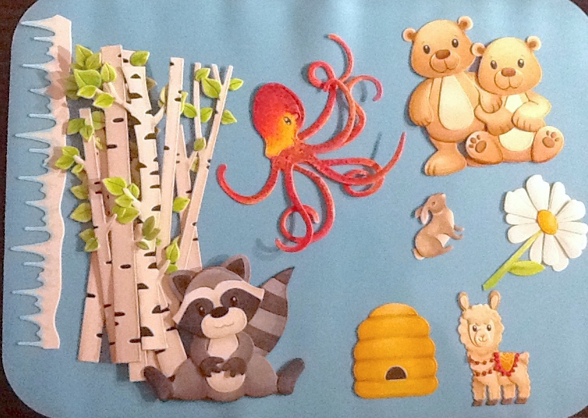 |
|
|
|
Post by kmage on Apr 3, 2024 13:40:31 GMT
I Copic color all my die cut stuff. Here's a very random assortment of things from yesterday and today that hasn't been put away in the storage binder yet. Birch trees, icicle border, octopus, raccoon, two bears, a tiny rabbit, daisy, beehive and baby llama.  These are just amazing! Do you have any suggestions for youtube videos/tutorials for coloring without lines? I tried coloring a flower the other day and it didn't go well. I am decent at coloring with alcohol markers if there are lines to color in, but without them, free form, is much harder imho. |
|
|
|
Post by Embri on Apr 3, 2024 21:10:54 GMT
I've only watched a couple of videos that featured alcohol marker colouring and they were either really basic (mostly I was looking for a review of the actual marker brand, not a how-to) or not my style. I learned how to wield Copics by using them, and a general art background / experience in watercolours helped. Alcohol markers are the most akin to watercolour painting, not traditional pencil colouring.The big differences are the drying time (super fast!) and trading off flexibility for more consistent colour. There's no faffing about with how much water and pigment you have loaded in the brush of course. Barring sitting around for a decade plus with no use or running dry, a marker always puts out the same colour and can be layered up 1-2 times for more range. When I go to colour something I start by finding a reference and picking my colours. Usually I can just pull what I want off the rack by memory - some colours are definitely more favourite than others - but I also have a swatchbook and blendbook of previous combos to consult. Some things I don't need a picture for - a daisy is a daisy and I've done enough of them to know by heart what colours I like to use - but for most things I'll use an image search to get some inspiration. The tiny bunny for example, I would have forgotten that most rabbits have a pale ridge of white fur around their cheeks. Once I've got my colours and an idea of where they're going to go, it's just a matter of putting down the ink. I use a plastic laminated board so that ink doesn't end up everywhere on the table, plus it's got some weak double sided tape in one corner for holding down tiny fiddly bits for inking. This is also the point where I'm picking my light source/direction. That plus volumetric shape determines where the darkest colours go. e.g. on the raccoon, if the tail had been on the left I would have had to put the darker shading on the opposite side. Planning ahead is important. I usually divide up my pieces by main colour - do all the white bits together, then the grey bits, then the dark grey for the racooon, then assemble in stages, starting with anything that has a fixed position. Things like the head, tail or arms are usually last as I'll decide on an exact pose. It's important to know the limitations of your medium. Alcohol markers are not capable of making extremely thin, distinct lines on previously coloured areas. For things like the eyebrows, mouth or paw lines on critters, I bring in the water based fineliners. My brand of choice is Staedler Triplus fineliners. I've had a set since high school that's still going strong and added a bunch of colours since. For eye shines, white acrylic paint applied with a tiny ball tipped stylus. The speed of the marker determines how much ink gets left behind. The faster you move it, the less gets deposited. For solid pieces like animal parts I'll start at the top following the shape of the piece and then work downwards towards the bottom, overlapping layers and slowing down more to get a nice gradient. For more contrast this process can be repeated with darker markers if they're close in value. If there's a lot of difference I'll use the flicking technique instead, putting the tip down where I want the darkest part and sweeping it towards the lighter area and lifting up. Use a decent white cardstock. I don't have anything special, just 200gsm white from the local business supply store. The thicker and more absorbent the paper the more layers you can apply, but also the more ink you'll spend. I find 200gsm is a good balance between "can hold the ink" and "doesn't suck my markers dry". Get to know your colours. While sometimes I can get a whole piece out of one or two markers, more often I'm using three, four or five per colour. For a piece with multiple colours, it's not uncommon to have twenty markers out on the table by the time I'm done. If you don't have closely related (but not too closely!) colours, it's hard to get nice transitions or blends. One way around this is to literally paint with the darker colour. Tap or swipe the dark colour onto a non-absorbent surface like an acrylic block or the aforementioned laminated sheet, then pick up a bit of that colour with the lighter one. This gives you gradient swipes with the two colours when applied to paper. Just remember to clean off the light marker's tip on scrap paper or towel when you're done. This works best in small areas. I wouldn't attempt to do anything bigger than a couple cm² this way unless the desired texture was streaky / variegated. Some of the go-to colours I reach for all the time: W1/W3 - These are warm grey, think grey mixed with brown. Anything that's going to be a fairly neutral white gets these for shading; they're used on the birch tree trunks and raccoon above. BG70/B000 - an extremely light seafoam blue-green and baby blue. Great for shading white again but where you need cold, like the icicles and daisy (but the indoor lighting kaiboshed the daisy's contrast, sorry about that. Doesn't show up well.) E41 - light cream. Again for shading white or a starting point for light brown, this time in the warm side. It's used on the bear bellies, alpaca and rabbit. E51/E34/E55 - my favourite set of warm soft browns. 95% of the two bears are done in this set of three colours, and the first two feature in the alpaca as well. I find myself reaching for these fawn colours time and time again for so many things. E41+E31 makes great sand. E44 - my favourite desaturated chocolately dark brown. The tiny rabbit is done mostly with this colour. YG11/YG03/YG17 - my go-to yellow green blend. 11&17 make up the birch leaves and daisy stem/leaf. BG11/BG13/BG49 - vibrant aquas. Not the most natural of colours so I tend to use them on objects not critters, but they're just so pleasing to the eye. I'm a sucker for a nice blue of any hue. E04 - despite being classed an "earth tone", this is a pink. A desaturated dusky rose pink, but a pink all the same. Great for adding some shading to flesh or pinky things or stuff like noses-that-should-be-pink while avoiding the garish fluo-pink look. Small bits of E04 often make it into any faces I do. It also makes great realistic shading on strawberry ice-cream. The real stuff, not the artificially coloured pink with no fruit in it. And if you made it through that wall o' text, have some more colourings, this time slightly less quality fail since it's not the middle of the night! |
|
|
|
Post by grammadee on Apr 3, 2024 22:01:02 GMT
You ladies are all amazingly talented. Embri those critters are adorable and I love the varigated leaves! |
|
|
|
Post by Embri on Apr 3, 2024 23:30:41 GMT
If you're interested in learning about making better marker blends, these are pretty close to what I do instinctively, www.vanillaarts.com/undercover which is underpainting. TLDR, shift your hue not just your value for more interesting final colours. Hardly anything is just one hue.
Fair Warning: Like most of the corporatized modern internet, both of these sites heavily push affiliate shopping links, paid workshops, tutorials and other digital goods. I have not bought anything from them, I'm not affiliated, nor endorsing - do your own research. I have not wanted or needed anything but the publicly posted info which I found helpful and sound.
|
|