Chinagirl828
Drama Llama
  Melbourne, Australia
Posts: 7,010
Jun 28, 2014 6:28:53 GMT
|
Post by Chinagirl828 on Apr 16, 2015 7:53:12 GMT
What do we think?
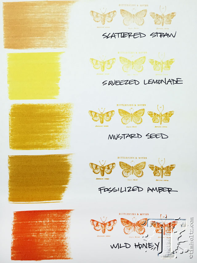
I like the vintage-y tones in this one but I'm not sure how I'd be able to use it in most of my scrapping. I think most of my colour palettes tend more towards Mustard Seed. I'm trying so hard not to get caught up in the hype of *must have them all*...


|
|
|
|
Post by miominmio on Apr 16, 2015 11:30:53 GMT
I'm not overly impressed with the colours so far, amd haven't bought any of them.
|
|
scrappinwithoutpeas
Pearl Clutcher

Posts: 3,215  Location: Northern Virginia
|
Post by scrappinwithoutpeas on Apr 16, 2015 12:17:05 GMT
I like it, but I don't love it. It seems fairly close (in the same family at least) to the mustard seed color, just more saturated & deeper, whereas mustard seed is brighter. They'd both make nice sunflowers! I do tend to gravitate towards more vintage-looking colors, so this one might be something I'd use. So far, the only one I've liked was the pink/salmon-ey one ("Abandoned Coral"). Haven't purchased any yet though.
|
|
|
|
Post by alissa103 on Apr 16, 2015 13:10:45 GMT
I think it looks more home decor, so if I needed it for an altered something or other, I'd get it. But yeah, really close to the mustard one. Probably if you blended mustard and some walnut, you'd get a similar look. I actually don't use my TH Distress inks that much (I know... shame on me!) so I'm not even tempted by this color of the month thing  |
|
|
|
Post by ScrapsontheRocks on Apr 16, 2015 13:25:42 GMT
I like it, I am on a pre-order programme with a local shop for the whole year's inks. I don't love it to bits or regard it as a must-have though. The January Cracked P was a must-have. The Coral filled a gap in my stash of colours nicely. Mermaid and this one are good, but not gobsmacking.
|
|
oaksong
Drama Llama
 
Posts: 6,167  Location: LA Suburbia
Site Supporter
Jun 27, 2014 6:24:29 GMT
|
Post by oaksong on Apr 16, 2015 13:28:10 GMT
By itself, it's not very appealing to me. But on a layout, it's a nice tone of gold that would go with a lot of the colors I like. I haven't bought any of these so far. I plan to get the set of all 4 mini inks when they are released in May. That will satisfy my curiosity. If I really love any of them, I'll add more items once I've seen the colors in the context of my other supplies.
|
|
|
|
Post by alissa103 on Apr 16, 2015 13:33:53 GMT
By itself, it's not very appealing to me. But on a layout, it's a nice tone of gold that would go with a lot of the colors I like. I haven't bought any of these so far. I plan to get the set of all 4 mini inks when they are released in May. That will satisfy my curiosity. If I really love any of them, I'll add more items once I've seen the colors in the context of my other supplies. Getting the mini inks is a GREAT idea! |
|
MDscrapaholic
Drama Llama
 
Posts: 7,238
Location: Down by the bay....
Jun 25, 2014 20:49:07 GMT
|
Post by MDscrapaholic on Apr 16, 2015 15:40:19 GMT
I think they're very pretty, but better for fall than spring.
|
|
|
|
Post by papersilly on Apr 16, 2015 18:14:23 GMT
I love yellows and oranges so I've liked the releases so far.
|
|
Peamac
Pearl Clutcher
 Refupea # 418
Posts: 4,240 
|
Post by Peamac on Apr 16, 2015 21:30:56 GMT
Thanks for posting- I'd forgotten to check to see what the new color was when April rolled around.
|
|
|
|
Post by streetscrapper on Apr 16, 2015 22:25:57 GMT
Initially I didn't think I liked if, but the more I see it I thin it's a colour I will use... Heck even if it's not I would bet that somehow I'll end up owning it! I love distress inks! Mini pads are a great idea! I wish I hadn't already bought 2!! I
|
|
Chinagirl828
Drama Llama
  Melbourne, Australia
Posts: 7,010
Jun 28, 2014 6:28:53 GMT
|
Post by Chinagirl828 on Apr 17, 2015 5:34:26 GMT
I so think I'm going to end up buying the mini inks, not because I need them, just because their marketing works!
|
|
camcas
Pearl Clutcher

Posts: 4,414 
|
Post by camcas on Apr 17, 2015 8:26:36 GMT
Ha! I agree with china Girl!!
|
|
|
|
Post by woodysbetty on Apr 17, 2015 11:42:12 GMT
I have liked the first 3 better than this color....this one will wait until the mini comes out......
|
|
FurryP
Prolific Pea
   To pea or not to pea...
Posts: 7,797
Site Supporter
Jun 26, 2014 19:58:26 GMT
|
Post by FurryP on Apr 18, 2015 1:49:21 GMT
At this point is is not a must have. But I am not ruling it out completely. Can't wait to see what the rest of the year's colors are.
|
|
|
|
Post by ametallichick on Apr 21, 2015 18:24:41 GMT
What do we think?
I like the vintage-y tones in this one but I'm not sure how I'd be able to use it in most of my scrapping. I think most of my colour palettes tend more towards Mustard Seed. I'm trying so hard not to get caught up in the hype of *must have them all*...


I agree. I need to get off the "must have it" mentality. I love his stuff but about 9 mos. ago, I made a spinner to hold all of his Distress pads and cannot fit new colors in there so I am not buying the new ones. |
|
|
|
Post by crimsoncat05 on Apr 22, 2015 21:10:27 GMT
to me, it's not really an amber color, more like a mustardy yellow (the bottle of paint looks just like the bottle of French's mustard in our frig). Just like the one from last month (?) that was titled some sort of coral, but it didn't look coral to me at all. Not liking this color at all.
|
|
scrappington
Pearl Clutcher
 in Canada
Posts: 3,157 
|
Post by scrappington on Apr 23, 2015 17:14:06 GMT
I have ordered them all. I love distress ink for everything but stamping.
I don't think the colour on the packaging really shows the colour that the amber is to me based on his swatch though.
I pre ordered it anyway.
|
|
|
|
Post by ScrapsontheRocks on Apr 24, 2015 7:16:31 GMT
I have ordered them all. I love distress ink for everything but stamping. I don't think the colour on the packaging really shows the colour that the amber is to me based on his swatch though. I pre ordered it anyway. I agree on the packaging colour comment. IMO the very early inks / first releases more than 10 years ago (I still have and use them) were accurate. Some time ago the label colours became "unreliable". A (then) friend who owned a LSS (since sold) had a shrinkwrapped batch of pads with three different colours of labels on the same ink. Long story short: I love the Ranger factory's colours. Their sticker supplier's colours, not so much. |
|
|
|
Post by crimsoncat05 on Apr 24, 2015 15:34:35 GMT
^^^ good point, because now that I'm looking at it again, the swatch of ink on the page looks totally different than the label on the bottles and ink pad.
(it's still not what I consider as 'amber' but then again, there are a lot of different types of amber.)
|
|
scrappington
Pearl Clutcher
 in Canada
Posts: 3,157 
|
Post by scrappington on Apr 24, 2015 15:46:49 GMT
I really don't think wild honey is that orange in real life.
Until I actually have it and swatch it myself who knows what the colour will look like.
|
|