|
|
Post by cmpeter on Jun 29, 2014 23:23:20 GMT
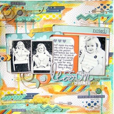
Not my layout...but how do you think she made the title (Lesson)? Hand cut? Cameo? Something else.  |
|
scrapngranny
Pearl Clutcher
 Only slightly senile
Posts: 4,858 
|
Post by scrapngranny on Jun 29, 2014 23:25:41 GMT
My guess is with the print and cut feature on the Silhouette.
|
|
|
|
Post by ctpea on Jun 29, 2014 23:58:55 GMT
Looks like a cameo cut.
|
|
lisavb
Full Member
  
Posts: 148
Jun 25, 2014 21:49:19 GMT
|
Post by lisavb on Jun 30, 2014 0:06:47 GMT
honestly, the whole layout looks like a digi layout not a traditional layout.
|
|
|
|
Post by alissa103 on Jun 30, 2014 0:09:31 GMT
Did they use the sketch feature on the cameo and then cut it out after sketching? That's what it looks like to me. Or digi scrapped. Kind of hard to tell. If it's a digi page, they did a really great job making it look layered!
|
|
|
|
Post by Crazyhare on Jun 30, 2014 1:19:26 GMT
It looks digital to me too.
|
|
|
|
Post by TracieClaiborne on Jun 30, 2014 1:20:15 GMT
I believe that is digital. It just has a look about it.
|
|
|
|
Post by cmputerdazed on Jun 30, 2014 2:08:37 GMT
Cute layout. I like the way the "lesson" looks too.
|
|
|
|
Post by mamanay on Jun 30, 2014 2:16:14 GMT
Lesson cut on a cameo or similar cutter and outlined by hand with a pen would be my guess.
|
|
*Marjorie*
Full Member
  
Posts: 362
Location: Hawaii
Jun 26, 2014 16:43:45 GMT
|
Post by *Marjorie* on Jun 30, 2014 2:29:28 GMT
honestly, the whole layout looks like a digi layout not a traditional layout. I agree. But you could use the Cameo or Portrait to create that title. |
|
|
|
Post by Merge on Jun 30, 2014 2:30:05 GMT
That looks digi to me ... look at the yarn/string swirl in the top left corner. I don't think that's "real."
|
|
Deleted
Posts: 0
Nov 22, 2024 8:11:57 GMT
|
Post by Deleted on Jun 30, 2014 2:31:35 GMT
That looks digi to me ... look at the yarn/string swirl in the top left corner. I don't think that's "real." The yarn/string made me think digi, too. |
|
|
|
Post by doesitmatter on Jun 30, 2014 2:36:07 GMT
honestly, the whole layout looks like a digi layout not a traditional layout. Looks digi to me too. |
|
|
|
Post by Basket1lady on Jun 30, 2014 3:32:17 GMT
Digital was my first thought as well.
|
|
|
|
Post by momof3pits on Jun 30, 2014 3:58:15 GMT
honestly, the whole layout looks like a digi layout not a traditional layout. I'm leaning towards agreeing with this, only because it looks so intricate and detailed. Otherwise, I can only imagine the amount of time that went into constructing that layout. As for the title, it either looks like a stamp and die coordinating set or a print and cut from a Cameo. |
|
|
|
Post by chaosisapony on Jun 30, 2014 4:03:53 GMT
I agree it looks digital to me. It has that flat look that all digital layouts have. It's cool though!
|
|
PaperAngel
Prolific Pea
  
Posts: 7,994
Jun 27, 2014 23:04:06 GMT
|
Post by PaperAngel on Jun 30, 2014 4:18:46 GMT
IMHO the intricate layout appears to be created by an uber-talented digi scrapper. Without an electronic cutter, you could achieve the same effect by fussy-cutting the word printed in a similar font or your own handwriting. HTH
|
|
|
|
Post by mariemily on Jun 30, 2014 4:20:44 GMT
Looks digital to me too. However, you can cut the same word with a Silhouette. I am pretty sure the font is Digs My Heart (http://www.fonts101.com/fonts/view/Script/26002/Digs_My_Hart). Then you can doodle around the letters with a black pen.
|
|
Gennifer
Drama Llama
 
Posts: 5,238 
|
Post by Gennifer on Jun 30, 2014 4:21:14 GMT
Seasoned digital girl here, and I agree... I think it's a digital layout.
|
|
|
|
Post by cmpeter on Jun 30, 2014 4:43:21 GMT
Interesting thoughts on it being digital. I saw it on Peachy Cheap last night, as an example of layouts using the cut and paste stamps by My Minds Eye. The black arrows on the layout match the stamps being sold. Maybe a hybrid layout? I haven't tried cut and paste with my Cameo yet...might have to play around with that this week to see if I can sketch/cut it.  |
|