Chinagirl828
Drama Llama
  Melbourne, Australia
Posts: 6,682
Member is Online
Jun 28, 2014 6:28:53 GMT
|
Post by Chinagirl828 on Feb 8, 2018 9:59:31 GMT
Here's my first page. It's a co-ordinating page for a pocket page that has quite a bit of colour so I wanted to keep it quite neutral. 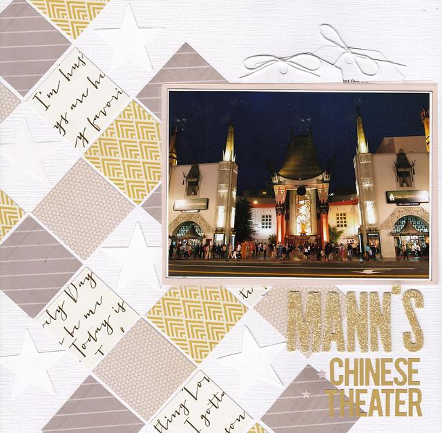 Mann's Chinese Theater Mann's Chinese Theater |
|
|
|
Post by JaneB on Feb 8, 2018 17:06:08 GMT
Here's my first page. It's a co-ordinating page for a pocket page that has quite a bit of colour so I wanted to keep it quite neutral.  Mann's Chinese Theater Mann's Chinese Theater The photo has quite a lot of colour and a lovely dark sky too, so the neutrals work well. I like how they seem to pull their colour from the buildings, so it feels more together too. And somehow I can't help but think of comforting milky coffee or hot chocolate, and I feel all warm and fuzzy  |
|
|
|
Post by mamakoala on Feb 8, 2018 20:15:31 GMT
I made a valentine for my bff. I had to sneak that scrap with the bird on it because I love it so much. The grey pieces were printables I've had for a long time. Never thought I would use them. I'm good for something then - providing the reason to use something  I think it's a lovely card, using supplies you have and making them work. i was laughing too  |
|
|
|
Post by mamakoala on Feb 8, 2018 20:15:49 GMT
Here's my first page. It's a co-ordinating page for a pocket page that has quite a bit of colour so I wanted to keep it quite neutral.  Mann's Chinese Theater Mann's Chinese Theater Your color choices are PERFECT! |
|
|
|
Post by justjac on Feb 8, 2018 22:54:44 GMT
Here is my take on the template. It is colour overload, but the paper line is called Family Frenzy so I had to use it. I like your colour choices Chinagirl828 . 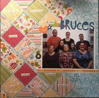 LOAD7 LOAD7 by Jacqueline Bruce, on Flickr |
|
|
|
Post by crystalb on Feb 8, 2018 23:46:01 GMT
jane this was a challenging (in a good way) for me. I hope I did your awesome template justice in my sick state! You know I don't feel well when I willingly use GOLD! I am SO a no gold girl! 
|
|
|
|
Post by grammadee on Feb 8, 2018 23:51:05 GMT
crystalb, I love ALL the colours you used here, including the gold. This looks like a really fun line. What was it?
|
|
|
|
Post by crystalb on Feb 9, 2018 0:04:33 GMT
crystalb , I love ALL the colours you used here, including the gold. This looks like a really fun line. What was it? These are from two new Recollection lines at Ms right now. Modern Pop and something else. They were all from 6X6 paper pads. They fit these pictures so much! |
|
|
|
Post by stinkerbelle on Feb 9, 2018 0:52:06 GMT
Chinagirl828 your page is stunning! Love the color scheme and gold title and white-on-white stars and tags  justjac justjac perfect paper line, as you said. It certainly made for a great LO! crystalb what a fun LO! Love the bright colors and frame over the photo  hope you're feeling better soon!
|
|
Chinagirl828
Drama Llama
  Melbourne, Australia
Posts: 6,682
Member is Online
Jun 28, 2014 6:28:53 GMT
|
Post by Chinagirl828 on Feb 9, 2018 4:52:16 GMT
crystalb I really like that you also tilted all your embellishments so they are straight on the paper squares - I don't remember seeing that here yet but I like it!
|
|
Chinagirl828
Drama Llama
  Melbourne, Australia
Posts: 6,682
Member is Online
Jun 28, 2014 6:28:53 GMT
|
Post by Chinagirl828 on Feb 9, 2018 6:16:40 GMT
I couldn't resist one more for this challenge. Journaling is on a tag in the glassine bag behind the photo mats and talks about why we decided to get married overseas. 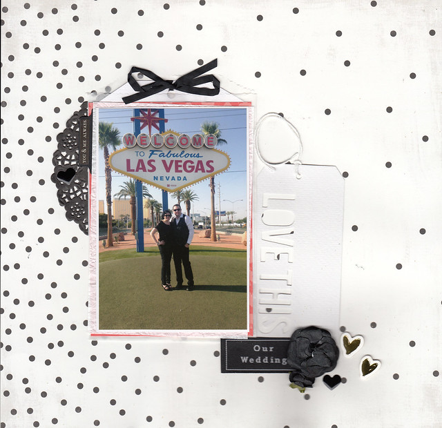 our wedding our wedding |
|
|
|
Post by JaneB on Feb 9, 2018 6:34:23 GMT
Here is my take on the template. It is colour overload, but the paper line is called Family Frenzy so I had to use it. I like your colour choices Chinagirl828 .  LOAD7 LOAD7 by Jacqueline Bruce, on Flickr It's wonderful  It's such a lovely family group and all the colours from the photo follow through to the paper. I think it's great  |
|
|
|
Post by JaneB on Feb 9, 2018 6:38:16 GMT
jane this was a challenging (in a good way) for me. I hope I did your awesome template justice in my sick state! You know I don't feel well when I willingly use GOLD! I am SO a no gold girl! I'm sorry you're feeling ill - and having to use gold too, well that's too much!  Of course you did the template justice, and like Chinagirl828 says, lining up the word strips with the squares is a different look. It's a fun page, it made me smile  |
|
|
|
Post by JaneB on Feb 9, 2018 6:40:47 GMT
I couldn't resist one more for this challenge. Journaling is on a tag in the glassine bag behind the photo mats and talks about why we decided to get married overseas.  our wedding our wedding Ooh it's confetti! I really like the black and white, and the cut out Love This tag.  |
|
|
|
Post by stinkerbelle on Feb 9, 2018 12:46:45 GMT
Chinagirl828 oh my word girl, you outdid yourself! i love this page even more than the first  the colors, especially that hint of pink, are so perfect!
|
|
|
|
Post by scrapincin on Feb 10, 2018 1:03:54 GMT
Here's my attempt at the Template Tuesday for week 1 It gave me fits the entire way I used screen shots from the tv since we could not see it here doing the heavy clouded sky. 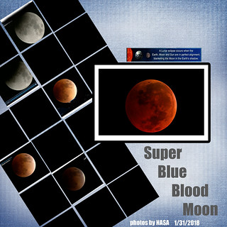 eclipse layout-2 eclipse layout-2 by Cindy Blair, on Flickr |
|
|
|
Post by LisaDV on Feb 10, 2018 1:24:26 GMT
It took me longer than I wanted to finish my 7 layouts for day 3 and get back over to this thread. JaneB, this template is gorgeous. I can't wait to use it. stinkerbelle, gorgeous layout. I love the brightness of those papers. grammadee, love, love, love that page. I like the black background. It makes your colors pop. I also like how you used the hearts in place of stars in spots. @elaynef, great way to change up the sketch and make it your own. nylene, super cute. I know I'll have the same problem with my paper trimmer too. patin, fabulous job. I love all of the orange. woodysbetty, gorgeous page. I love your photo and how your layout is about the superbowl. msliz, wonderful take on the sketch and gorgeous layout! I love that you turned it. kiwigirl, beautiful page and take. KikiPea, awe, what a little doll! Fun interpretation. Chinagirl828, wow! Beautiful page. I love the stars in box places and the colors and well everything. 2nd page: beautiful. I like the confetti and black and white style on it. justjac, I love all of your patterns. Gorgeous page. crystalb, fun layout. I think you better watch those girls, they look like they have too much fun together.  scrapincin scrapincin, great page. I never thought to use screen shots. It was too cloudy here too. |
|
|
|
Post by jeremysgirl on Feb 10, 2018 2:08:44 GMT
Here's mine  |
|
|
|
Post by grammadee on Feb 10, 2018 2:27:40 GMT
Love the photo jeremysgirl, and that title! I like the way you organized your pp diamonds, too. |
|
Chinagirl828
Drama Llama
  Melbourne, Australia
Posts: 6,682
Member is Online
Jun 28, 2014 6:28:53 GMT
|
Post by Chinagirl828 on Feb 10, 2018 3:01:18 GMT
jeremysgirl Beautiful page! I love the repeated pattern of the squares in one of the tags and the striped paper.
|
|
|
|
Post by DawnMcD on Feb 10, 2018 3:02:00 GMT
jane I loved your template. I decided to use vellum for the squares. I love how it softens this paper. It was really difficult to get a good photo of it between the vellum , the glitter and the gold foil. The photos are my girls last St. Patrick's Day. 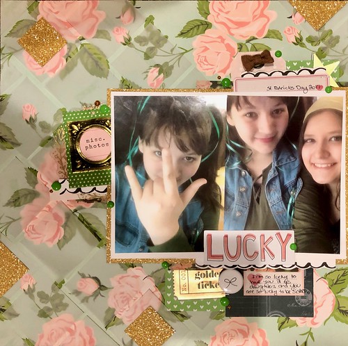
|
|
|
|
Post by grammadee on Feb 10, 2018 3:43:39 GMT
What a cool idea, DawnMcD! Gret photos, and I like the vellum and the glittery gold. |
|
|
|
Post by stinkerbelle on Feb 10, 2018 11:57:26 GMT
scrapincin oh wow, love your page! I really really like the randomly placed photos amongst all the black! jeremysgirl fabulous colors! Love the addition of the floral paper and how your words are lined up top to bottom. Awesome page! DawnMcD your vellum idea is so clever! the gold glitter adds the perfect amount of sparkle and contrasts well with the softness of the vellum, and I really love the golden ticket tucked in! fabulous page!
|
|
|
|
Post by mikklynn on Feb 10, 2018 14:34:05 GMT
scrapincin Taking screenshots was a brilliant idea. Your page is stunning! jeremysgirl I love the use of the kraft background with your bright squares. The title is awesome, too! DawnMcD Using vellum for your squares was a great idea. Your daughters are lovely. I'm working on the This or That challenge and using torn vellum on my layout. I haven't used vellum for ages!
|
|
|
|
Post by mikklynn on Feb 10, 2018 20:47:42 GMT
JaneB This was a tough challenge! I changed it up a bit. Since my squares were so busy, I used journaling strips in place of words on the squares. 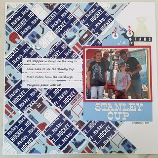 Template Tuesday 1 Template Tuesday 1 by Mikk Lynn, on Flickr
|
|
|
|
Post by grammadee on Feb 10, 2018 21:06:14 GMT
My iPad is having trouble with Flickr. I tried a couple of times to post this comment, mikklynn: What a cool experience! I love that you used these papers for this page. They really up the ante for page excitement. Putting the journaling strips in a block on top of the squares like this really draws the focus to the story and the photo. |
|
MDscrapaholic
Drama Llama
 
Posts: 6,633
Location: Down by the bay....
Jun 25, 2014 20:49:07 GMT
|
Post by MDscrapaholic on Feb 10, 2018 21:21:14 GMT
 Everyone is JUST ROCKING THIS CHALLENGE!! Here's mine (my first one for February!):  |
|
MDscrapaholic
Drama Llama
 
Posts: 6,633
Location: Down by the bay....
Jun 25, 2014 20:49:07 GMT
|
Post by MDscrapaholic on Feb 10, 2018 21:26:15 GMT
Ack! How do I make it smaller?
|
|
|
|
Post by mikklynn on Feb 10, 2018 21:27:31 GMT
|
|
MDscrapaholic
Drama Llama
 
Posts: 6,633
Location: Down by the bay....
Jun 25, 2014 20:49:07 GMT
|
Post by MDscrapaholic on Feb 10, 2018 21:29:21 GMT
Thank you! Sharpie marker and ruler does the trick! |
|