Chinagirl828
Drama Llama
  Melbourne, Australia
Posts: 6,682
Jun 28, 2014 6:28:53 GMT
|
Post by Chinagirl828 on Feb 7, 2018 7:06:14 GMT
Can you believe we're one week into 28-4-28 already? I'll be bringing you a This or That challenge each week. Simply choose one item from each pair to use on your page or project. Don't have either of the options in your stash? Substitutions are welcome! Prefer to scrap in a simpler style? Choose a smaller number of pairs from the list to make your project. - single page or double page
- woodgrain or ombre
- thickers or flat title
- inked edges or torn edges
- frames or pockets
- die cuts or stickers
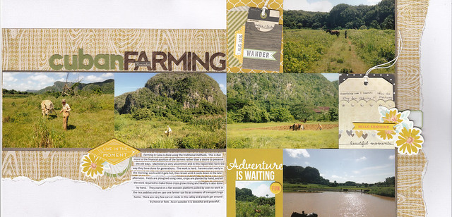
And since this thread is useless without pictures here's my example. I used: single page or double page woodgrain or ombre thickers or flat title inked edges or torn edges frames or pockets die cuts or stickers  Cuban farming Cuban farming |
|
|
|
Post by kiwigirl on Feb 7, 2018 7:24:42 GMT
Gorgeous LO Chinagirl828 I love how you've got so many photos on but there's still white space too. Great challenge, I'm looking forward to this  |
|
|
|
Post by woodysbetty on Feb 7, 2018 12:39:39 GMT
Chinagirl828...great challenge and I love your take on it. Double page layouts that flow always make me smile and your colors are fabulous!! Here is mine - single page, woodgrain, flat title, inked edges, frames ( if you count around the title with a sharpie pen..), stickers. 
|
|
|
|
Post by Linda on Feb 7, 2018 12:54:59 GMT
|
|
|
|
Post by woodysbetty on Feb 7, 2018 12:59:30 GMT
I am an early riser ( 5:00 am) and was already working on this layout...just happened to fit! How often does that happen!! |
|
|
|
Post by mikklynn on Feb 7, 2018 13:40:56 GMT
Chinagirl828 Fun challenge! I like what you did with it, especially the right side layout. It's hard to use 3 4x6 photos. woodysbetty I can't believe you did it already! I really like the color combo you chose.
|
|
christinec68
Drama Llama
 
Posts: 5,430  Location: New York, NY
|
Post by christinec68 on Feb 7, 2018 13:44:29 GMT
Wow..fun choices! I love your layout!! That wood grain paper is swoon worthy!
|
|
|
|
Post by grammadee on Feb 7, 2018 14:36:42 GMT
Awesome challenge and example, Chinagirl828! Love your take on it, woodysbetty. Great use of all those road sign stickers and metal pieces! Just a note: if you choose the two page option, I will score it double points. Got Karen's 4 points noted already. |
|
|
|
Post by kiwigirl on Feb 7, 2018 15:53:08 GMT
OMG, I am so struggling with this! I keep doing that thing where you think ooh, I am sure I have such-and-such and it would be perfect...... where is it? Look through 16 boxes and not find it. Give up and have break. Lather, rinse, repeat! I'm not getting anywhere today!
|
|
|
|
Post by grammadee on Feb 7, 2018 16:06:00 GMT
OMG, I am so struggling with this! I keep doing that thing where you think ooh, I am sure I have such-and-such and it would be perfect...... where is it? Look through 16 boxes and not find it. Give up and have break. Lather, rinse, repeat! I'm not getting anywhere today! BTDT. It is no fun. Some days I wish my memory loss--at least for specific scrappy supplies I own--were complete. Problem is that I remember I HAD such-and-such. Just can't remember (a) did I use it already or (b) if I didn't use it, then where did I put it. And I think my stash laughs at me while I frantically tear things apart in the search. On to a new tactic: Right now, my scraproom is such a mess that I have been working on the premise that what wants to be found will climb to the top of a pile, or peek out from under it. I kind of let my supplies find ME at this point  . |
|
|
|
Post by stinkerbelle on Feb 7, 2018 16:39:06 GMT
i chose single page, woodgrain, torn edges, both types of lettering and a few stickers and diecuts both. fun fun challenge! ETA: i used frames, too, behind the photos.  |
|
|
|
Post by stinkerbelle on Feb 7, 2018 16:53:47 GMT
OMG, I am so struggling with this! I keep doing that thing where you think ooh, I am sure I have such-and-such and it would be perfect...... where is it? Look through 16 boxes and not find it. Give up and have break. Lather, rinse, repeat! I'm not getting anywhere today! hugs! take a deep breath  i have complete faith you'll come up with an amazing page! |
|
|
|
Post by mikklynn on Feb 7, 2018 17:08:55 GMT
|
|
|
|
Post by grammadee on Feb 7, 2018 17:58:53 GMT
Love your page, stinkerbelle. Christmas scrapping is all about reliving the fun! |
|
|
|
Post by grammadee on Feb 7, 2018 18:05:30 GMT
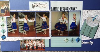
Here is my take on the challenge. I have trouble making choices b/c I love options. I did a double page. Started with ombre (which I searched a bit for and was delighted when I found it), then ended up with some woodgrain, too (I use that a lot and had bits and pieces lying around). I did a FLAT title at the top and then couldn't resist adding the puffy sticker at the bottom as well. The first thing I did was tear some edges. But then some of the layers weren't standing out enough, so I inked some edges too. I spent time looking for some library pockets I KNOW I own, but ended up making a pocket out of pp (This was after I located some cb frames, but realized their colours would do nothing but clash with everything else). For embellishments, I managed to stick to stickers: some VERY old ones that have been in my stash forever.  dance performance dance performance by Gramma Dee, on Flickr |
|
|
|
Post by Linda on Feb 7, 2018 19:10:57 GMT
great layouts stinkerbelle and grammadeeI choose SINGLE, FLAT title, and DIECUTS - went with a simple option so less this and thats. Used the sketch savvy #168 sketch and adapted to 8.5x11 - white background with 8" diecut heart from pink cardstock(using my cricut), 2 each 3x5 scraps of brown on brown PP and pink heart PP, matted my two pictures on white cardstock, added a flat diecut title "Baking cookies" |
|
msliz
Drama Llama
  The Procrastinator
Posts: 6,419
Jun 26, 2014 21:32:34 GMT
|
Post by msliz on Feb 7, 2018 19:24:53 GMT
Here's mine. Single page, wood grain, flat title, torn edges, frame, and die cuts. I used a couple of leaf dies to make "wings" for a heart. My favorite thing about this page? I made it from scraps over a piece of neon orange card stock! It feels great!  Chinagirl828 Chinagirl828, thanks for the challenge. This one was just fun for me. I love looking at your layouts, but I really enjoy reading them. You write about some fascinating places. woodysbetty, you really brought the feel of the auto shop to your page. Nice! stinkerbelle, another awesome page - your album is going to be such a joy to look through every year! grammadee, I like the way you kept the color scheme to just the blue and white, and let the photos be the "star of the show" It's nice finishing a challenge earlier in the day for a change. I'm going to try to do something to use up some scraps. |
|
|
|
Post by grammadee on Feb 7, 2018 19:45:30 GMT
msliz those leaf "wings" are genious! And good job covering up the "ugly paper" with stuff you like!
|
|
nylene
Drama Llama
 
Posts: 6,779 
|
Post by nylene on Feb 7, 2018 23:24:18 GMT
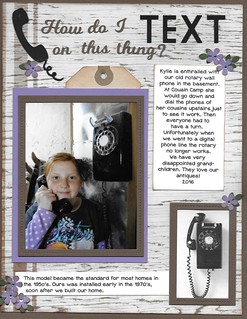
I am just leaving for a meeting, but will be back later to chat. Here is my layout for today using: Single Page, Wood grain, flat letters, inked edges on everything, die cut frames (brown stitched) and die cuts (phone).  How Do I Text on this Thing How Do I Text on this Thing by Nylene Budge, on Flickr |
|
Deleted
Posts: 0
Nov 22, 2024 16:32:15 GMT
|
Post by Deleted on Feb 8, 2018 0:33:04 GMT
 Nylene, I love your story as well as the page. My grandparents had a really old phone like the picture. My great grandmother lived on their property but had no phone service. They set it up so she could call them. I wish I had a picture!  Here is my this or that. single page, woodgrain,thickers, inked edges and stickers. I struggled with this one and really wish I had chosen a different photo for the woodgrain but it was too late to switch. I can't believe I don't have any ombre! My dd sent me this picture of her daily walk with her dog to the lake near her house in fall. |
|
|
|
Post by grammadee on Feb 8, 2018 1:54:25 GMT
@elaynef, I LOVE that woodgrain pp you used! I think it is perfect for this woodland walk photo. Also love the pops of orange and yellow that pick up the foliage in the photo. Well done!
|
|
|
|
Post by stinkerbelle on Feb 8, 2018 5:09:27 GMT
Chinagirl828 love!  I really like how the torn edges add to the rustic feel and sort of tie in with your journaling. And 2 pockets—I’m impressed! Fabulous page and challenge, thanks! woodysbetty I really like the denim background on this awesome masculine page! All the bits and bobs really add to the manly feel  grammadee grammadee the ombre looks great! I really like the wood pocket too and your old stickers are the perfect touch! Linda your page sounds yummy! I bet the pink/brown color scheme is perfect for a sweet page about cookies  msliz msliz woohoo using up scraps and ugly cardstock! Your wings are so clever! Really love the torn frame and your soft, pretty color scheme  nylene nylene love your page! So much goodness here…love that you added info about the phone, your title, the pretty little flowers, the stitched frames…oh so pretty! @elaynef this is my favorite from you so far  everything just goes so perfectly, the woodgrain and leaves…and I super love the torn vellum under your title! Gorgeous page! 
|
|
|
|
Post by patin on Feb 8, 2018 5:48:02 GMT
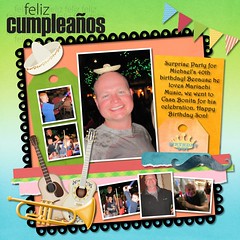
Today's This or That is a digital offering, since I don't have any ombre paper in my stash. SHOCKER! I chose: a 1-page spread, ombre paper (both in the background & a couple of the tags), a flat title, torn edges( on the pink,blue & green strips), frames- the photos are framed in white along with the scalloped frame on the page. There are lots of virtual stickers on the page. This one was a challenge for me as I had a hard time finding paper. I have a lot of woodgrain paper, but I have been using it a lot & wanted a chnge, so this ombre challenged me. Thank you, China Girl!  2010 - Page 002 2010 - Page 002 by Pati Nuce, on Flickr |
|
|
|
Post by stinkerbelle on Feb 8, 2018 5:54:53 GMT
patin what a fun, festive page! i love the music accents and scallop frame. nice to see a page where a mustache makes sense! 
|
|
Chinagirl828
Drama Llama
  Melbourne, Australia
Posts: 6,682
Jun 28, 2014 6:28:53 GMT
|
Post by Chinagirl828 on Feb 8, 2018 7:42:41 GMT
I am an early riser ( 5:00 am) and was already working on this layout...just happened to fit! How often does that happen!! It was very serendipitous! I really love the orange and all the metal accents on your page. |
|
Chinagirl828
Drama Llama
  Melbourne, Australia
Posts: 6,682
Jun 28, 2014 6:28:53 GMT
|
Post by Chinagirl828 on Feb 8, 2018 7:45:18 GMT
That wood grain paper is swoon worthy! Secret - it's actually an old Simple Stories houndstooth print in yellow from one of their first ever collections (in the brown distressed phase) with a cream coloured woodgrain Hambly transparency layered over the top. I discovered you can actually tear a transparency if you put a little cut mark in one edge first. |
|
Chinagirl828
Drama Llama
  Melbourne, Australia
Posts: 6,682
Jun 28, 2014 6:28:53 GMT
|
Post by Chinagirl828 on Feb 8, 2018 7:57:40 GMT
stinkerbelle I love the idea of ugly ornaments! I have a whole lot of ornaments I've picked up on my travels which I fondly refer to as my tacky ornament collection. I think you've used a great design to make sure the photos stay the focus - I really love Nana's expression. (Also, pretty impressed you used three flair on one page!) msliz I love it when hoarding that neon cardstock is finally justified. I really like the softness the torn mat brings and the wings are beautiful @elaynef I think the photo is beautiful on the woodgrain, the darker gaps in the bark give it depth and I love the pops of colour in your embellishments.
|
|
Chinagirl828
Drama Llama
  Melbourne, Australia
Posts: 6,682
Jun 28, 2014 6:28:53 GMT
|
Post by Chinagirl828 on Feb 8, 2018 8:02:40 GMT
Chinagirl828, thanks for the challenge. This one was just fun for me. I love looking at your layouts, but I really enjoy reading them. You write about some fascinating places. Thank you! Story is really important for me and it's the factual stuff I find really interesting. I want my albums to remind me of more than just the feeling of being there. |
|
|
|
Post by kiwigirl on Feb 8, 2018 11:38:29 GMT
Here's mine from yesterday. I'm sure it needs something else but I couldn't think what so I've just gone with, this'll do! I went for single page, ombre, flat title, inked edges, a frame and stickers.  |
|
|
|
Post by kiwigirl on Feb 8, 2018 11:47:54 GMT
woodysbetty you were so quick! Love your LO, great design and the embellishments are perfect! stinkerbelle what a great LO! I love all your layers and embellishments it just looks wonderful! grammadee fab LO, I love the design and that skirt is beautiful! msliz lovely LO! I love the 'wings' and those scrap papers are great! nylene what a gorgeous LO! The colours are beautiful and I love your design. I remember those phones, the impatience of waiting for the dial to turn around! @elaynef I think your picture goes perfectly with that paper! Great LO  patin patin what a fantastic, fun LO! I adore all the colours, it looks wonderful!
|
|