|
|
Post by thracian on Feb 8, 2018 20:10:48 GMT
Here's my layout. 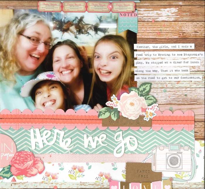 I went with single page, woodgrain, Thickers, inked edges, and die cuts. Thanks for the challenge! |
|
|
|
Post by grammadee on Feb 8, 2018 20:45:05 GMT
Love the silly faces in the photo, thracian. And you have done a lovely job of showcasing it. I always seem to use woodgrain for masculine LO's, but you have used it so well with all those girlie colours and flowers and frills, that I may need to give this a try. |
|
Deleted
Posts: 0
Nov 22, 2024 17:10:43 GMT
|
Post by Deleted on Feb 8, 2018 21:07:15 GMT
Here's my layout.  I went with single page, woodgrain, Thickers, inked edges, and die cuts. Thanks for the challenge! This is gorgeous! |
|
nylene
Drama Llama
 
Posts: 6,779 
|
Post by nylene on Feb 8, 2018 21:45:45 GMT
Nylene, I love your story as well as the page. My grandparents had a really old phone like the picture. My great grandmother lived on their property but had no phone service. They set it up so she could call them. I wish I had a picture! @elaynef, so funny that you would post that because my dad had a phone just like the one you posted and we played with it when we were kids. We put it in our little play area in the lilac trees in the backyard and someone entered the yard one night and stole it. They had to climb the fence to get to it. My dad was so mad that we had left it outside. I love your wood grain paper with that beautiful photo. That must be such a wonderful walk to take in all seasons. Nicely scrapped. |
|
|
|
Post by crystalb on Feb 8, 2018 23:51:07 GMT
Chinagirl828 great challenge! single page or double page woodgrain or ombre thickers or flat title inked edges or torn edges frames or pockets die cuts or stickers
I did a single page for 52 favorite over at Paper Issues. It has woodgrain in the little bear sticker, inked edges, flat title, going into a pocket page (doing a 6X8 album for the year), if not I "framed the picture" (I am sick do I get a pass lol!) and I used all stickers for embellishments. 
|
|
|
|
Post by grammadee on Feb 8, 2018 23:53:03 GMT
Love your wintery fun LO, crystalb. Great use of all the blues and greys. |
|
|
|
Post by stinkerbelle on Feb 9, 2018 1:16:47 GMT
kiwigirl really love your color scheme! I’m impressed with your expertise using nuvo drops and equally impressed you used photo turns! Pretty sure I have like 3 of them in a baggie of random Christmas colored embellies I’ve been hanging onto for 10 years…now that I see them in use again, I might have to go digging! thracian what a gorgeous page! Love it all  the design, colors, accents, that fab photo…gorgeous! crystalb brr, your LO is so frosty! Love all the sparkle!
|
|
Chinagirl828
Drama Llama
  Melbourne, Australia
Posts: 6,682
Jun 28, 2014 6:28:53 GMT
|
Post by Chinagirl828 on Feb 9, 2018 5:00:17 GMT
kiwigirl your page looks deceptively simple - always a challenge to pull off effectively. I love the two different coloured rows of nuvo drops and the fun bird sticker. thracian your colour combo is beautiful! I love the woodgrain in this mix, the whole page just feels so light and happy. crystalb That looks like it would be fun! I love the cute little bear (and nice job sneaking the woodgrain in!) and the snowflake background. I'm impressed you got everything in on your smaller canvas 
|
|
|
|
Post by kiwigirl on Feb 9, 2018 13:54:30 GMT
thracian that is simply stunning! Your papers are so pretty and offset the crazy photo perfectly! I adore it 
|
|
|
|
Post by mikklynn on Feb 10, 2018 20:50:04 GMT
Great challenge, Chinagirl828 . I don't know if I would have searched out this ombre paper without it! I chose single page, ombre paper, Thickers, torn edges (on vellum), frame, and die cuts. 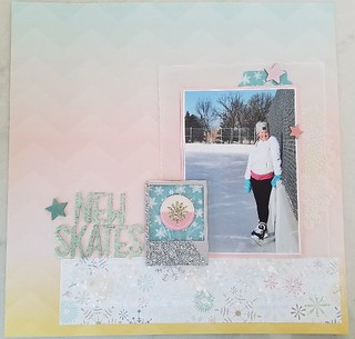 This or That 1 This or That 1 by Mikk Lynn, on Flickr |
|
|
|
Post by mikklynn on Feb 10, 2018 20:55:08 GMT
thracian I love your layout! I like the mix of feminine with the wood grain. The photo is priceless! crystalb We were on the same page with winter photos and sparkly elements. Great job! I hope you are feeling better soon.
|
|
|
|
Post by stinkerbelle on Feb 11, 2018 2:32:27 GMT
mikklynn that ombre paper is so perfect! Really love all the sparkle 
|
|
|
|
Post by justjac on Feb 11, 2018 3:31:45 GMT
single page or double page woodgrain or ombre t hickers or flat title inked edges or torn edges frames or pockets die cuts or stickers
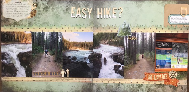 LOAD9 LOAD9 by Jacqueline Bruce, on Flickr |
|
|
|
Post by stinkerbelle on Feb 11, 2018 11:17:39 GMT
justjac love love your page!! everything is so perfect for your theme and the potty people are a great touch!
|
|
|
|
Post by mikklynn on Feb 11, 2018 13:35:21 GMT
justjac Nice! I like the ? in the title...it gives a pretty good clue!
|
|
|
|
Post by LisaDV on Feb 11, 2018 23:10:28 GMT
Chinagirl828, wonderful page and challenge. woodysbetty, that is a very cool page. I love the masculine feel and all of your embellishments. stinkerbelle, too funny! Such a wonderful page! love it. grammadee, I really like that you included all the music notes. I'm a sucker for them for some weird reason. Great job. msliz, fantastic job using scraps. I love this layout. The colors, patterns, the fairy wings. perfect. nylene, Laughing at that title, but the title and page are both terrific. I love the story. patin, love the bright colors and the fun playful feel to this page. kiwigirl, a very clean and beautiful page. and as always, you're rocking those nuvo drops! thracian, such a beautiful and feminine page. crystalb, that looks like so much fun. I might even get my ds to do that (he refuses to go skiing). Fantastic page. mikklynn, I feel cold and feminine looking at your page. It's perfect for that photo. justjac, I'm glad you didn't end up in a horror movie. You're pages are so gorgeous. I've said it before, I'll say it again. I love your nature pages.
|
|
gramma
Pearl Clutcher

Posts: 3,114  Location: Sacramento, Ca
|
Post by gramma on Feb 14, 2018 16:29:26 GMT
Double page - Flat title - Die cut banner pieces
Sometimes the only pictures I have to scrap are downloads from Facebook. The quality is not good so I change them to sepia or black and white - - That's what I did here. I don't love it, but his 16th birthday will be in his book. That's what's important, right?

|
|
|
|
Post by grammadee on Feb 14, 2018 16:34:08 GMT
Double page - Flat title - Die cut banner pieces
Sometimes the only pictures I have to scrap are downloads from Facebook. The quality is not good so I change them to sepia or black and white - - That's what I did here. I don't love it, but his 16th birthday will be in his book. That's what's important, right?
I am sure he will LOVE the pages. And that IS what's important. I like that you toned down the papers to match the sepia photos. I am not sure I would have thought to do this--or had the papers to make it work! |
|
|
|
Post by stinkerbelle on Feb 15, 2018 5:41:12 GMT
gramma I’d rather scrap crappy photos than no photos, so I’m right there with you! What a great masculine page and fabulous fun banners!
|
|
Chinagirl828
Drama Llama
  Melbourne, Australia
Posts: 6,682
Jun 28, 2014 6:28:53 GMT
|
Post by Chinagirl828 on Feb 15, 2018 7:29:24 GMT
gramma I definitely think the story can be more important than the quality of the photos. I love the banners and the neutral colour scheme with the pops of red.
|
|
|
|
Post by LisaDV on Feb 19, 2018 1:27:41 GMT
• single page or double page • woodgrain or ombre i nstead of woodgrain I used kraft• thickers or flat title • inked edges or torn edges • frames or pockets• die cuts or stickers I had time to create a digital page the other day! It was so nice to take a minute. Images from 2015. 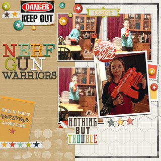 dNerfGunWarriors dNerfGunWarriors by Lisa Davolt, on Flickr |
|
|
|
Post by DawnMcD on Feb 20, 2018 19:32:05 GMT
I am still trying to play catch up on these challenges! I was down sick with the flu Friday-Mon. Feeling a bit better now. I put the finishing touches on this layout today. I used a SG sketch for the basic design. Items I chose: * double page * woodgrain * flat title * inked edges * frames * stickers 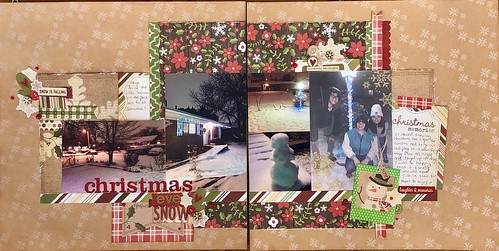 |
|
|
|
Post by DawnMcD on Feb 20, 2018 20:47:10 GMT
Chinagirl828 Thank you for the fun challenge. I really love your page. The tones just flow with your photo and really tell the story without even having to read. woodysbetty Your layout has such a nice masculine, grungy feel, perfect for your photos. I really like the background you chose. stinkerbelle your layout is so fun. I like the one big cluster with the accent one on the right. Woodgrain is my favorite! grammadee I love how things just kept getting added to your page. What a fun thing to scrap and your paler blue lets the photos shine. msliz this is so pretty and fantasy feeling. Love that you used up a paper you don't love as well. nylene I really like the white woodgrain you used- helps keep the page softer, Your photos and title is too fun. @elaynef I think your photo looks beautiful with your photo! the layers of matting help to make it stand out. I think you should use a stock photo or just a photo of your Grandmother to tell your other story! patin Your bright age is perfect for the subject mater. I think you did a great job over coming your struggles. kiwigirl I think your layout is simple but stunning. As always I love your use of the novo drops! thracian I really love your shabby chic feeling page with your super fun photo. All your layering of patterns and use of scents is so pretty. crystalb I really like that you used one giant photo to tell your story. The wintery blues and that cute bear are perfect. mikklynn your page is just stunning. That Ombre works so well with your photo and the layout has such great composition. justjac could your papers be more perfect for your photos? I like that tree like border all the way across and how you placed your smaller accents around the page. gramma I too have a lot of facebook pics from my older son. I love ho you were able to edit them to make them work. Your banner border across the bottom is a nice festive touch. LisaDV your layout is s fun. I love the bright colors against the woodgrain and your great photos.
|
|
|
|
Post by stinkerbelle on Feb 21, 2018 7:52:22 GMT
LisaDV how fun! I really love the danger embellie  DawnMcD DawnMcD glad you’re feeling better and can come out to play with us again  your spread is sooo pretty! I like how you added the bit of journaling about the first snowman  ExpatBackHome ExpatBackHome look at that cutie! Your page is fantastic—love all the bright colors and fun little bits you’ve added. Great job with the frames!
|
|
|
|
Post by grammadee on Feb 22, 2018 3:11:03 GMT
I did single page, woodgrain, thickers, ink, frames and stickers. I have so many frames and I never know what to do with them! 😆  Welcome to the party! Love this page! hope you have some more time to play with us! |
|
|
|
Post by ExpatBackHome on Feb 22, 2018 3:59:47 GMT
Welcome to the party! Love this page! hope you have some more time to play with us! Thanks! I've been watching a bit so far. I hope to get some more layouts done in the next few days  |
|
Chinagirl828
Drama Llama
  Melbourne, Australia
Posts: 6,682
Jun 28, 2014 6:28:53 GMT
|
Post by Chinagirl828 on Feb 22, 2018 8:29:59 GMT
ExpatBackHome frames are my nemesis. I've stopped buying them but occasionally still get them in die cut packs and I have a few left from before I knew better. I really like how you've used them to hold your embellishment clusters and the rainbow of colours works beautifully with these photos.
|
|
|
|
Post by JaneB on Mar 1, 2018 11:06:58 GMT
I had this almost finished for over two weeks. This or that choices: - single page - ombre background in grey - thickers, digital equivalent for the week 05 title - inked edges round one photo at the bottom right - frames around all photos, sort of polaroid style - stickers - they're on the floor there!   This Or That This Or That by Jane Bradbury, on Flickr Supplies include: journal card with alphabet from Capture Life by Becky Higgins and background paper recoloured from Bermuda Triangle an old collab kit from Pixels & Co. Everything else made by me. Font is Open Sans. Created in Photoshop. |
|
|
|
Post by stinkerbelle on Mar 2, 2018 6:07:31 GMT
JaneB love the pops of color and that cool background!
|
|