|
|
Post by stinkerbelle on Feb 13, 2018 4:11:56 GMT
gramma I’m so glad you got past your hatred of orange because your layout turned out wonderful! I had to chuckle a bit at your journaling  jeremysgirl jeremysgirl I really like the symmetrical design you have going on! @elaynef I LOVE your title! Woohoo for manufacturers doing all the work for us, eh?  I’m totally stealing your torn vellum journaling! nylene your lil Christmas angels are all so so adorable  I love the bright green with red! msliz love how you used such a busy paper in a way that still makes your photos shine!
|
|
|
|
Post by maribeth on Feb 15, 2018 15:22:54 GMT
So this challenge was a fun one for me. I used the link and I put purple in as my first color only because I had been going through my cardstock and found I had a ton of purple cardstock. However when the results came back with the complimentary color I realized those were the colors of the LA Lakers and I had been needing to make my Laker page for a home deck project using some of my trading cards collection. How cool. I love how these challenge are really working to get projects completed. 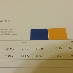  |
|
|
|
Post by grammadee on Feb 15, 2018 15:51:49 GMT
So this challenge was a fun one for me. I used the link and I put purple in as my first color only because I had been going through my cardstock and found I had a ton of purple cardstock. However when the results came back with the complimentary color I realized those were the colors of the LA Lakers and I had been needing to make my Laker page for a home deck project using some of my trading cards collection. How cool. I love how these challenge are really working to get projects completed. Isn't it cool how serendipity works? This is a fun project: so glad you got it finished. I like that you have so many cards, but yet had room for a large title and the little sports embellishments. |
|
|
|
Post by mikklynn on Feb 15, 2018 16:03:43 GMT
maribeth I love how you used it for something other than traditional scrapbooking. It looks great!
|
|
|
|
Post by maribeth on Feb 15, 2018 16:07:49 GMT
kiwigirl - i agree with your thoughts on the limited color pallet being easier to work with. I think I will use this website in the future to assist me when selecting colors. Your page is terrific, fresh and modern. grammadee - wonderful pages, as always, your pages are so precious. Looks like those boys had a ton of fun. gramma - I know right, that color wheel/site is awesome. You pages are great! jeremysgirl - love the colors you incorporated into these fun pages. @elaynef - isn't it nice when you get that bonus and the page just comes together quickly. I think it is a great page! nylene - a wonderful page, how could you go wrong with those adorable smiling faces. stinkerbelle - awesome page msliz - great page, love that background paper
|
|
|
|
Post by justjac on Feb 15, 2018 22:24:32 GMT
|
|
|
|
Post by stinkerbelle on Feb 16, 2018 4:34:18 GMT
maribeth what a fun project! justjac your good old red and green looks fab! I really like your background 
|
|
|
|
Post by Linda on Feb 16, 2018 17:03:00 GMT
www.sessions.edu/color-calculator-results/?colors=611717,176117 I'm scrapping Christmas pictures so red and green it was with some white and silver thrown in for good measure. Using the DCWV Cranberry Christmas stack and some green metallic cardstock. white reindeer paper as the background with a wide strip of red reindeer paper down the left side and a narrow strip of the cardstock. Two 4x6 photos tilted and overlapping at the top. A Happy Holiday reindeer cut-apart tucked into the green border (on the red border) at the bottom and computer journalling on white cardstock matted with the green on the right bottom.
|
|
|
|
Post by mikklynn on Feb 17, 2018 1:11:34 GMT
I used an obvious, but favorite combo of pink and green. I used some older paper from my stash, so yay! 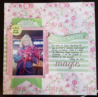 color chaos 2 color chaos 2 by Mikk Lynn, on Flickr |
|
|
|
Post by stinkerbelle on Feb 18, 2018 6:04:51 GMT
mikklynn lovelove that color scheme! i also really like your design 
|
|
|
|
Post by patin on Feb 19, 2018 0:33:33 GMT
As soon as I saw this challenge, I knew what I would do. I know that orange & blue are complimentary colors & when I think orange & blue , I think of my DENVER BRONCOS. I had been waiting for the right moment to scrap these photos & this was it.  28-4-28 28-4-28 by Pati Nuce, on Flickr |
|
|
|
Post by woodysbetty on Feb 19, 2018 15:52:32 GMT
Back and trying to catch up. I took my color wheel & used green-yellow as a pure color reference which gave me violet- blue and orange- reds as triads with orange-yellow and green as tint shades... Thanks, lilacgal!!  |
|
|
|
Post by grammadee on Feb 19, 2018 15:55:00 GMT
Way to work that colour wheel, woodysbetty! Love all the layers, and that you blocked the journaling, sentiment and the photo together on top of them all. |
|
|
|
Post by justjac on Feb 20, 2018 3:31:46 GMT
Here's another complimentary colour layout. It's a digital one using a template and kit by Seatrout Scraps.  LOAD19 LOAD19 by Jacqueline Bruce, on Flickr |
|
|
|
Post by stinkerbelle on Feb 21, 2018 9:12:43 GMT
patin if ever there was a challenge tailor-made for the broncos, this is it! I love how you kept your photos on the right and used the left side for the awesome title work! woodysbetty your colorful layers are fantastic…really love the striped frame too! And I’m so glad your Christmas flower finally bloomed and brightened your day  justjac justjac what a fun template! I really like all the gear and train embellies you used and the colors are perfect!
|
|
|
|
Post by thracian on Feb 21, 2018 18:18:04 GMT
The color site is great! Here's the page I made using it. Thank you for the challenge!  |
|
|
|
Post by stinkerbelle on Feb 21, 2018 18:24:49 GMT
thracian great color combo!! i really like the cute camera border and doggie flair 
|
|
|
|
Post by DawnMcD on Feb 24, 2018 0:34:46 GMT
Complimentary color schemes are hard to me. I often find them a bit too stark or garish for me. But I played with the color wheel you linked and made this combo.  I do not use these colors a lot especially purple but I pulled out some watercolors and am really in love with the results. Thank you so much for pulling me out of my comfort zone! 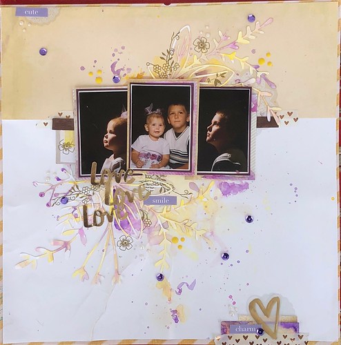 |
|
|
|
Post by stinkerbelle on Feb 28, 2018 1:01:29 GMT
DawnMcD your page is sososo gorgeous!! your purple and yellow mixed with gold really works beautifully!
|
|
gramma
Pearl Clutcher

Posts: 3,114  Location: Sacramento, Ca
|
Post by gramma on Feb 28, 2018 16:30:11 GMT
The color site is great! Here's the page I made using it. Thank you for the challenge!  What sweet babies. I think I have to steal this layout.
|
|
gramma
Pearl Clutcher

Posts: 3,114  Location: Sacramento, Ca
|
Post by gramma on Feb 28, 2018 16:32:20 GMT
Well ya'll seemed to like my green and orange so much - - - -

|
|
|
|
Post by stinkerbelle on Mar 1, 2018 0:30:09 GMT
gramma well, those colors certainly work well for your assortment of critter photos! that lizard looks fierce, yikes! love your funky borders 
|
|