|
|
Post by Linda on Oct 8, 2018 1:38:45 GMT
Today's challenge is to make a mono-chromatic card - pick a colour, use various shades, you can add white/black/metals but it should be primarily one colour. My sample card scanned very crooked -I'm sorry. It's a lovely rectangle in real life, lol.  and a card I made earlier for the vellum challenge also works well for this one  |
|
|
|
Post by grammadee on Oct 8, 2018 4:34:34 GMT
Hmmm.... Will have to think about this one. I think I have some paper packs that might work for this. Will look in the morning.
|
|
|
|
Post by freeatlast on Oct 8, 2018 13:30:47 GMT
Ooh, I have an idea. Now if I just had the time to get to my craft room.
|
|
|
|
Post by joblackford on Oct 8, 2018 15:48:33 GMT
I have an all white card I made recently. I'm not sure I'll have time to complete any new cards today or for a week or so (besides the ones I have to get ready for my SIL before tomorrow - eek!) so I'll post this as a slight cheat  and hopefully you'll forgive me. All texture, no color: http://instagram.com/p/Bn4kKXJgU5c |
|
|
|
Post by grammadee on Oct 8, 2018 16:14:27 GMT
joblackford , that white on white is gorgeous!!! Here are the 3 cards I created this morning. When I saw the challenge I remembered I had some remnants of a pack of different greens, and I decided to try a take on your geometric design, Linda . Even managaged to work in some mesh I found deep in the drawer where I was looking for those papers! 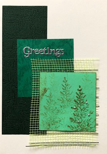 CardTober #8 green CardTober #8 green by Gramma Dee, on Flickr Then I started looking around on my messy desk, and decided to use a couple of stamps before they were put away. So I now have two more cards: 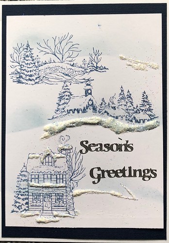 CardTober #8 drifted scene CardTober #8 drifted scene by Gramma Dee, on Flickr I used a piece of fussy cut scrap cs as a mask to create the "snowdrift" bg with TH oxide ink. I then stamped the images and finished off with Nuvo white drops and glitter. Even covered up a greeting on the one stamp I didn't want to use here. This last one, I inked over the embossed bg, added some bling, and then just started layering: 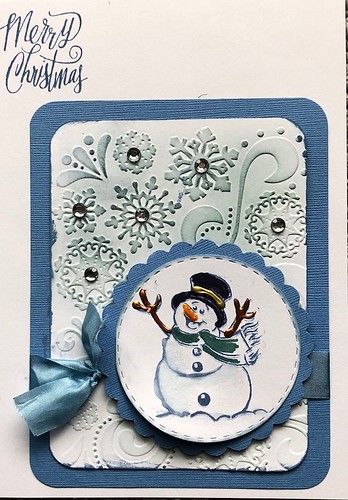 CardTober #8 happy snowman CardTober #8 happy snowman by Gramma Dee, on Flickr
|
|
|
|
Post by Linda on Oct 8, 2018 16:20:06 GMT
joblackford - that's gorgeous -very elegant! grammadee - love the greens and the mesh! The snowdrifts look great! And that snowman on the inked embossing is perfect!
|
|
scrapnnana
Drama Llama
 
Posts: 6,449 
|
Post by scrapnnana on Oct 8, 2018 18:03:48 GMT
joblackford, I love your white on white card! grammadee, your 3 cards are fun, and I especially love the village with the snow. I had a slightly harder time with this challenge. My card is below. The fern paper is actually a light green, although it doesn't look like it from the photo. 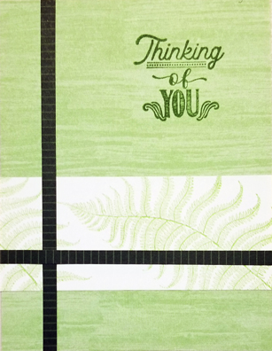 |
|
|
|
Post by grammadee on Oct 8, 2018 19:01:08 GMT
scrapnnana, that is a lovely card. Sympathy cards are hard, but you have really created something beautiful here. I love those dark green border strips with the softer colours/patterns: gives the whole page an elegant feel.
|
|
|
|
Post by Linda on Oct 8, 2018 19:03:04 GMT
|
|
|
|
Post by grammadee on Oct 8, 2018 19:13:39 GMT
Here's another one with the same supplies as the one above, except I added some green plaid pp and then decided to decorate the tree with Nuvo "garlands". Made a bit of a mess of that, but I kind of like the result. 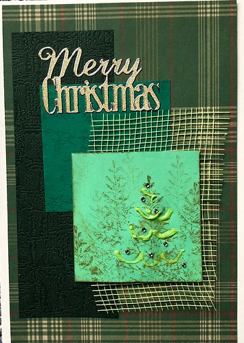 Cardtober #8 green w plaid Cardtober #8 green w plaid by Gramma Dee, on Flickr |
|
|
|
Post by JaneB on Oct 9, 2018 20:36:16 GMT
I managed a card this evening  I enjoyed this challenge, right up my street thank you Linda
Digital vellum skills are improving, it's going to be on everything at this rate! I drew or made everything. Fonts are Novecento and Montic.
joblackford white on white is perfect for a wedding card, and yours is beautiful 
grammadee I like all your different versions, and smiled to myself at your description of just looking around your desk to see what was there. I love that snowman card though  I like your Nuvo garland too, garlands don't have to be perfect on a tree, ours never are!
scrapnnana those greens are beautifully soft against the starker lines, lovely card  |
|
|
|
Post by Linda on Oct 9, 2018 20:45:48 GMT
grammadee - love the plaid on that last card! JaneB - beautiful! I love the vellum and the flowers!
|
|
|
|
Post by joblackford on Oct 13, 2018 15:58:09 GMT
JaneB that digital vellum is so cool! I love your card.
|
|
|
|
Post by warrior1991 on Oct 14, 2018 23:43:46 GMT
I liked joblackford 's card, so I followed her example.   |
|
|
|
Post by grammadee on Oct 14, 2018 23:46:35 GMT
I like that you changed your lift from landscape to portrait, warrior1991. Is that silver cs? Or did you spritz that colour? |
|
|
|
Post by joblackford on Oct 14, 2018 23:52:55 GMT
I liked joblackford 's card, so I followed her example.  That's really cool!  I love the silver. Die cut words are my favorite way to add a sentiment. the look is so bold. |
|
|
|
Post by warrior1991 on Oct 14, 2018 23:53:58 GMT
It is cardstock, well paper. It is text paper weight. I call it "glimmer" paper.
My word die looks similar to hers. I don't remember where I got it from.
|
|
|
|
Post by Eddie-n-Harley on Oct 16, 2018 3:55:15 GMT
Here is my monochromatic card for this challenge! 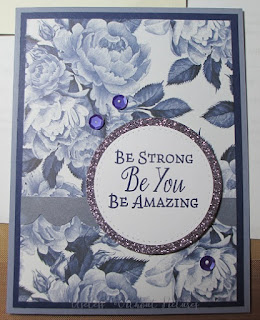 |
|
|
|
Post by gale w on Oct 19, 2018 20:14:03 GMT
 I used the ink smooshing technique with distress oxides to make the background. I think salty ocean, faded jeans, and blueprint sketch. The snowflakes are die cut from some light blue vellum and the word is from SSS. The shadow layer looks silver/gray but it's actually a light grayish blue cut from some metallic paper from Nasco, I think. The dark blue cardstock is from bazzill. After using some tombow mono multi to adhere the snowflakes, there was some stickiness on the front so I dabbed some ultra fine blue glitter on it in those places. eta: now that I look it's kinda blah. lol. I might have to add a few sequins. |
|
Deleted
Posts: 0
Nov 22, 2024 11:20:28 GMT
|
Post by Deleted on Oct 20, 2018 2:08:59 GMT
Here's my monochromatic card for this challenge. I used a Cerulean Blue watercolor as my base color then created lighter and darker shades of it to keep things monochromatic. To help the white embossed sentiment "pop" against the background, I added a drop shadow around everything using a dark gray marker.  |
|
|
|
Post by joblackford on Oct 20, 2018 3:09:24 GMT
Oooh, 2 new blue cards. They're both gorgeous gale w and CoffeeCrafter! CoffeeCrafter I really like the effect of the drop shadow. It really does help everything pop. I might have to try that. gale w I think your card is lovely. You could add a little sparkle with sequins or nuvo drops, but I don't think you need to. |
|
scrapnnana
Drama Llama
 
Posts: 6,449 
|
Post by scrapnnana on Oct 24, 2018 1:54:42 GMT
grammadee, I like the Nuvo drops garlands, as well as your use of mesh. It is a beautiful card.
JaneB, your digital cards are amazing. That really looks like vellum held on with an eyelet. I love the wishies (as my kids always called them) and how the writing wraps around the corner.
warrior1991, I love the embossed glimmer paper. That's a lovely card.
Eddie-n-Harley, your card is beautiful. I love the papers, the sequins, and the phrase.
gale w, your ink smooshing looks great. Thanks for explaining the process.
CoffeeCrafter, your watercolor background is lovely. I appreciated reading about your process, too.
|
|
|
|
Post by patin on Oct 26, 2018 20:44:48 GMT
SORRY THAT I POSTED ALL OF MY CARDS ON THIS POST. IT WAS JUST SUPPOSED TO BE THE FIRST PEACOCK CARD!They were demo-ing these new markers at Scrapbook expo & I loved how we got such a beautiful watercolor effect along with the loveley background. I was happy to be able to turn this into a card for my lovely niece. 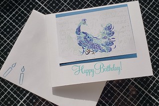 Cardtober #8 Cardtober #8 by Pati Nuce, on Flickr |
|
scrapnnana
Drama Llama
 
Posts: 6,449 
|
Post by scrapnnana on Oct 27, 2018 2:26:41 GMT
Beautiful watercolor peacock, patin! And I love the Christmas card you made with the Heartfelt Creations dies, etc.
|
|