|
|
Post by grammadee on Oct 10, 2018 14:52:50 GMT
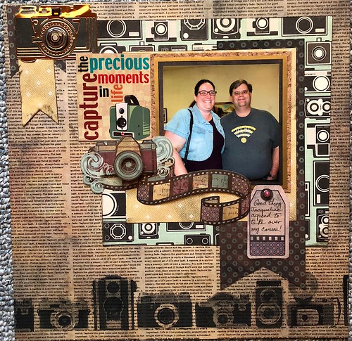
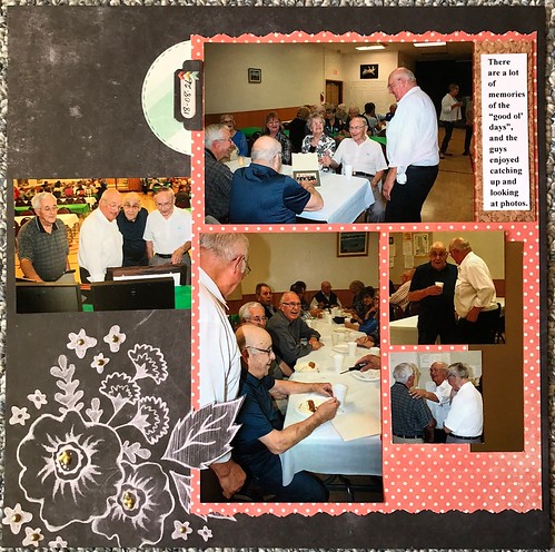
Here are two more pages from yesterday. The second is for the September sketch/scraplift challenge that got lost in all the Sketchtember madness.  Some memories... Some memories... by Gramma Dee, on Flickr  Some memories 2 Some memories 2 by Gramma Dee, on Flickr And here is the one I did this morning for Chinagirl828 's Stash Challenge.  gold friends 1 gold friends 1 by Gramma Dee, on Flickr Points: Three pages created & shared (6). October Stash challenge (1). September scraplift challenge (1). #3 handwriting (1). #4 I found my deco Scissors! (1). #5 diecut circle (1). #6 letter stickers (1). #12 someone I love (3). #20 flowers (1). #23 word up (1). #24 HOTP on two of them; WRMK on the other (3). #25 square pages (3). Rectangular photos (2). #29 I fussy cut the leaf to slide the photo under (1). #30 black bg (1). #31 gold foil (3). #38 Nuvo's (1). #42 camera (2). Total: 33 |
|
|
|
Post by Linda on Oct 10, 2018 15:36:15 GMT
grammadee - lovely pages! I love the quote on the first page and all the cameras bits on the second! Great job fussy cutting for the third!
|
|
|
|
Post by kiwigirl on Oct 10, 2018 16:35:00 GMT
Fabulous LOs grammadee ! I love the brown and the cameras and the florals too. It's all lush and I do love the top you're wearing at your anniversary party, it's lush!  I managed to finish this one off. I have done JaneB 's My Way #45 challenge and used my perfume box since I just got a new bottle. I have worn this perfume for years, I know I bought my first bottle in 1997!   Here's a closeup too cause I used some embossing paste but it's not showing up in the photo at all, I can see it IRL!  Taking 31 for this one, 1 for a LO, 1 for sharing, #4, #13, #14, #18, #19, #20, #21, #22, #23, #25, #26, #27, #28, #30, #32, #35, #36, #38 + BONUS, #39, #41, #42, #45, #50, Stash Challenge - Scraps & Favourite Manu, Bonus challenge very, very old flower and the acrylic heart is very new. |
|
|
|
Post by grammadee on Oct 10, 2018 16:38:27 GMT
Beautiful, kiwigirl. I love the white and the Nuvo's against the black background. So cool to use a perfume box as an element on the page. LOVE the mesh! |
|
|
|
Post by Linda on Oct 10, 2018 17:50:05 GMT
another gorgeous layout kiwigirl! Love the perfume box and the mesh and nuvos and .... |
|
|
|
Post by gmcwife1 on Oct 10, 2018 19:11:57 GMT
Another set of 20 cards completed! I’m only photographing part of them to post as I post from my iPad and large amounts are too large.
Tree card - challenges: die cut - 5, stitching - 18, word up - 23, rectangle- 26, stamp - 54, create, share = 7 X 20 / 140 total points
|
|
|
|
Post by Linda on Oct 10, 2018 19:33:08 GMT
gmcwife1 -lovely cards - I really like your style - simple and elegant
|
|
|
|
Post by gale w on Oct 10, 2018 19:41:32 GMT
Another set of 20 cards completed! I’m only photographing part of them to post as I post from my iPad and large amounts are too large. Tree card - challenges: die cut - 5, stitching - 18, word up - 23, rectangle- 26, stamp - 54, create, share = 7 X 20 / 140 total points  Glad you're on my team!  |
|
|
|
Post by grammadee on Oct 10, 2018 19:57:32 GMT
Those cards look AWESOME gmcwife1 . I love their simplicity, with such a classic elegant look. Here are two pages I was able to put together today. I used fall colours b/c this happened in September (and b/c there is a challenge to use fall colours LOL), but since these pic's were taken along the BC coast, everything is pretty green in the photos.  explore explore by Gramma Dee, on Flickr Points: Two pages created and shared (4). #3 handwriting (1). #4 fall papers in a bag of camping/outdoor scrappy supplies (2). #12 I love these guys! (2). #14 photos from the cloud (2). #16 fall colours (2). #23 title is on a metal tag, and a preprinted label on page two (2). #25 square pages (2). #26 rectangular photos (2). #27 brads (2). #31 foil behind journaling spot (1). #39 wood and metal (2). #41 bling on brads and leaves (2). Total: 26 |
|
|
|
Post by Linda on Oct 10, 2018 21:00:42 GMT
gorgeous photos grammadee - the fall paper looks great with them |
|
|
|
Post by gmcwife1 on Oct 10, 2018 21:28:12 GMT
gmcwife1 -lovely cards - I really like your style - simple and elegant Thank you  I can’t take credit though, they all start on Pinterest! |
|
|
|
Post by Linda on Oct 10, 2018 21:43:18 GMT
gmcwife1 -lovely cards - I really like your style - simple and elegant Thank you  I can’t take credit though, they all start on Pinterest! sure you can -you may have been inspired by Pinterest but you're the one who did the work |
|
|
|
Post by gmcwife1 on Oct 10, 2018 22:06:14 GMT
Thank you  I can’t take credit though, they all start on Pinterest! sure you can -you may have been inspired by Pinterest but you're the one who did the work Thank you  |
|
|
|
Post by Linda on Oct 10, 2018 23:03:17 GMT
I finally got a layout done today.  <iframe width="26.5" height="34" style="position: absolute; width: 26.5px; height: 34px; z-index: -9999; border-style: none;left: 5px; top: 43px;" id="MoatPxIOPT0_95970979" scrolling="no"></iframe> <iframe width="26.5" height="34" style="position: absolute; width: 26.5px; height: 34px; z-index: -9999; border-style: none; left: 1252px; top: 43px;" id="MoatPxIOPT0_25505350" scrolling="no"></iframe> <iframe width="26.5" height="34" style="position: absolute; width: 26.5px; height: 34px; z-index: -9999; border-style: none; left: 5px; top: 1658px;" id="MoatPxIOPT0_65737374" scrolling="no"></iframe> <iframe width="26.5" height="34" style="position: absolute; width: 26.5px; height: 34px; z-index: -9999; border-style: none; left: 1252px; top: 1658px;" id="MoatPxIOPT0_52949254" scrolling="no"></iframe>  |
|
joyfulnana
Pearl Clutcher

Posts: 3,043 
|
Post by joyfulnana on Oct 11, 2018 1:34:07 GMT
Well I had a long post of love for everyone, and I guess you can't do that by trying to cheat the system and having two tabs open  I will be taking a page from stinkerbelle's book and using word and cutting and pasting from now one. I love everything, so much creativity and talent here on this board! Great work ladies! |
|
|
|
Post by grammadee on Oct 11, 2018 2:49:26 GMT
joyfulnana, I hate when that happens. I think sometimes I hit close when I mean to hit post reply, but maybe it is just "the system"? Linda, I am glad you got a couple of pages done, even while being worried about the storm coming in. The starry paper is a good choice for a military LO. That mauve is not a colour I would have chosen, but it goes really well with these photos.
|
|
|
|
Post by JaneB on Oct 11, 2018 6:46:27 GMT
My latest three cards.
Merry Christmas - where I do digital icing on a biscuit (it originally said 2015 in the photo) and conquer digital glitter, much less messy than the real thing. Other than that, I'm not entirely sure I like the result   Challenges met: Cardtober #9, rectangles, ribbon, glitter = 6
You're A Star - inspired by Mel and her challenge example for Day 4, more digital vellum for a shaker card.  Challenges met: Cardtober #7, rectangles = 4
Celebrate - a straight lift of the challenge exampe by lovestocreate because I thougt it was gorgeous. I am irrationally proud of those sequins, made entirely from scratch. There may be sequins all over the place once I perfect the style  Digital embossing for stitching is also improving...  Challenges met: Cardtober #10, rectangles, bling = 5
|
|
|
|
Post by KelleeM on Oct 11, 2018 8:54:50 GMT
I’m here looking and liking all of your cards and pages. I’m sorry I don’t have the time or energy to comment on each of them.
I have today off to attend a funeral but may find some time to put together a page. I need a distraction.
|
|
|
|
Post by Linda on Oct 11, 2018 12:13:40 GMT
JaneB - great job with sequins and glitter and shaker cards! Woohoo - you are a digital master! KelleeM - ((((Hugs)))) and prayers. I'm so very sorry
|
|
|
|
Post by Linda on Oct 11, 2018 13:38:47 GMT
almost done with the 2017 photos from DS26  |
|
|
|
Post by stinkerbelle on Oct 11, 2018 14:15:31 GMT
kiwigirl I totally love your signature scent page!! So clever to use the box and I love the color scheme. the dark embossing looks really cool with the white splatter over the top and I love the mesh and little scattering of buttons, your awesome multi-font title, the nuvo border, all of it is just gorgeous! gmcwife1 more beautiful cards from you! I really like that music paper for the tree and the stitching really ups the fanciness. Linda your US Navy page is great, just enough extras to look pretty but not compete with those great photos. Congrats to your son! Also since my birthday is july 4, I’m a sucker for the red/white/blue combo  on the new flat page I love that coffee cup paper and contrasting orange strip. The big title looks awesome! i've left love in the gallery for you grammadee and JaneB 
|
|
|
|
Post by Linda on Oct 11, 2018 14:26:22 GMT
one more to go after this and I can scan the layouts for Okinawa 2017 and buy an album for it!  |
|
|
|
Post by kiwigirl on Oct 11, 2018 14:41:52 GMT
stinkerbelle and I were talking about one of our favourite scrappers the other day so I decided to channel her and do this LO. Points if you know the scrapper I was channeling   Only 16 points for this, 1 for a LO, 1 for a share, #7, #13, #14, #22, #23, #26, #35, #36, #39, #41, #42, #43, #50 and Bonus Challenge.
|
|
|
|
Post by Linda on Oct 11, 2018 14:55:45 GMT
kiwigirl -no idea who the scrapper is but that's an awesome layout - I love how you have all those details in such a small part of the layout!
|
|
|
|
Post by stinkerbelle on Oct 11, 2018 15:18:35 GMT
kiwigirl I LOVE THAT PAGE! and i sort of hate your guts because it's not fair you can do both minimal and your normal style so well *pout* all the details in there are just fantastic 
|
|
|
|
Post by stinkerbelle on Oct 11, 2018 15:19:45 GMT
Linda i love those papers for your christmas in japan page, great design too!
|
|
|
|
Post by sleepingbooty on Oct 11, 2018 15:54:21 GMT
Finally joining in on the scrappy fun this month! Slowly but surely... 
Double 6x12 LO about my love for city centre living since I was a young child.
"In sinu urbis" (in the heart of the city) for my 6x12 "To be and to become" album Page completed (2) + posted (2) #Sketchy Saturday 1 (1) #2 BOO! - hidden journaling on the back of the brown tag in the glassine bag behind the top photo (1) #4 Found items - paint swatch brochure (1) #8 Happy - H for the wood veneer heart, A for for alpha Thickers, P for paint swatch, P for Prima Marketing which I used to fussy cut some florals, Y for the bright yellow gold of the "urbis" Thickers (1) #13 AC/DC... stay current (1) #20 Flowers (1) #21 Mix it up (1) #22 Acrylics aren't just... - permitted wood substition as my tiny stash as acrylic-free at the present (1) #25 Be there or be square (1) #26 Rock those rectangles (1) #29 Be a little fussy (1) #31 Foil and trouble (1) #32 Splishy splatter (1) #35 These are a few of my favorite things - favourite places I lived in growing up (1) #36 Tiny talk (1) #43 Tie me up! (1) #45 My way - white background, metallic title, loads of white space, journaling with a typewriter, muted tones, small details, touches of floral, mixed media AKA the Booty special #53 Get your glitter on (1)
Total: 22
|
|
|
|
Post by Linda on Oct 11, 2018 16:07:37 GMT
@sleepybooty - beautiful layout - I really love your style - simple, elegant
|
|
|
|
Post by grammadee on Oct 11, 2018 16:47:27 GMT
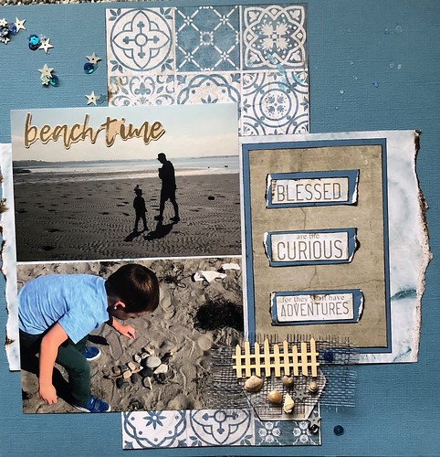
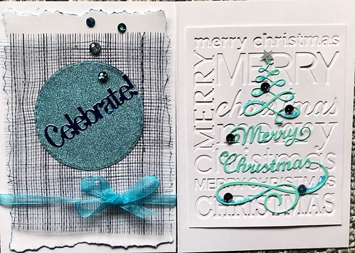
Sorry for the huge dump. Yesterday evening and today, I finished 7 pages and two cards. I am sharing them all together here, and will add up my points after I take a bit of a break.  beach time beach time by Gramma Dee, on Flickr  Beach time 2 Beach time 2 by Gramma Dee, on Flickr  A little dirt A little dirt by  Fall guys Fall guys by Gramma Dee, on Flickr Gramma Dee, on Flickr  corn maze farm fun corn maze farm fun by Gramma Dee, on Flickr  CardTober #10 CardTober #10 by Gramma Dee, on Flickr Points: Seven pages created & shared (14). two card created & shared (4). #1 CardTober (2). #3 handwriting (7). #4 found the mesh (2). #5 diecuts (5). #6 letter stickers (1). #7 punctuate (1). #12 someone I love (7). #14 download it (5). #16 fall colours (5). #20 flowers (1). #21 mixed media (2). #23 Word up (5). #25 square pages (7). #26 rectangular cards and photos (9). #31 foil (4). #32 splatter (3). #34 dirt (1). #38 nuvos (1). #39 wood + metal (1). #41 bling (4). #43 ribbon (1). #45 my way: torn inked edges (5). #49 overlay (1). #50 mesh (2). #53 Glitter (1). Total: 101 |
|
|
|
Post by sleepingbooty on Oct 11, 2018 17:46:59 GMT
Leaving love for the current page (8):
grammadee (Some memories) Oh, I love how you fit so many photos on a page! It's no easy feat but you did it really well. The main background with the distress effect looks beautiful. What a wonderful idea to get your title to give a cheeky wink to the photos ("never fade" for those bright and colourful pictures).
grammadee (Some memories 2) You puzzled those papers together perfectly to create the background for that photo. It's like a matrioshka doll of monochromatic prints and it looks awesome! Great job on extracting the colours from the people featured to add them as little touches to your LO as well (denim blue and WIFI yellow for the gold on the camera).
grammadee (Gold friends) Great use of a dark cool brown! These colours don't get enough love these days but when done well, they look awesome. I love the fussy-cut flower and cork background for your journaling too. It gives your LO some beautiful natural elements which fit the autumn season so well (I have ALL the autumn feels right now  ).
kiwigirl (My signature scent) Great minds think alike because I have a favourite scent project scribbled down on my must-make list for this month!  I love this black LO so much and it's very you: the Nuvo drop outline, the smiling selfie/portrait, the beautiful let-me-mix-several-alphas title, the geometric lines and shapes. The white splatter and embossed splashy circles give it such a fun touch as well as being a reminder of spraying on perfume. I see what you did there! You go, Issey girl!
gmcwife1 Love these minimalist Christmas cards. It doesn't need to be fussy and complicated to look beautiful! Great job on getting so many done as well. That's some serious work happening in your little workshop, you busy elf!  Santa approves.
grammadee (Explore) What a pretty double LO! I can see a lot of love went into this. The pattern paper strips put vertically and horizontally really gives great dynamic to the entire page. And some autumny orange hues to your oh-so-lush-green photos!  Those "falling" leaves on the right page look wonderful and seasonal. I had to giggle because the two you superposed look like an avocado gone wrong to my silly brain ("No, the flesh must be green, not orangey!").  It's probably my avocado-deprived brain talking (avocado season here, in the south of Europe, is in autumn and winter: I've not had any since April, please forgive me!)...
Linda First of all, congratulations to your son! I love that you went subtle with the colour selections to let the navy shade shine: such a beautiful hommage to your boy. The muted American flag that's all dusty pink looks so beautiful with the blue. Great colour combo!
JaneB (Merry Christmas) Oh my, what an exquisite card! I absolutely love it. Those pine branches at the top are making my heart swoon. And I can't tell it used to say '2015' so well done! I really love that you treated the bell cut-out shape as a glass jar to create a little landscape in. This is making me feel very Christmassy!
JaneB (You're a Star) Soft and delicate and yet still, somehow, bold. Great job! This has such pretty night time qualities to the scene. I love that digital vellum shaker pocket so much.
JaneB (Celebrate) You've done an incredible job creating your own sequins, you should be proud! I really like how you've shadowed the foreground scenery by doing that subtle hexagon pattern in the background: it does a great job of elongating the overall effect and giving it some airiness. Beautiful colour seletion as well!
Linda Well, looks like I need to congratulate your son (belatedly but that's your fault for scrapping 2017 memories only now  ) again: yay on his new crib! Green and orange is one of those combos I keep forgetting about but they work so well together. I love the exclamation point in the title to underscore the enthusiasm of this move. A lovely LO overall!
Linda Oh, I like an "inversed" Christmas LO with a lot of white space (ok, I confess: I love white space ALL. the. time). That wordy Christmas paper is so fun. You did a wonderful job balancing out the traditional red and green to have something fresh and airy with this page.
kiwigirl (Hello, my name is) Ah, be still, my minimalist heart!  I love that you challenged yourself to play with a different aesthetic. It has worked out beautifully. The background paper reminds me of a Maggie Holmes line (but I'm sure it's not). Very pretty (and how nice to let it breathe and take centre stage)! The small photo cluster is perfectly executed: loving all the black elements to balance out your black shirt.
I'll be back after dinner for the rest of the projects on this page.  My hungry belly is starting a riot... |
|